- Subscribe to RSS Feed
- Mark Discussion as New
- Mark Discussion as Read
- Pin this Discussion for Current User
- Bookmark
- Subscribe
- Printer Friendly Page
- Mark as New
- Bookmark
- Subscribe
- Mute
- Subscribe to RSS Feed
- Permalink
- Report Inappropriate Content
Apr 22 2024 03:23 AM - edited Apr 22 2024 03:25 AM
In MS Project Resource Graph, how can I show the Bold Horizontal line indicating the Maximum Units number?
- Mark as New
- Bookmark
- Subscribe
- Mute
- Subscribe to RSS Feed
- Permalink
- Report Inappropriate Content
Apr 22 2024 05:50 AM
That is not how the Resource Graph works. It is designed to display only a single value in a column chart format. For example, you can display Cost, Work, Peak Units, Percent Allocation, etc., but you cannot display two values in a combination column chart/line chart (which is what you are describing). Sorry, but hope this helps.
- Mark as New
- Bookmark
- Subscribe
- Mute
- Subscribe to RSS Feed
- Permalink
- Report Inappropriate Content
Apr 23 2024 11:21 PM - edited Apr 23 2024 11:22 PM
Thank you for your reply.
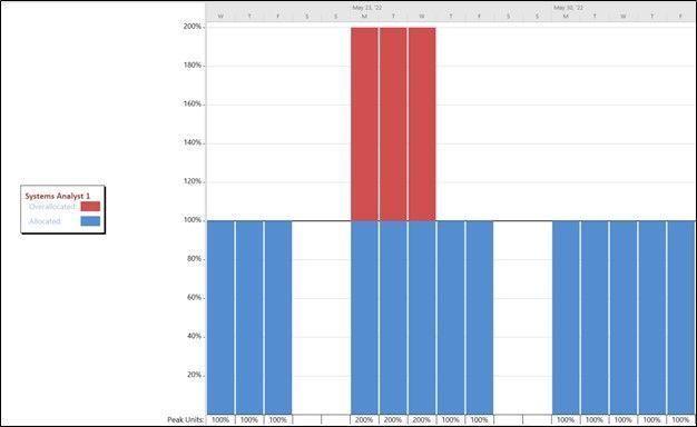
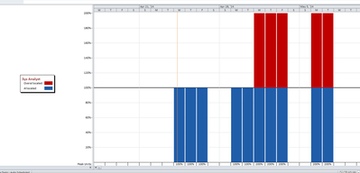
In the attached picture there is a bold horizontal black line that separates between Allocated (Blue) and Overallocated (Red) resources. I can not show this line which indicates the Maximum Units. I have tried the GRIDLINES list but couldn't find it there either. Do you know how to show it?
- Mark as New
- Bookmark
- Subscribe
- Mute
- Subscribe to RSS Feed
- Permalink
- Report Inappropriate Content
Apr 24 2024 05:20 AM
Where did you find that screenshot? I created a project with the same overallocation, and my Resource Graph view DOES NOT display the black gridline that is shown in your screenshot. So, the best I can tell you is that it is NOT possible to display the Max. Units gridline in the Resource Graph view. But if I am wrong, I would gladly invite the others to correct me and to tell me how to display it. Hope this helps.
- Mark as New
- Bookmark
- Subscribe
- Mute
- Subscribe to RSS Feed
- Permalink
- Report Inappropriate Content
Apr 24 2024 08:43 AM - edited Apr 24 2024 09:27 AM
SolutionThere ya go, throwing down a challenge. I'll give it a go and see what I can come up with. Stay tuned.
Update (a few minutes later).
As usual you are correct in that with current versions of Project the bold horizontal line is neither present nor available to display. However, when I stepped into my wayback machine and tried this on Project 2010, not only can I show the bold line but I can also delete it by turning off the bar styles option "show availability line". Another gotcha from our good friends at MS. Maybe, just maybe, it's an artifact from the assignment units/peak units change that was made back in that time frame.
John
- Mark as New
- Bookmark
- Subscribe
- Mute
- Subscribe to RSS Feed
- Permalink
- Report Inappropriate Content
Apr 24 2024 09:31 AM - edited Apr 24 2024 11:18 AM
KAA_82,
So to answer your question, that horizontal line IS the resource Max Units line. It's just called the "availability" line on the Resource Graph. And apparently you have an older version of Project that has that feature.
John
- Mark as New
- Bookmark
- Subscribe
- Mute
- Subscribe to RSS Feed
- Permalink
- Report Inappropriate Content
Apr 25 2024 03:39 AM
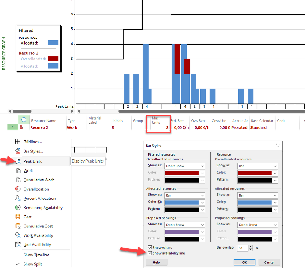
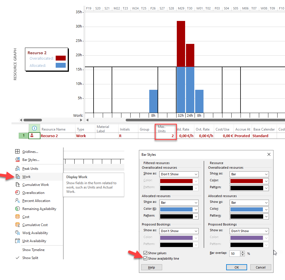
As Jhon and Dale say, the Resource graph showing Peak Units looks like a disaster, but not the Work graph, which seems to work correctly, at least in this example, and without forgetting to check the Show availability line option.
Ignacio
- Mark as New
- Bookmark
- Subscribe
- Mute
- Subscribe to RSS Feed
- Permalink
- Report Inappropriate Content
- Mark as New
- Bookmark
- Subscribe
- Mute
- Subscribe to RSS Feed
- Permalink
- Report Inappropriate Content
Apr 28 2024 07:22 AM
You're welcome and thanks for the feedback.
John
Accepted Solutions
- Mark as New
- Bookmark
- Subscribe
- Mute
- Subscribe to RSS Feed
- Permalink
- Report Inappropriate Content
Apr 24 2024 08:43 AM - edited Apr 24 2024 09:27 AM
SolutionThere ya go, throwing down a challenge. I'll give it a go and see what I can come up with. Stay tuned.
Update (a few minutes later).
As usual you are correct in that with current versions of Project the bold horizontal line is neither present nor available to display. However, when I stepped into my wayback machine and tried this on Project 2010, not only can I show the bold line but I can also delete it by turning off the bar styles option "show availability line". Another gotcha from our good friends at MS. Maybe, just maybe, it's an artifact from the assignment units/peak units change that was made back in that time frame.
John


