- Home
- Microsoft 365
- Excel
- How To Create a Gauge-Style Doughnut Chart that Includes Negative Numbers & Greater than 100% Values
How To Create a Gauge-Style Doughnut Chart that Includes Negative Numbers & Greater than 100% Values
- Subscribe to RSS Feed
- Mark Discussion as New
- Mark Discussion as Read
- Pin this Discussion for Current User
- Bookmark
- Subscribe
- Printer Friendly Page
- Mark as New
- Bookmark
- Subscribe
- Mute
- Subscribe to RSS Feed
- Permalink
- Report Inappropriate Content
Oct 15 2023 09:35 PM
Hello, I need to create a gauge-style doughnut Chart that not only shows the 0% - 100% range, but that will also show ranges that fall below 0%, or that go over 100%.
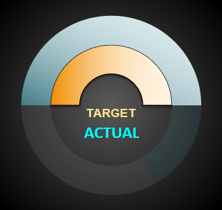
By following tutorials on YT, I've made gauge-style doughnut charts that look like this...
...and different charts that combine 2 doughnuts to look like this... (combining 2 tutorials)
As much as I like the chart above with the 100 slices, the solid-fill chart works best for the spreadsheet I'm working on since I have to reduce the size down to very small (and the slices don't show up very clear when zoomed down so small), since I need to visually see up to 23 charts (one for each day of the month) on a single sheet, like this...
These doughnut charts are rotated to a 270-degree angle and the 0% - 100% values work fine, but when given a value of minus 0%, the gauge doesn't work properly (rather than the gauge going the opposite direction, it fills part of the gauge...in the same direction as it would when a positive number is given. And when a value of greater than 100% is given, it doesn't go beyond the 100% level.
In order to visually describe what I'm trying to achieve, I've created in Photoshop what I need the chart to do, I hope that's OK.
Here is a picture of the chart (no Photoshop) that works perfectly fine when no value less than 0% or greater than 100% is given. (The inner (purple) doughnut represents the "daily target" which is always going to occupy the 0%-100% range, since that never changes. The outer (blue) doughnut represents the "actual" figure...and this figure will very often be either a negative value, or a value greater than 100%)...
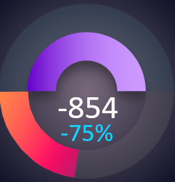
Here is a Photoshop'ed picture...showcasing what I would like the outer doughnut (the "actual" value) to look like when a negative value is given to it...
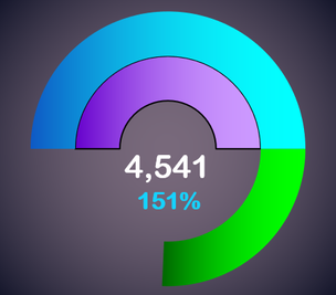
And here is another Photoshop'ed picture...showcasing what I would like the outer doughnut (the "actual" value) to look like when a value greater than 100% is given to it...
Thank you so much for your time! I would appreciate any help in being able to create this gauge chart that allows for negative values and values over 100%.
Kind Regards,
Nathan
- Mark as New
- Bookmark
- Subscribe
- Mute
- Subscribe to RSS Feed
- Permalink
- Report Inappropriate Content
Oct 15 2023 11:37 PM
Solution@ntlknight Not exactly what you had in mind with regard to the vivid colours, but close. See attached.
The driving force sits out of view below the chart.
- Mark as New
- Bookmark
- Subscribe
- Mute
- Subscribe to RSS Feed
- Permalink
- Report Inappropriate Content
Oct 16 2023 01:55 AM
Wow, I don't know how to thank you! Thank you so much...this is very nice! I appreciate that you took the time to help me figure this out...it looks really, really good!
I hope you won't mind if I ask a few further questions.
First of all, I ported your chart/formulas over to my spreadsheet and did some color adjustments...and here's how it looks...
I added a thin black border to the inner doughnut/gauge to add some separation between the 2 doughnuts. Is there a way to add some space between the 2 doughnut instances and let the (gradient) background color be the separator instead of adding the border?
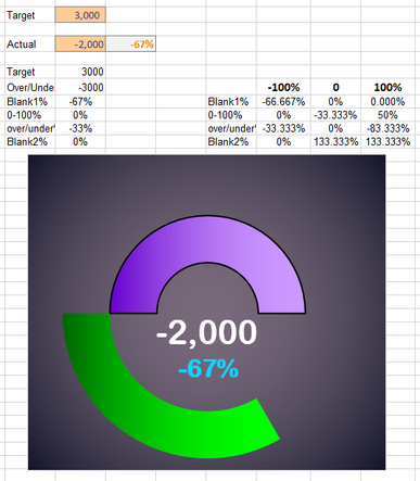
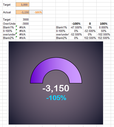
If I enter a negative value to the "Actual" field that exceeds the "Target" field, it doesn't populate the negative portion of the gauge...it disappears. As long as the "Actual" field is negative by an amount that is equal to the "Target" amount (in the case here, if the "Target" is 3,000 and the negative value is between -1 and -3,000 (shown below), the lower part of the doughnut/gauge populates perfectly, but if the negative value goes below -3,000, (more than -100% also shown below), it disappears.
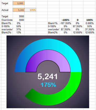
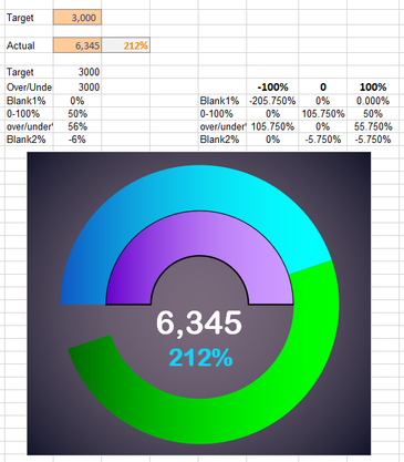
Conversely, if the "Actual" value exceeds the "Target" by more than twice the "Target" amount (more than 200%), it throws off the axis of both the upper and lower parts of the outer ("Actual") doughnut.
Would it be possible to "cap-off" the negative part of the doughnut (the lower/outer part) at -100%...so that any value over -100% will be the same as if it were -100%? And conversely, could the positive part of the doughnut (the part that exceeds 100%) also "cap-off" at +200%, so that any value over 200% will be treated the same as if it were 200%?
Last thing I wanted to ask is if there is any chance we could have the negative part of the "Actual" doughnut be a different color than the positive part that exceeds 100%---so that a different color can be used for the negative, like reds, while the positive side could use greens.
Again, I can't thank you enough for this wonderful chart you've helped me figure out!
Best Regards,
Nathan
- Mark as New
- Bookmark
- Subscribe
- Mute
- Subscribe to RSS Feed
- Permalink
- Report Inappropriate Content
Oct 16 2023 02:26 AM - edited Oct 16 2023 02:47 AM
@ntlknight To be honest, I'm not a big fan of pie- or donut charts and have no real hands-on experience about all the formatting features for background, donut borders and sizes.
With respect to the limitation of plus or minus 100%, I was aware of that but didn't know how likely it would be if an actual would be more than 100% off target. Referring to my original file, change the formula in D5 to:
=IF(C5<0,MAX(-1,C5/C7),MIN(2,C5/C7))
That will set limits the negative and positive scores to not less then -100% and not greater than 200% respectively. Then you'll probably want to change the settings of the data labels to indicate that a capping has been applied.
Coloring negative performance red and positive over-performance green would not work in this setup as both values come from the same slice. And a slice can only have one color, unless you manipulate it with VBA, based on the situation. And that is something I do not get involved in. Sorry.
- Mark as New
- Bookmark
- Subscribe
- Mute
- Subscribe to RSS Feed
- Permalink
- Report Inappropriate Content
Oct 16 2023 02:39 AM
Not a problem regarding the red color for the negative and green color for the positive slices. Maybe I'll try to figure out how to copy/paste another donut instance on top of this one so that there can be separate slices that can have alternate color editing when applied and set to invisible when not applied.
Best Regards,
Nathan
- Mark as New
- Bookmark
- Subscribe
- Mute
- Subscribe to RSS Feed
- Permalink
- Report Inappropriate Content
Oct 16 2023 02:45 AM - edited Oct 16 2023 02:45 AM
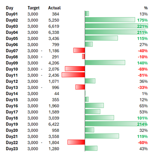
@ntlknight Why not use conditional formatting with data bars? That takes up a lot less space and doesn't require all these helper formulas. Something like in the picture below. Up to you of course.
- Mark as New
- Bookmark
- Subscribe
- Mute
- Subscribe to RSS Feed
- Permalink
- Report Inappropriate Content
Oct 16 2023 02:53 AM
Yes, I do use some conditional formatting with data bars for visually seeing progress. The world of Charts in Excel is a big one and I'm still finding some that inspire more than others and some that work better than others for visually getting a glimpse of what's going on. Until I get the charts on the screen and use them or a month or 2, it's hard to tell which ones are the most useful...and I'm enjoying the gauge/donut style chart as a 2nd or even 3rd visual stimulant to see where the progress is for the day/week/month/year...
- Mark as New
- Bookmark
- Subscribe
- Mute
- Subscribe to RSS Feed
- Permalink
- Report Inappropriate Content
Oct 16 2023 03:12 AM
@ntlknight That's clear then. Thanks for the feed-back.
- Mark as New
- Bookmark
- Subscribe
- Mute
- Subscribe to RSS Feed
- Permalink
- Report Inappropriate Content
Oct 16 2023 03:33 PM
@Riny_van_Eekelen I think I may need your help one more time, if you're able to! I'm very close to having the lower part of the gauge (-0% and +100%) to use 2 different colors. I just don't understand the formulas enough (that you created) to know how to separate the negative from the positive...and assign those 2 parts to 2 different charts sitting on top of each other.
I've duplicated the doughnut chart (by CTRL+C and CTRL+V) and then dragging the duplicate chart right on top of the original one. I then 'made invisible" the parts of the 2nd doughnut (the upper gauge part) that I didn't need to show (since the first instance shows that part already). But then I tried to create a new formula that would only populate this new gauge/chart if it went in the negative...but I couldn't figure out how to do that. Are you able to help me either create a couple more lines of formula to use for the "Select Data" of the 2nd instance of the Doughnut chart?--or have one set of formulas to use in the "Select Data" for the positive and another for the negative charts?
Thank you once again!
Nathan
- Mark as New
- Bookmark
- Subscribe
- Mute
- Subscribe to RSS Feed
- Permalink
- Report Inappropriate Content
Oct 16 2023 10:56 PM
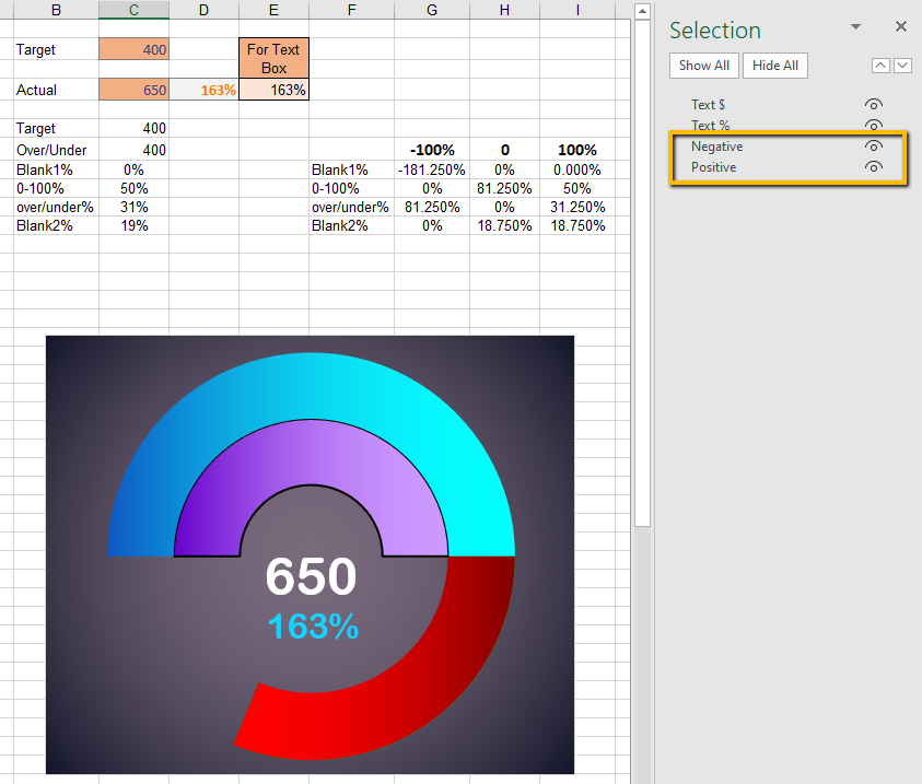
@ntlknight OK, I believe I figured it out by separating the slices for under and over and adding one more for a blank space. I'll leave the correct colour settings to you. See attached.
What the helper formulas in G:I do is set the size of each slice for each of the three situations (negative, 0-100% or over target).
Let's look at a -50% performance. The LOOKUP formulas in C9:C13 will pick-up the percentages from column G. Looking at the outer doughnut starting at 270 degrees for zero, you want the bottom left part (50% of the lower half) filled and the rest blank. Given the fact that the entire ring represents a value of twice the target, you need to set the size of the third slice to half the performance. Then I just set the first slice to 1 minus the third and all others to 0. You only do this only once. It works the same all the time.
For a performance between 0 and 100%, set the 0-100 slice to the actual performance. No need to divide by two here. Now the sum of the following slices amount to 1 minus the performance.
Lastly, for over performance, the whole 0-100 slice is always filled (but that now represents only 50% of the entire outer doughnut. The over slice is half the over performance and the last blank slice equals 1 minus the other two.
I could have condensed the use of slices, I believe, but found the use of a few extra ones easier to visualise the position and size of each slice.
And, just for the record: I still don't like doughnut charts. :)
- Mark as New
- Bookmark
- Subscribe
- Mute
- Subscribe to RSS Feed
- Permalink
- Report Inappropriate Content
Oct 17 2023 12:48 AM
@Riny_van_Eekelen Well, for not being crazy about doughnut charts, you sure are good at editing them and figuring out how they work! I'm amazed, it's perfect! I read, re-read and then read 2 more times your last post...and I still have a hard time wrapping my head around it! I didn't know you could separate the slices like that (rather than superimposing (duplicating) one doughnut chart on top of another one).
There is one thing I don't know how I missed before...if the "Actual" cell contains a 0, or is blank, the inner gauge ("Target") doesn't retain its half-circle shape, but rather makes a full circle. This will cause a confusing look to the Sheet, as there will be one of these gauges for each day of the month...and until the day is approached, all the upcoming/future days will be 0. Is there a way to have the inner (Target) slice keep its half-circle shape even when a 0 or blank is in the "Actual" field?
Much appreciated,
Nathan
- Mark as New
- Bookmark
- Subscribe
- Mute
- Subscribe to RSS Feed
- Permalink
- Report Inappropriate Content
Oct 17 2023 03:25 AM
@ntlknight Aha! didn't think of that. Change the formula in C7 to:
=IF(C4,C6*SIGN(C4),C6)That should fix it.
- Mark as New
- Bookmark
- Subscribe
- Mute
- Subscribe to RSS Feed
- Permalink
- Report Inappropriate Content
Oct 17 2023 11:28 AM
Best Regards,
Nathan
Accepted Solutions
- Mark as New
- Bookmark
- Subscribe
- Mute
- Subscribe to RSS Feed
- Permalink
- Report Inappropriate Content
Oct 15 2023 11:37 PM
Solution@ntlknight Not exactly what you had in mind with regard to the vivid colours, but close. See attached.
The driving force sits out of view below the chart.

