- Home
- Microsoft 365
- Excel
- Trying to add moving average to scatterplot but the lines are showing up crazy
Trying to add moving average to scatterplot but the lines are showing up crazy
- Subscribe to RSS Feed
- Mark Discussion as New
- Mark Discussion as Read
- Pin this Discussion for Current User
- Bookmark
- Subscribe
- Printer Friendly Page
- Mark as New
- Bookmark
- Subscribe
- Mute
- Subscribe to RSS Feed
- Permalink
- Report Inappropriate Content
Nov 27 2023 01:43 PM
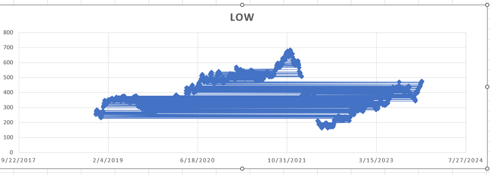
Trying to add a moving average line to the lowest daily stock price data. There are 1259 data points. When I enter it, it looks like this picture. What am I doing wrong?
- Mark as New
- Bookmark
- Subscribe
- Mute
- Subscribe to RSS Feed
- Permalink
- Report Inappropriate Content
Nov 27 2023 03:01 PM
Could you attach a small sample workbook demonstrating the problem (without sensitive data), or if that is not possible, make it available through OneDrive, Google Drive, Dropbox or similar?
- Mark as New
- Bookmark
- Subscribe
- Mute
- Subscribe to RSS Feed
- Permalink
- Report Inappropriate Content
Nov 27 2023 03:57 PM
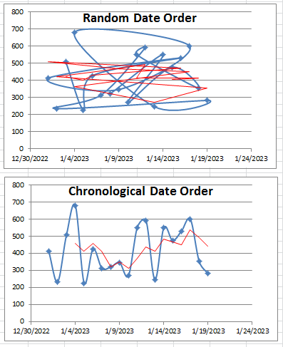
Your data needs to be in chronological order in cell range.
The blue line is the data. The red line is a moving average trendline.
Even though the random data is plotted in chronological order, the "dots" are connected in the order that the data appears in the cell range.

