- Home
- Microsoft 365
- Excel
- 2 bars next to each other in a stacked bar chart
2 bars next to each other in a stacked bar chart
- Subscribe to RSS Feed
- Mark Discussion as New
- Mark Discussion as Read
- Pin this Discussion for Current User
- Bookmark
- Subscribe
- Printer Friendly Page
- Mark as New
- Bookmark
- Subscribe
- Mute
- Subscribe to RSS Feed
- Permalink
- Report Inappropriate Content
May 04 2024 03:07 PM
Hi,
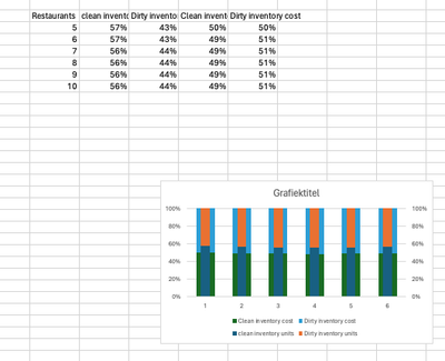
I would love to get to bars next to each with one including clean inventory vs dirty inventory in units and one clean inventory vs dirty inventory in costs. So that for every number on x-axis there are 2 bars next to each other. This is what I got so far: The two bars are behind each other and I am working with two y-axis even though they are the same? Someone any tips how I get them next to each other? Thank you!
- Labels:
-
Charting
- Mark as New
- Bookmark
- Subscribe
- Mute
- Subscribe to RSS Feed
- Permalink
- Report Inappropriate Content
May 04 2024 03:56 PM
I don't think Excel has a chart type that provides both a stacked bar and side by side series.
For that, you could create a chart of the 'clean' values with transparent chart and plot areas and superpose it on a second chart that shows the 100% stacked totals.
- Mark as New
- Bookmark
- Subscribe
- Mute
- Subscribe to RSS Feed
- Permalink
- Report Inappropriate Content
May 05 2024 02:04 AM
Thank you for the help!
I am trying but have another question.
So you make the underlying one with thicker bars and then you put the transparant one on top, but how do you get the transparant one then more to the left or right? Thank you in advance!
- Mark as New
- Bookmark
- Subscribe
- Mute
- Subscribe to RSS Feed
- Permalink
- Report Inappropriate Content
May 05 2024 03:22 AM - edited May 05 2024 03:24 AM
Many effects are possible. What I used were two ordinary series charts. These are then overlaid to give the illusion of a stacked chart with multiple series (or to give a 'thermometer' chart if you prefer).
to give
Tip: Using Home / Find & Select / Selection pane with Show / Hide can make it easier to work with the constituent charts.


