Turn on suggestions
Auto-suggest helps you quickly narrow down your search results by suggesting possible matches as you type.
- Home
- Education Sector
- Educator Developer Blog
- Exploring Pi with Jupyter & Azure Notebooks
Exploring Pi with Jupyter & Azure Notebooks
- Subscribe to RSS Feed
- Mark as New
- Mark as Read
- Bookmark
- Subscribe
- Printer Friendly Page
- Report Inappropriate Content
Published
Mar 21 2019 05:41 AM
626
Views
Mar 21 2019
05:41 AM
Mar 21 2019
05:41 AM
First published on MSDN on Jun 26, 2017
A guest post by Ben Curnow , Microsoft Student Partner from the University of Cambridge.

Pi could end up being a questionable choice of topic to place within the title of this blog. Not only because computers are.. well... computers, and can only represent Pi to a finite precision. Ok, I admit, 2.7+ trillion digits isn't too bad. It's probably accurate enough for most practical purposes...
In any case, to calculate Pi to any kind of reasonable accuracy (let's say 1+ trillion digits) would require a very fast computer and a very complicated power series and a lot of time. None of which I think are very interesting or fun. So let's try and estimate Pi as interestingly and categorically not-using-power-series-y as possible.
While we're at it, I might get around to mentioning some of the great features that Jupyter offers us while we're doing mathematical programming. Let's start with one now: Jupyter let's you write LaTeX inside the markdown blocks within the notebook.

It's a Julia/ R/ Python environment which you can use from within the browser. You can run a notebook server locally, or run one in the cloud at sites such as http://notebooks.azure.com/
This entire article is being written inside of a Jupyter notebook on the Azure platform using a combination of Python and Markdown blocks, then saved directly into a Markdown document (where the Python blocks are saved as codeblocks). See the Notebook at https://notebooks.azure.com/LeeStott-Microsoft/libraries/JupyterPi
Well, let's make good use of one of Jupyter's biggest features: inline diagrams. Essentially we'll try and draw as many pretty graphs as possible, and try and justify them to the best of our ability by creating at least some kind of connection to Pi. We'll also try and write semi-optimised code using the 'Numpy stack', one of the (if not the ) biggest scientific computing package in Python.
The entirety of the code will be contained within this post. If you want to download the notebook to play around with the code, it can be found on my Github at https://github.com/bencurnow/JupyterPi or in a Azure Notebook at https://notebooks.azure.com/LeeStott-Microsoft/libraries/JupyterPi

So let's get started with one of the simplest methods to estimate Pi.
Imagine you have a circle in a box and you want to calculate its area. You can do this by throwing a large number of balls into the box and counting the number that land on the circle. Then calculating the area of the circle is as simple as:

To get any kind of decent accuracy, you would need to throw a very, very large number of balls into the box. Of course, we could spend a day or two throwing balls into the box to calculate the area of a circle, or we could use Python and throw thousands of balls within seconds. I don't mind which you choose, but I'm personally going to choose Python.

The actual calculation is rather simple, we just choose a large (maybe a million?) random numbers from the ether and check whether they are within a distance of 1 of the origin - you may notice that this is rather similar to the definition of a circle. Then we just sum up the number that 'land' within the circle, and we can easily calculate an estimate for Pi.


A couple of things from this estimate stand out:
The estimate is inaccurate, just as I promised
The last line of the code in this block uses a feature of Jupyter where simply typing the name of a variable sends it to the output
We have only used the first quadrant of the circle for simplicity. We can plot the data to see what is happening


Imagine you want to predict the size of a pride of lions. Assuming you have a reasonably behaved pride (as long as there is not too much breeding...), you could use the 'logistic map'. It's very simple.
You only need to find one thing, it's called 'r'. It's a measure of the 'average number of offspring per parent' (in humans it's just above 2). Then if we say the population of lions (as a proportion of the maximum
population) in your pride in 2017 is

 (in year n, it will be
 ), then we model it by:

The interesting aspect is what happens when the lions start breeding like rabbits. i.e. when this 'r' value becomes very large (large in this context is something huge like 4!). Scarcity of resources will cause large fluctuations in the population and prevent reaching a stable value.
So basically, we're going to tinker with the breeding rate of the lions and see what kind of chaos we can cause in the population levels.
We'll try to investigate what this does as follows: we will start with some population, and keep changing the breeding rate by some tiny little amount, then for each value, simulate about a century worth of population variation. Then we'll plot all the chaos that we cause. This is known as a bifurcation map.
A naïve approach might be to iterate through each value for r, then perform the iteration to estimate the population level, then rinse and repeat. But we're a bit smarter than this, aren't we? In any case, we'll try it and see what kind of performance we can muster with this naïve approach.


The x-axis here is the shows the different r values - the 'breeding rate'. The y-axis shows the population size after a large number of years.
For small r values (i.e. when more lions die than are born), just as we'd expect, the population dies out. For r values between 1 and 3, the population reaches a fixed value. This means that the population is stable, as it is unchanged year on year.
For large r values, the population jumps around different values chaotically. As the r values become larger, we are unable to predict the population size too far into the future.
Some enthusiasts may have heard of the 'three-body problem' - a problem in astronomy where we are unable to accurately predict the motion of three planets in orbit around each other when you go far enough into the future. This leads us to the definition of chaos - small changes in the input produce large changes in the output.
The "%%time" flag that I have used here shows us how long it takes the computer to execute the codeblock. The time taken for the Azure environment is shown below the codeblock. We will now attempt to improve upon this time.


The time taken to perform 100 iterations is under 1s when using Numpy, compared to about 20s when using 'pure' Python. This isn't the only speedup we experience: the time taken to initialise the arrays is also dramatically reduced.
Moral of the story: always use Numpy (when possible)


There are two major problems with this plot that stand out for me:
The resolution. Conveniently, this is something that Jupyter fixes with one extra line. We just add the 'retina' flag to the InlineBackend.
The 'forks' in the graph are not sharp as we might expect (from a quick Google search of the problem..). Luckily this can easily be fixed by simulating the process for more than a century. So let's simulate a longer period, perhaps a millennium?.
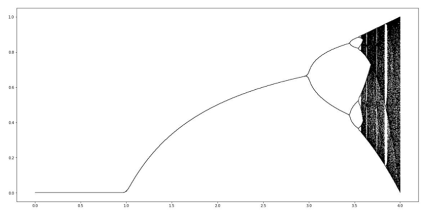
Below I have plotted the 'retina' version of the graph above, and have circled the forks which I am referring to. Then below that is a plot of a very chaotic millennium.


Remember that the x-axis here is the possible r-values, and the y-axis is the population size after a large number of years.
We can easily see a couple of important details:
As we would expect, if the average breeding rate is less than 1, then the population dies out Perhaps less intuitively, we are able to see the manic chaos that occurs for very large breeding rates Despite the chaos, there is (at least?) one major 'vertical strip' where it seems less chaotic on the plot, and a few smaller ones
So to explore this final point more, I would like to create more chaos. Hopefully we'll also find Pi hidden somewhere too...
The Mandelbrot set is a fractal. No matter how far you zoom into it, it will always be self-similar. It is the quintessential mathematical curiosity.
We take some complex number from the complex plane, say . Then perform the iteration (starting from


 ):
):

We repeat indefinitely, and if the process sends

 , then we colour it white. If it doesn't, then we colour it
black.
To make the code work, we don't expect the values to go all the way up to infinity (that would take a really long time..). We say that if the values exceed something huge like 2 then they're large enough...
We will generate a numpy array containing all the complex numbers we want in some region of the complex plane, then perform the iteration described above.


I'm sure you'll have seen the Mandelbrot set before (you might even find it interesting..?).
So let's try and do two things you might not have seen before:
First, let's display a link between the Mandelbrot set and the bifurcation map we plotted above.
Then let's try and find Pi...
To achieve the first of these, I'll plot both plots on the same diagram (possibly with some suspiciously chosen axis ranges...)


Ok, ok.. perhaps the connection isn't as obvious as I'd hoped..!
Let me make it a bit more explicit
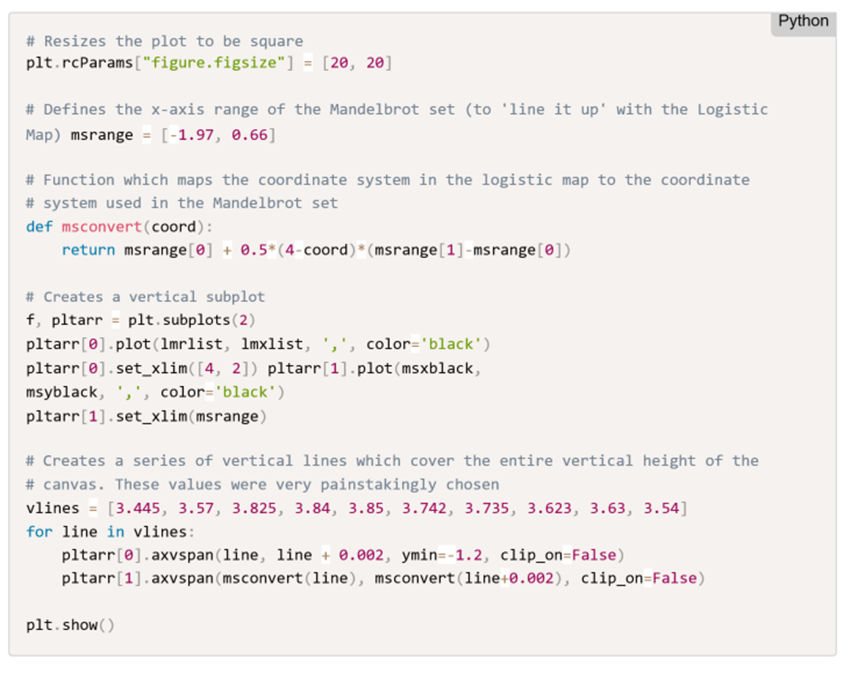

And there you have it! A link between the Mandelbrot set and the bifurcation map we made above! If you think that this might just be a coincidence, I promise you it's not.
For those who are interested, these similarities occur because the Mandelbrot set and the bifurcation map above were both constructed using quadratic iterations.
For those who are really interested, these similarities occur because the Mandelbrot set and the bifurcation map are showing the same information in different ways. The bifurcation map shows us which values end up oscillating and between which values they oscillate. Whereas the Mandelbrot set (along the real axis at least) shows us the period of the oscillations for different points. For further reading, you can read the Quora answer here at https://goo.gl/ubW3yG
We are going to make use of the 'cusp' of the Mandelbrot set. I have circled it on the plot below. It turns out that the cusp occurs at the point 0.25 on the real axis.
Then we will get closer and closer to the cusp and calculate how many times we have to apply the 'Mandelbrot iteration' before we obtain a value greater than 2.
I hope that this sounds strange, because it really is strange. Anyway, let's see what we get:


Now that we've defined this function we can use another feature of Jupyter: creating HTML elements to be displayed on the page. This is only possible because Jupyter is accessed through the browser.
So let's create a HTML table and hopefully we'll see a pattern...


Hopefully you notice that the "How long?" column has numbers which look quite similar to Pi. In fact, it almost looks like they are approaching Pi. It's not feasible to check this anymore using a computer because we might get an underflow/ significant rounding errors, but you'll have to believe me that this is really Pi that we're seeing.
You might think that this all seems a bit convoluted.. a bit forced. But Pi does actually arise naturally here in a close study of the Mandelbrot set. You can see more information on the topic here
Although we went on a rather significant detour from Pi, we managed to find Pi in a rather unexpected place (I hope) at the end.
The main purpose of this post, however, was not to estimate Pi, but to demonstrate some of the features of
Jupyter which are very helpful when doing mathematical programming. In fact, most of these features mean that Jupyter is the only option.
Some of the features I've tried to cover are:
But this is not a comprehensive list! Jupyter is rich with interesting and useful features, and the only way to find them is to try it, use it, and explore!
Jupyter Notebooks for Computing Mathematics at Cambridge University https://notebooks.azure.com/library/CUED-IA-Computing-Michaelmas
A guest post by Ben Curnow , Microsoft Student Partner from the University of Cambridge.
Introduction
Pi could end up being a questionable choice of topic to place within the title of this blog. Not only because computers are.. well... computers, and can only represent Pi to a finite precision. Ok, I admit, 2.7+ trillion digits isn't too bad. It's probably accurate enough for most practical purposes...
In any case, to calculate Pi to any kind of reasonable accuracy (let's say 1+ trillion digits) would require a very fast computer and a very complicated power series and a lot of time. None of which I think are very interesting or fun. So let's try and estimate Pi as interestingly and categorically not-using-power-series-y as possible.
While we're at it, I might get around to mentioning some of the great features that Jupyter offers us while we're doing mathematical programming. Let's start with one now: Jupyter let's you write LaTeX inside the markdown blocks within the notebook.
What's Jupyter?
It's a Julia/ R/ Python environment which you can use from within the browser. You can run a notebook server locally, or run one in the cloud at sites such as http://notebooks.azure.com/
This entire article is being written inside of a Jupyter notebook on the Azure platform using a combination of Python and Markdown blocks, then saved directly into a Markdown document (where the Python blocks are saved as codeblocks). See the Notebook at https://notebooks.azure.com/LeeStott-Microsoft/libraries/JupyterPi
So, what's the plan?
Well, let's make good use of one of Jupyter's biggest features: inline diagrams. Essentially we'll try and draw as many pretty graphs as possible, and try and justify them to the best of our ability by creating at least some kind of connection to Pi. We'll also try and write semi-optimised code using the 'Numpy stack', one of the (if not the ) biggest scientific computing package in Python.
Can I get the Notebook?
The entirety of the code will be contained within this post. If you want to download the notebook to play around with the code, it can be found on my Github at https://github.com/bencurnow/JupyterPi or in a Azure Notebook at https://notebooks.azure.com/LeeStott-Microsoft/libraries/JupyterPi
So let's get started with one of the simplest methods to estimate Pi.
Monte-Carlo Integration
What's Monte-Carlo Integration
Imagine you have a circle in a box and you want to calculate its area. You can do this by throwing a large number of balls into the box and counting the number that land on the circle. Then calculating the area of the circle is as simple as:
To get any kind of decent accuracy, you would need to throw a very, very large number of balls into the box. Of course, we could spend a day or two throwing balls into the box to calculate the area of a circle, or we could use Python and throw thousands of balls within seconds. I don't mind which you choose, but I'm personally going to choose Python.
The code
The actual calculation is rather simple, we just choose a large (maybe a million?) random numbers from the ether and check whether they are within a distance of 1 of the origin - you may notice that this is rather similar to the definition of a circle. Then we just sum up the number that 'land' within the circle, and we can easily calculate an estimate for Pi.
What can we see?
A couple of things from this estimate stand out:
The estimate is inaccurate, just as I promised
The last line of the code in this block uses a feature of Jupyter where simply typing the name of a variable sends it to the output
We have only used the first quadrant of the circle for simplicity. We can plot the data to see what is happening
Logistic Map
What is the logistic map?
Imagine you want to predict the size of a pride of lions. Assuming you have a reasonably behaved pride (as long as there is not too much breeding...), you could use the 'logistic map'. It's very simple.
You only need to find one thing, it's called 'r'. It's a measure of the 'average number of offspring per parent' (in humans it's just above 2). Then if we say the population of lions (as a proportion of the maximum
population) in your pride in 2017 is
(in year n, it will be
), then we model it by:
The interesting aspect is what happens when the lions start breeding like rabbits. i.e. when this 'r' value becomes very large (large in this context is something huge like 4!). Scarcity of resources will cause large fluctuations in the population and prevent reaching a stable value.
So basically, we're going to tinker with the breeding rate of the lions and see what kind of chaos we can cause in the population levels.
The code
We'll try to investigate what this does as follows: we will start with some population, and keep changing the breeding rate by some tiny little amount, then for each value, simulate about a century worth of population variation. Then we'll plot all the chaos that we cause. This is known as a bifurcation map.
A naïve approach might be to iterate through each value for r, then perform the iteration to estimate the population level, then rinse and repeat. But we're a bit smarter than this, aren't we? In any case, we'll try it and see what kind of performance we can muster with this naïve approach.
What does this plot actually show?
The x-axis here is the shows the different r values - the 'breeding rate'. The y-axis shows the population size after a large number of years.
For small r values (i.e. when more lions die than are born), just as we'd expect, the population dies out. For r values between 1 and 3, the population reaches a fixed value. This means that the population is stable, as it is unchanged year on year.
For large r values, the population jumps around different values chaotically. As the r values become larger, we are unable to predict the population size too far into the future.
Some enthusiasts may have heard of the 'three-body problem' - a problem in astronomy where we are unable to accurately predict the motion of three planets in orbit around each other when you go far enough into the future. This leads us to the definition of chaos - small changes in the input produce large changes in the output.
The "%%time" flag that I have used here shows us how long it takes the computer to execute the codeblock. The time taken for the Azure environment is shown below the codeblock. We will now attempt to improve upon this time.
The time taken to perform 100 iterations is under 1s when using Numpy, compared to about 20s when using 'pure' Python. This isn't the only speedup we experience: the time taken to initialise the arrays is also dramatically reduced.
Moral of the story: always use Numpy (when possible)
What can we see?
There are two major problems with this plot that stand out for me:
The resolution. Conveniently, this is something that Jupyter fixes with one extra line. We just add the 'retina' flag to the InlineBackend.
The 'forks' in the graph are not sharp as we might expect (from a quick Google search of the problem..). Luckily this can easily be fixed by simulating the process for more than a century. So let's simulate a longer period, perhaps a millennium?.
Below I have plotted the 'retina' version of the graph above, and have circled the forks which I am referring to. Then below that is a plot of a very chaotic millennium.
Remember that the x-axis here is the possible r-values, and the y-axis is the population size after a large number of years.
We can easily see a couple of important details:
As we would expect, if the average breeding rate is less than 1, then the population dies out Perhaps less intuitively, we are able to see the manic chaos that occurs for very large breeding rates Despite the chaos, there is (at least?) one major 'vertical strip' where it seems less chaotic on the plot, and a few smaller ones
So to explore this final point more, I would like to create more chaos. Hopefully we'll also find Pi hidden somewhere too...
Mandelbrot Set
What is the Mandelbrot Set?
The Mandelbrot set is a fractal. No matter how far you zoom into it, it will always be self-similar. It is the quintessential mathematical curiosity.
We take some complex number from the complex plane, say
. Then perform the iteration (starting from
):
We repeat indefinitely, and if the process sends
, then we colour it white. If it doesn't, then we colour it
black.
To make the code work, we don't expect the values to go all the way up to infinity (that would take a really long time..). We say that if the values exceed something huge like 2 then they're large enough...
The code
We will generate a numpy array containing all the complex numbers we want in some region of the complex plane, then perform the iteration described above.
Ok, great! Now what..?
I'm sure you'll have seen the Mandelbrot set before (you might even find it interesting..?).
So let's try and do two things you might not have seen before:
First, let's display a link between the Mandelbrot set and the bifurcation map we plotted above.
Then let's try and find Pi...
To achieve the first of these, I'll plot both plots on the same diagram (possibly with some suspiciously chosen axis ranges...)
Ok, ok.. perhaps the connection isn't as obvious as I'd hoped..!
Let me make it a bit more explicit
And there you have it! A link between the Mandelbrot set and the bifurcation map we made above! If you think that this might just be a coincidence, I promise you it's not.
For those who are interested, these similarities occur because the Mandelbrot set and the bifurcation map above were both constructed using quadratic iterations.
For those who are really interested, these similarities occur because the Mandelbrot set and the bifurcation map are showing the same information in different ways. The bifurcation map shows us which values end up oscillating and between which values they oscillate. Whereas the Mandelbrot set (along the real axis at least) shows us the period of the oscillations for different points. For further reading, you can read the Quora answer here at https://goo.gl/ubW3yG
Now let's find Pi
We are going to make use of the 'cusp' of the Mandelbrot set. I have circled it on the plot below. It turns out that the cusp occurs at the point 0.25 on the real axis.
Then we will get closer and closer to the cusp and calculate how many times we have to apply the 'Mandelbrot iteration' before we obtain a value greater than 2.
I hope that this sounds strange, because it really is strange. Anyway, let's see what we get:
Now that we've defined this function we can use another feature of Jupyter: creating HTML elements to be displayed on the page. This is only possible because Jupyter is accessed through the browser.
So let's create a HTML table and hopefully we'll see a pattern...
Hopefully you notice that the "How long?" column has numbers which look quite similar to Pi. In fact, it almost looks like they are approaching Pi. It's not feasible to check this anymore using a computer because we might get an underflow/ significant rounding errors, but you'll have to believe me that this is really Pi that we're seeing.
You might think that this all seems a bit convoluted.. a bit forced. But Pi does actually arise naturally here in a close study of the Mandelbrot set. You can see more information on the topic here
Finishing up
Although we went on a rather significant detour from Pi, we managed to find Pi in a rather unexpected place (I hope) at the end.
The main purpose of this post, however, was not to estimate Pi, but to demonstrate some of the features of
Jupyter which are very helpful when doing mathematical programming. In fact, most of these features mean that Jupyter is the only option.
Some of the features I've tried to cover are:
- The usefulness of mixing codeblocks and markdown blocks
- Writing LaTeX within Markdown blocks
- Inline plots (with 'retina' flag)
- %%time flag to time a codeblock
- HTML output
But this is not a comprehensive list! Jupyter is rich with interesting and useful features, and the only way to find them is to try it, use it, and explore!
Resources
Jupyter Notebooks for Computing Mathematics at Cambridge University https://notebooks.azure.com/library/CUED-IA-Computing-Michaelmas
0
Likes
You must be a registered user to add a comment. If you've already registered, sign in. Otherwise, register and sign in.