charting
1706 Topics
GLSU Excel add-in fails to load after Office update from Version 2607 to 2608
Our Excel add-in, Process Runner GLSU , fails to load after Microsoft Office updates from Version 2607 to Version 2608. This started August 17, 2026 and is actively growing in scope. Error messages: Excel: Cannot run the macro 'onLoad' VBA: System Error &H80004005 (-2147467259). Unspecified error VBA: Compile error in hidden module: ThisWorkbook Has anyone encountered similar issue with their own custom add-on. If yes, any pointers to fix it. We are seeking help on priority. Thanks, Vrushali Pawale, Sr. Manager, Insightsoftware.596Views0likes1Comment
Data Triggers
I'm relatively new to spreadsheets and excel. I'm working with a spreadsheet for mileage allocation. The mileage is funded from a single source but allocated to several people. In the spreadsheet, is it possible for the alpha entry in, for instance, column "C" cause the data in column "B" to populate in columns "D", "E". or "F" depending on the entry in column "C"? Example. Can the mileage cash value that's populated in column "B" get sent to a cell in either columns "D", "E", or "F" according to the name inserted in column "C" Entry "John" would cause B to populate D; "Dave" would cause B to populate E and "Jane would cause B to populate F so I can tally each person's share of the mileage without having to re-enter that amount in each of the columns? Any help in this would be appreciated.116Views0likes1Comment
Spacing on stacked bar charts
Hi all, I searched for a solution, but changing to 'text' axis doesn't work and that's the only solution I have seen offered. Issue: When using a date axis, there is too much white space / bars are too skinny to be legible despite gap width set all the way at 0. When switching to a text axis, the bar spacing is perfect, but the spacing between dates are at times nonsensical or for some reason it thinks the range is way different than what is highlighted. Here is how the data is highlighted, I only hid columns to make the picture a reasonably proportion the screenshots from above are when no columns are hidden. Is there a way to re-scale the gap-width when using a data axis to effectively to go something like -50%? Or to somehow manipulate the range and the months between labels when using a text axis? Thank you for the help. Matt221Views1like5Comments
Chart from Date, Time, Temperature and Humidity
I have data from a temperature sensor that I want to create a chart from. The data is: Date,Time,Temperature_Celsius,Relative_Humidity(%), and it arrives as a .csv file. If it's just a single date, then I can easily produce a line chart by ignoring the date column. However the data will likely be for several days at a time. So how do I create a line chart with the date and time as one value on the x-axis? If I can do that, the values on the y-axis will not be a problem. I think it could be done by combining data and time into a single value, but I can't find how to do that, and then format the x-axis so it shows each day separately with the times as minor values. Here's some of the data: Date Time Temperature_Celsius Relative_Humidity(%) 01/07/2026 12:00 am 20.8 61 01/07/2026 12:30 am 20.7 61 01/07/2026 1:00 am 20.7 61 01/07/2026 1:30 am 20.6 61 01/07/2026 2:00 am 20.5 61 01/07/2026 2:30 am 20.5 61 01/07/2026 3:00 am 20.4 61 01/07/2026 3:30 am 20.4 61 01/07/2026 4:00 am 20.3 61 01/07/2026 4:30 am 20.3 61 01/07/2026 5:00 am 20.2 61 01/07/2026 5:30 am 20.2 60 01/07/2026 6:00 am 20.1 60 01/07/2026 6:30 am 20.1 60Solved195Views0likes2Comments
Chart plotting values in wrong place according to axis?
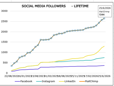
I have this chart in excel that is being produced from a table in another tab in the same workbook. It has simple date in one column and values in another. When I hover over the plots for the MailChimp line the value displays correctly (e.g. 1344 in the screengrab for 25/6/26 datapoint) but the plot is between 2500 and 3000 on the graph according to the axis. This isn't happening for any other lines on the graph for any other values, only for the Mailchimp line. Any ideas how I can rectify this or what could be going wrong?Solved97Views0likes2Commentssort by column then by numbers in a row
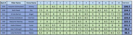
HI all I have a table of results pictured here. Once the results are in, I sort the table by the Total Score Column. When we have a tie (as in line 3 & 4, I need to sort by who has the most highest score... so, who has the most 9 (equal here), then by most 8.5 (line 4 wins the tiebreaker, 4 over 2) Can I do this so it doesn't affect the order of the columns but just the rows involved.307Views0likes7Comments
Line chart dynamic scaling of Y-axis
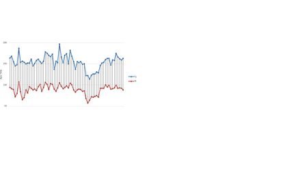
Micro$oft, please, please, pretty please with sugar on top, END the ensh*ttification, and get the Y-axis of a line chart to dyanmically scale with the data range that is being plotted. The range defaults to 0 as the lowest Y-value. The only way to change it, is to manually set the ax range, or use a work-around involving VBA. So... NO! This is crazy! It should be easy as apple pie for you lot to add an option to dynamically scale the Y-range in the chart, but I guess you are far too busy pushing people onto your crappy AI, which you can really stick some place the sun doesn't shine. Thank you.99Views0likes1Comment