Forum Discussion

Alternative to Pivot Table in Dashboard for better UI Experience
 May 05, 2026
Hello kahjun_0504,
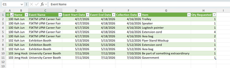
You can improve the dashboard look and interactivity without relying on Pivot Tables by using Excel’s dynamic array functions and slicers. Convert your cleaned dataset into an Excel Table and use the FILTER function to display borrowed item details based on selected date ranges. For example: =FILTER(BorrowData,(BorrowData[Event Start Date]>=FromDate)*(BorrowData[Event End Date]<=ToDate),"No records found"). Add slicers for Event Name, Item, and Borrower to create clickable filters that update the table instantly. This gives a cleaner, modern interface while keeping everything inside Excel. If you want a true draggable pane experience, consider building a simple VBA UserForm to show the filtered table in a movable window, or move the dataset into Power BI for a fully interactive dashboard with resizable visuals and drag‑and‑drop filtering.

Excel Tables + FILTER()
Instead of PivotTables, you can try to use dynamic arrays:
Example:
=FILTER(Table1, (Table1[Event Name]=SelectedEvent)*(Table1[Date]>=StartDate)*(Table1[Date]<=EndDate))
It’s a simple alternative…
Cleaner than pivots
Fully customizable layout
Works great with dropdowns (Data Validation)