sharepoint
4127 TopicsPublish rich and interactive content with HTML pages in SharePoint
HTML pages in SharePoint let you create rich, interactive content with Copilot or upload existing HTML, then edit, publish, and share it alongside modern pages. Copilot-created pages use your site’s branding, while familiar SharePoint permissions and security controls help manage access. Availability is rolling out gradually through the Frontier program.1.5KViews0likes3CommentsCopilot, Microsoft 365 & Power Platform Community call
💡 Copilot, Microsoft 365 & Power Platform weekly community call focuses on different use cases and features within the Microsoft 365 and Power Platform - across Microsoft 365 Copilot, Copilot Studio, SharePoint, Power Apps and more. Demos in this call are presented by the community members. 👏 Looking to catch up on the latest news and updates, including cool community demos, this call is for you! 📅 On 29th of October we'll have following agenda: Latest on SharePoint Framework (SPFx) Latest on Copilot prompt of the week PnPjs CLI for Microsoft 365 Dev Proxy Reusable Controls for SPFx SPFx Toolkit VS Code extension PnP Search Solution Demos this time Ranjith D – Build Power Automate Flows and Power Apps from Copilot Studio - Just by Asking Marc André Schröder-Zhou – Designing Adaptive Cards with AI support in SharePoint David Warner - Using Copilot Notebooks - Instant Agentic Experiences & More 📅 Download recurrent invite from https://aka.ms/community/m365-powerplat-dev-call-invite 📞 & 📺 Join the Microsoft Teams meeting live at https://aka.ms/community/m365-powerplat-dev-call-join 💡 Building something cool for Microsoft 365 or Power Platform (Copilot, SharePoint, Power Apps, etc)? We are always looking for presenters - Volunteer for a community call demo at https://aka.ms/community/request/demo 👋 See you in the call! 📖 Resources: Previous community call recordings and demos from the Microsoft Community Learning YouTube channel at https://aka.ms/community/youtube Microsoft 365 & Power Platform samples from Microsoft and community - https://aka.ms/community/samples Microsoft 365 & Power Platform community details - https://aka.ms/community/home 🧡 Sharing is caring!13Views0likes0CommentsCopilot, Microsoft 365 & Power Platform product updates call
Copilot, Microsoft 365 & Power Platform product updates call concentrates on the different use cases and features within the Microsoft 365 and in Power Platform. Call includes topics like Microsoft 365 Copilot, Copilot Studio, Microsoft Teams, Power Platform, Microsoft Graph, Microsoft Viva, Microsoft Search, Microsoft Lists, SharePoint, Power Automate, Power Apps and more. 👏 Weekly Tuesday call is for all community members to see Microsoft PMs, engineering and Cloud Advocates showcasing the art of possible with Copilot, Microsoft 365 and Power Platform. 📅 On the 27th of October we'll have following agenda: News and updates from Microsoft Together mode group photo Joe Komban - Copilot in SharePoint: Using Custom Plugins for Enterprise AI Rabia Williams - Introduction on Copilot prompt sample gallery Paolo Pialorsi - Understanding Copilot Cowork extensibility 📞 & 📺 Join the Microsoft Teams meeting live at https://aka.ms/community/ms-speakers-call-join 🗓️ Download recurrent invite for this weekly call from https://aka.ms/community/ms-speakers-call-invite 👋 See you in the call! 💡 Building something cool for Microsoft 365 or Power Platform (Copilot, SharePoint, Power Apps, etc)? We are always looking for presenters - Volunteer for a community call demo at https://aka.ms/community/request/demo 📖 Resources: Previous community call recordings and demos from the Microsoft Community Learning YouTube channel at https://aka.ms/community/youtube Microsoft 365 & Power Platform samples from Microsoft and community - https://aka.ms/community/samples Microsoft 365 & Power Platform community details - https://aka.ms/community/home 🧡 Sharing is caring!13Views0likes0CommentsIntroducing a team knowledge base, curated by Copilot and agents
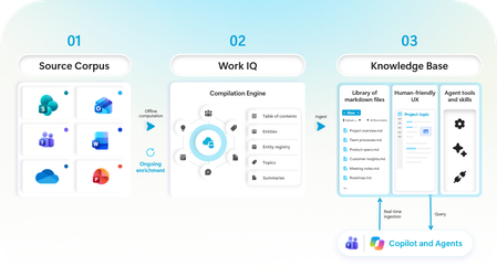
Collaboration is changing as teams of humans and agents now work together to get more done. That’s why we’ve evolved Copilot to empower these human-agent teams: just last month, we announced copilot in Teams, Autopilot as your digital teammate, and new tools in Copilot for managing a team’s content workflows. Today, we are taking the next step in human-agent team collaboration, designed to help address the problem of fragmented and outdated information and enable agent teammates to have the required team context they need to perform tasks and answer questions. In Frontier Preview, Copilot and agents in the newly announced Copilot app, Teams, and SharePoint will be able to create, contribute to, curate, and reference a team’s knowledge base in SharePoint. If the player doesn’t load, open the video in a new window: Open video Knowledge bases can support a range of team needs by bringing together the context people and agents need to do their best work. Here are some examples of how we are working with frontier teams to leverage a knowledge base: Legal: Collecting isolated knowledge from emails, files, and personal notes to help agents reference relevant context when creating agreements and contracts. Engineering: Combining technical specifications, user feedback, market research, and product history to give coding agents project context and support the onboarding of new engineers. Sales: Organizing account knowledge and history so sales agents can recommend relevant next steps or quickly provide account snapshots. Team members can explicitly contribute content— whether email, messages, meetings or content that is already on the SharePoint sites they work with. Copilot will organize all this information into an up-to-date knowledge base for the team, readable to people and grounding any agents that are working with the team. Turning raw content into synthesized knowledge At its core, the knowledge base is a specialized library of interlinked agent-friendly markdown files, created by Copilot using Work IQ’s native knowledge compilation engine. This content processing platform can help transform a team’s content into agent-ready knowledge to improve agent performance and results. In our early internal testing, we see that an agent’s responses were up to 4x faster and 30% more token-efficient with the knowledge base when retrieving content to answer questions and performing team tasks 1 . Figure 1: The knowledge base pipeline We believe this is the first step in transforming how human-agent teams work together by leveraging Work IQ’s knowledge compilation engine. As the science advances, the engine improves. By combining advances in content processing with the latest corpus enrichment innovations from our Applied Science research teams, we are continually improving how enterprise content is transformed into usable knowledge. The evidence is promising so far. For example, in a recent paper, we evaluated agents on the task of answering complex questions that require connecting information across multiple documents. We observed significant improvements in both cost efficiency and quality when compared with traditional agents that worked with the original documents or other enrichment methods. Figure 2: Retrieval quality and cost improvement when using the knowledge base corpus map. Note: Results are from a synthetic test environment and published in a public research paper. With millions of sites created by customers every day, SharePoint plays a critical role as the home for the content and knowledge of a team, whether as a vibrant site of pages, files, and lists or the backing content store for a Teams Channel or Modern Group. When enhanced with a knowledge base, the SharePoint site evolves from a content source to the context layer for a team that people, Copilot, and agents can use and reference together. What’s available now This is rolling out now to our Frontier preview tenants. You can start by adding a knowledge base to any SharePoint site— including those backing Teams Channels and Microsoft 365 Groups. You can further use Copilot in SharePoint and the newly announced Autopilot in the Copilot app to create, curate and use your knowledge base. And with the power of Autopilot, you can also use the knowledge base directly from within Teams, from email (by emailing your autopilot). If the player doesn’t load, open the video in a new window: Open video Note: While the knowledge base and its tools are available in Frontier public, the integration with Autopilot requires access to Autopilot, which is rolling out on a separate cadence. Knowledge base is currently available only to users enabled for usage-based billing. Administrators can manage access and spending through the Microsoft 365 admin center. Learn more about managing AI experiences enabled by usage-based billing and how to create the right policies for your organization. Because knowledge base capabilities are currently in preview, billing terms may change before general availability. What’s coming soon Next on our roadmap: Knowledge bases in more places you work, including tools in Cowork and Copilot in Teams, and custom agents created in Microsoft Copilot Studio. Deeper integration with M365 groups – to allow for easier bootstrapping knowledge bases from existing sources (channels, email). Automated, ongoing curation with the help of Microsoft Copilot Studio’s agent flows to help keep your knowledge bases up to date as your organization’s content changes. Greater content scaling, building on our corpus map approach to support larger volumes of content with higher quality at a lower cost. Integration with CLIs and coding agents via Work IQ to allow a broader range of agents to contribute to and work with a knowledge base. If the player doesn’t load, open the video in a new window: Open video More content AI innovation across the Copilot ecosystem Our content AI strategy is focused on helping organizations turn their content into knowledge that people and agents can use in the flow of work. We’re continuing to bring that strategy to life across the Microsoft 365 and Copilot ecosystem with knowledge bases in SharePoint. And we’re not done yet! Here are a few more recent updates in the content AI space: SharePoint tools in Work IQ are coming soon. Last month, we announced that SharePoint tools were coming to the new Copilot app through Work IQ. Copilot in SharePoint is now generally available, bringing Copilot directly into the place where your organization’s content lives. It helps you understand, create, organize, and act on content with AI. Learn more in last month’s blog. New capabilities to govern the content that powers AI. Copilot and agents perform best on well-governed content. The SharePoint Admin Agent is the centerpiece of our new capabilities for getting there. Admins can use natural language to get tenant-level analysis and guided remediation across permissions, content lifecycle, storage, and settings. They can also monitor cross-geo content moves (preview). Catalog management turns a sprawling tenant into structured, manageable content clusters, so admins can scale actions like site attestations, access reviews, and Restricted Content Discovery, and build rollout plans that better match how their organization works. A detailed file level EEEU permissions report enables targeted cleanup, insights on agent access show which agents are reaching SharePoint and OneDrive content, and Governance Hub helps site owners follow through on assigned actions. Today’s preview is just a first step, and we look forward to building this with you. Learn more about how you can be among the first to put the knowledge base to work for your teams and help shape what comes next by sharing feedback. You can either share in-product feedback using Copilot in SharePoint, Autopilot, or sign up here for an opportunity to go deeper with us on this journey. References: 1. Results are based on Microsoft internal testing, October 2026.30KViews13likes4CommentsIntroducing SharePoint News and Viva Engage cross-posting
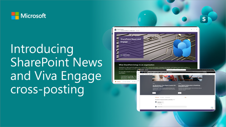
SharePoint News can now be cross-posted directly to a Viva Engage storyline or community. The original post retains its full SharePoint experience, while comments, replies, and reactions stay synchronized across both platforms.4.4KViews13likes26CommentsWhat to Do When SharePoint Search Doesn’t Return the Right Results
SharePoint search is one of the platform’s most powerful features—when it works as expected. But many organizations face a common frustration: search results that don’t seem accurate, complete, or relevant. If your users are struggling to find what they need, it can quickly undermine adoption and productivity. The good news? Most search issues can be diagnosed and fixed with the right approach. Here’s a practical guide to troubleshooting when SharePoint search isn’t returning the right results. https://dellenny.com/what-to-do-when-sharepoint-search-doesnt-return-the-right-results/299Views0likes1CommentHow to Index and Search SharePoint Online Custom Columns
SharePoint Online is basically a big Azure SQL application. Custom columns for sites and libraries enhance metadata and are even better if they’re properly indexed to become searchable. This article explores how even non-SharePoint administrators can create, index, and search custom columns. The key thing is to take your time. SharePoint cannot be rushed! https://office365itpros.com/2025/02/13/custom-columns-search/389Views0likes1CommentAutoSave disabled when opening SharePoint-synced files from Finder after macOS Tahoe 26.6 update
Files stored in SharePoint Online and synchronized locally through OneDrive are opened as local documents when launched from Finder. Office applications display "Saved to my Mac" and AutoSave is turned off by default. However, opening the exact same files through Word/Excel > Open > Sites, or via SharePoint "Open in Desktop App", correctly identifies them as cloud documents. In that scenario, AutoSave is enabled and collaboration/version history features work as expected. Troubleshooting already performed: OneDrive reset and re-linked SharePoint library re-synced Signed out and back into both Office and OneDrive Removed Microsoft credentials from macOS Keychain and re-authenticated Recreated local OneDrive sync relationships Verified OneDrive File Provider extensions are enabled Verified Office applications and OneDrive are fully up to date Tested with newly created files and existing files Tested "Always Keep on This Device" with no change in behavior The issue appears to be specific to the Finder-to-Office launch path after upgrading to macOS Tahoe 26.6. Before upgrading to macOS Tahoe 26.6, opening the same SharePoint-synchronized files directly from Finder correctly preserved cloud document identity and AutoSave was enabled as expected. I discussed this issue in detail with Apple Support, but they quickly dismissed it, saying that the problem is not on Apple's side and that I should contact Microsoft instead.4.2KViews13likes39CommentsMicrosoft Graph Data Connect for SharePoint is Generally Available
General Availability (GA) for Microsoft Graph Data Connect was announced on August 2023, about two years ago. Details can be found at Microsoft Graph Data Connect updates. At that time, the SharePoint datasets for Microsoft Graph Data Connect entered public preview. As of July 2025, Microsoft Graph Data Connect for SharePoint, which includes datasets for OneDrive and SharePoint, has reached General Availability (GA), following an extended public preview period. There are no changes to the datasets or features at this time. For more information about the datasets, visit https://aka.ms/OneDriveAndSharePointDatasets.Understanding the Notebooks in the Oversharing Template v2 (Microsoft Fabric)
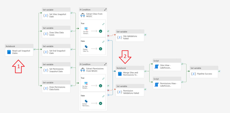
Introduction The Microsoft Graph Data Connect for SharePoint team published two notebooks used with Microsoft Fabric in the Information Oversharing v2 template. This blog explains what each code block inside these notebooks does. The goal was to help you understand what the notebooks do. Note that this document was written with help from Copilot, using simple prompts like “Analyze each section of this Jupyter notebook with PySpark and Scala code. Describe what each section does.” Notebook 1: Read Last Snapshot Dates This first notebook runs right as the pipeline starts. It checks the environment, verifies if the Sites and Permission tables exist in the Lakehouse, checks the last day data was gathered from MGDC and calculates the start and end date to use. It also cleans the staging tables and stores a few commands that are used in later steps. Section 0 – Set the Default Lakehouse for Notebook to Run %%configure { "defaultLakehouse": { "name": { "parameterName": "lakehouseName", "defaultValue": "defaultlakehousename" } } } This section uses the %%configure magic command to set a JSON configuration that defines a parameter (lakehouseName) with the default value "defaultlakehousename". This setting ensures that when the notebook is launched through a pipeline, it dynamically selects the target Lakehouse. Section 1 – Initialize Parameters import java.time.LocalDateTime import java.time.format.DateTimeFormatter import java.time.temporal.ChronoUnit import java.util.UUID import java.text.SimpleDateFormat import java.time.{LocalDate, LocalDateTime, Period} import java.time.format.DateTimeFormatter import java.time.temporal.ChronoUnit import java.util.Calendar import java.sql.Timestamp val runId = "00000000-0000-0000-0000-000000000000" val workspaceId = spark.conf.get("trident.workspace.id") val workspaceName = "LakeHouseTesting" val lakehouseId = spark.conf.get("trident.lakehouse.id") val lakehouseName = "IMAXDefault" val sitesStagingTableName = "Sites_Staging" val sitesFinalTableName = "Sites" val permissionsStagingTableName = "Permissions_Staging" val permissionsFinalTableName = "Permissions" val endTime = "2024-11-15T00:00:00Z" spark.conf.set("spark.sql.caseSensitive", true) This section imports various libraries for date/time handling and initializes key parameters for the ETL process. These include a run identifier (runId), workspace and Lakehouse information (with some values coming from Spark configuration), table names for staging and final datasets, and a fallback endTime. It also enforces case sensitivity in Spark SQL. Section 2 – Checking Required Final Tables Exist or Not val lakehouse = mssparkutils.lakehouse.get(lakehouseName) val lakehouseId = lakehouse.id val workspaceName = notebookutils.runtime.context("currentWorkspaceName") val permissionsStagingLocation = s"abfss://${workspaceName}@onelake.dfs.fabric.microsoft.com/${lakehouseName}.Lakehouse/Tables/${permissionsStagingTableName}" val sitesStagingLocation = s"abfss://${workspaceName}@onelake.dfs.fabric.microsoft.com/${lakehouseName}.Lakehouse/Tables/${sitesStagingTableName}" val sitesFinalLocation = s"abfss://${workspaceName}@onelake.dfs.fabric.microsoft.com/${lakehouseName}.Lakehouse/Tables/${sitesFinalTableName}" val permissionsFinalLocation = s"abfss://${workspaceName}@onelake.dfs.fabric.microsoft.com/${lakehouseName}.Lakehouse/Tables/${permissionsFinalTableName}" val tables = spark.catalog.listTables() val siteTableCount = tables.filter(col("name") === lit(sitesFinalTableName) and array_contains(col("namespace"), lakehouseName) ).count() val permissionsTableCount = tables.filter(col("name") === lit(permissionsFinalTableName) and array_contains(col("namespace"), lakehouseName)).count() val siteStagingTableCount = tables.filter(col("name") === lit(sitesStagingTableName) and array_contains(col("namespace"), lakehouseName) ).count() val permissionsStagingTableCount = tables.filter(col("name") === lit(permissionsStagingTableName) and array_contains(col("namespace"), lakehouseName)).count() This section retrieves the Lakehouse object and uses it to construct ABFS paths for both staging and final tables (for Sites and Permissions). It then checks for the existence of these tables by listing them in Spark’s catalog and filtering by name and namespace. Section 3 – Getting Snapshot Dates from Last Successful Extracts import org.apache.spark.sql.functions.{col, _} import org.apache.spark.sql.types._ import org.apache.spark.sql.{DataFrame, Row, SparkSession} import org.apache.spark.storage.StorageLevel val dtCurrentDateFormatt = DateTimeFormatter.ofPattern("yyyy-MM-dd HH:mm:ss.S") val dtRequiredtDateFormatt = DateTimeFormatter.ofPattern("yyyy-MM-dd'T'HH:mm:ss'Z'") var siteDataExists: Boolean = false var permissionsDataExists: Boolean = false val siteSnapshotDate = { if (siteTableCount == 1) { val dfSites = spark.sql(s"SELECT MAX(SnapshotDate) AS SnapshotDate FROM ${lakehouseName}.${sitesFinalTableName} ") val rowSites: Row = dfSites.select("SnapshotDate").head(1)(0) if (rowSites.get(0) == null) endTime else { siteDataExists = true println(s"Sites data Exists: ${siteDataExists}") LocalDateTime.parse(rowSites.get(0).toString(), dtCurrentDateFormatt) .format(dtRequiredtDateFormatt) } } else { endTime } } val permissionsSnapshotDate = { if (permissionsTableCount == 1) { val dfPermissions = spark.sql(s"SELECT MAX(SnapshotDate) AS SnapshotDate FROM ${lakehouseName}.${permissionsFinalTableName} ") val rowPermissions: Row = dfPermissions.select("SnapshotDate").head(1)(0) if (rowPermissions.get(0) == null) endTime else { permissionsDataExists = true println(s"Permissions data Exists: ${permissionsDataExists}") LocalDateTime.parse(rowPermissions.get(0).toString(), dtCurrentDateFormatt) .format(dtRequiredtDateFormatt) } } else { endTime } } This section queries the final tables to retrieve the latest SnapshotDate for both Sites and Permissions. It then reformats the date into an ISO-compliant format. If no snapshot date is found, it defaults to the predefined endTime, and two boolean flags (siteDataExists and permissionsDataExists) are toggled accordingly. Section 4 – Generate View Script for Sites val sitesView: String = s""" CREATE OR ALTER VIEW vw${sitesFinalTableName} AS SELECT *, [StorageQuotaFriendly] = (case when StorageQuota < 1048576 then concat(ceiling(StorageQuota / 1024.0), ' KB') when StorageQuota < 1073741824 then concat(ceiling(StorageQuota / 1048576.0), ' MB') when StorageQuota < 1099511627776 then concat(ceiling(StorageQuota / 1073741824.0), ' GB') when StorageQuota < 1125899906842624 then concat(ceiling(StorageQuota / 1099511627776.0), ' TB') else concat(ceiling(StorageQuota / 1125899906842624.0), ' PB') end ), [StorageUsedFriendly] = (case when StorageUsed < 1048576 then concat(ceiling(StorageUsed / 1024.0), ' KB') when StorageUsed < 1073741824 then concat(ceiling(StorageUsed / 1048576.0), ' MB') when StorageUsed < 1099511627776 then concat(ceiling(StorageUsed / 1073741824.0), ' GB') when StorageUsed < 1125899906842624 then concat(ceiling(StorageUsed / 1099511627776.0), ' TB') else concat(ceiling(StorageUsed / 1125899906842624.0), ' PB') end ) FROM ${sitesFinalTableName} """.stripMargin.replaceAll("[\n\r]"," ") println(sitesView) Here a SQL view (vwSites) is dynamically generated for the Sites final table. The view adds two computed columns (StorageQuotaFriendly and StorageUsedFriendly) that convert byte values into more digestible units such as KB, MB, GB, etc. This script will be stored and executed later. Section 5 – Generate View Script for Permissions val permissionsView: String = s""" CREATE OR ALTER VIEW vw${permissionsFinalTableName} AS SELECT *, ShareeDomain = CASE WHEN CHARINDEX('@', SharedWith_Email) > 0 AND CHARINDEX('.', SharedWith_Email) > 0 THEN SUBSTRING(SharedWith_Email,CHARINDEX('@', SharedWith_Email)+1,LEN(SharedWith_Email)) ELSE '' END, ShareeEMail = CASE WHEN CHARINDEX('@', SharedWith_Email) > 0 THEN SharedWith_Email ELSE '' END, PermissionsUniqueKey = CONCAT(SiteId,'_',RoleDefinition,'_',ScopeId,'_',COALESCE(LinkId,'00000000-0000-0000-0000-000000000000')), EEEUPermissionsCount = SUM(CASE WHEN SharedWith_Name LIKE 'Everyone except external users' THEN 1 ELSE NULL END ) OVER( PARTITION BY CONCAT(SiteId,'_',RoleDefinition,'_',ScopeId,'_',COALESCE(LinkId,'00000000-0000-0000-0000-000000000000'),SharedWith_Name) ), ExternalUserCount = SUM(CASE WHEN SharedWith_TypeV2 LIKE 'External' THEN 1 ELSE NULL END ) OVER( PARTITION BY CONCAT(SiteId,'_',RoleDefinition,'_',ScopeId,'_',COALESCE(LinkId,'00000000-0000-0000-0000-000000000000'),SharedWith_Name) ), B2BUserCount = SUM(CASE WHEN SharedWith_TypeV2 LIKE 'B2BUser' THEN 1 ELSE NULL END ) OVER( PARTITION BY CONCAT(SiteId,'_',RoleDefinition,'_',ScopeId,'_',COALESCE(LinkId,'00000000-0000-0000-0000-000000000000'),SharedWith_Name) ) FROM ${permissionsFinalTableName} """.stripMargin.replaceAll("[\n\r]"," ") println(permissionsView) This section builds a SQL view (vwPermissions) for the Permissions final table. It derives additional columns like ShareeDomain, ShareeEMail, and a composite key (PermissionsUniqueKey) while applying window functions to compute counts (e.g., for external or B2B users). This script will also be stored and executed later. Section 6 – Truncate the Staging Tables from Previous Runs if (siteStagingTableCount == 1) { spark.sql(s"DELETE FROM ${lakehouseName}.${sitesStagingTableName} ") println(s"Staging table deleted: ${lakehouseName}.${sitesStagingTableName}") } else { println(s"Staging table ${lakehouseName}.${sitesFinalTableName} not found") } if (permissionsStagingTableCount == 1) { spark.sql(s"DELETE FROM ${lakehouseName}.${permissionsStagingTableName} ") println(s"Staging table deleted: ${lakehouseName}.${permissionsStagingTableName}") } else { println(s"Staging table ${lakehouseName}.${permissionsStagingTableName} not found") } This section checks if the staging tables exist (by count) and, if found, issues a SQL DELETE command to remove existing data so that new data can be loaded. It prints messages indicating the action taken. Section 7 – Return Snapshot Dates Back to Pipeline import mssparkutils.notebook val returnData = s"""{\"LakehouseId\": \"${lakehouseId}\", \"SitesStagingTableName\": \"${sitesStagingTableName}\", \"SitesFinalTableName\": \"${sitesFinalTableName}\", \"SitesSnapshotDate\": \"${siteSnapshotDate}\", \"SitesDataExists\": ${siteDataExists}, \"SitesView\": \"${sitesView}\", \"PermissionsStagingTableName\": \"${permissionsStagingTableName}\", \"PermissionsFinalTableName\": \"${permissionsFinalTableName}\", \"PermissionsSnapshotDate\": \"${permissionsSnapshotDate}\", \"EndSnapshotDate\": \"${endTime}\", \"PermissionsDataExists\": ${permissionsDataExists}, \"PermissionsView\": \"${permissionsView}\"}""" println(returnData) mssparkutils.notebook.exit(returnData) This concluding section aggregates the key metadata—including Lakehouse information, table names, snapshot dates, existence flags, and the generated view scripts—into a JSON string. It then exits the notebook by returning that JSON to the pipeline. Notebook 2: Merge Sites and Permissions to Final Table This notebook runs after the Sites and Permissions data from MGDC has been collected successfully into the staging tables. If this is the first collection, it handles them as full datasets, storing the data directly in the final tables. If this is using MGDC for SharePoint delta datasets, it merges the new, updated or deleted objects from the staging tables into the final tables. Note: The word "Delta" here might refer to Delta Parquet (an efficient data storage format used by tables in a Microsoft Fabric Lakehouse) or to the MGDC for SharePoint Delta datasets (how MGDC can return only the objects that are new, updated or deleted between two dates). It can be a bit confusing, so be aware of the two interpretations of the word. Section 0 – Set the Default Lakehouse for Notebook to Run %%configure { "defaultLakehouse": { "name": { "parameterName": "lakehouseName", "defaultValue": "defaultlakehousename" } } } This section uses the same Lakehouse configuration as in Notebook 1. It sets the default Lakehouse through a parameter (lakehouseName) to support dynamic running of the notebook in different environments. Section 1 – Initialize Parameters import java.time.LocalDateTime import java.time.format.DateTimeFormatter import java.time.temporal.ChronoUnit import java.util.UUID import java.text.SimpleDateFormat import java.time.{LocalDate, LocalDateTime, Period} import java.time.format.DateTimeFormatter import java.time.temporal.ChronoUnit import java.util.Calendar val runId = "00000000-0000-0000-0000-000000000000" val workspaceId = spark.conf.get("trident.workspace.id") val workspaceName = "LakeHouseTesting" val lakehouseId = spark.conf.get("trident.lakehouse.id") val lakehouseName = spark.conf.get("trident.lakehouse.name") val sitesStagingTableName = "Sites_Staging" val sitesFinalTableName = "Sites" val permissionsStagingTableName = "Permissions_Staging" val permissionsFinalTableName = "Permissions" spark.conf.set("spark.sql.caseSensitive", true) This section is like Notebook 1’s Section 1 but here lakehouseName is retrieved from the configuration. It initializes variables needed for merging, such as run IDs, workspace/Lakehouse identifiers, and table names. Section 2 – Read Sites Dataset from Staging Table val lakehouse = mssparkutils.lakehouse.get(lakehouseName) val lakehouseId = lakehouse.id val workspaceName = notebookutils.runtime.context("currentWorkspaceName") println("Started reading Sites dataset") val sitesStagingLocation = s"abfss://${workspaceName}@onelake.dfs.fabric.microsoft.com/${lakehouseName}.Lakehouse/Tables/${sitesStagingTableName}" val dfSitesStaging = spark.read.format("delta").load(sitesStagingLocation) println("Completed reading Sites dataset") This section constructs the ABFS path for the Sites staging table and reads the dataset into a DataFrame using the Delta Parquet format. It includes print statements to track progress. Section 3 – Read Permissions Dataset from Staging Table println("Started reading Permissions dataset") val permissionsStagingLocation = s"abfss://${workspaceName}@onelake.dfs.fabric.microsoft.com/${lakehouseName}.Lakehouse/Tables/${permissionsStagingTableName}" val dfPermissionsStaging = spark.read.format("delta").load(permissionsStagingLocation) println("Completed reading Permissions dataset") This section performs the analogous operation for the Permissions staging table, loading the dataset into a DataFrame and providing console output for monitoring. Section 4 – Check Final Tables Exist or Not import io.delta.tables.DeltaTable val sitesFinalLocation = s"abfss://${workspaceName}@onelake.dfs.fabric.microsoft.com/${lakehouseName}.Lakehouse/Tables/${sitesFinalTableName}" val permissionsFinalLocation = s"abfss://${workspaceName}@onelake.dfs.fabric.microsoft.com/${lakehouseName}.Lakehouse/Tables/${permissionsFinalTableName}" val sitesFinalTableExists = DeltaTable.isDeltaTable(spark, sitesFinalLocation) if (!sitesFinalTableExists) { println("Final Sites table not exists. Creating final Sites table with schema only") dfSitesStaging.filter("1=2").write.format("delta").mode("overwrite").save(sitesFinalLocation) println("Final Sites table created") } else { println("Final Sites table exists already") } val permissionsFinalTableExists = DeltaTable.isDeltaTable(spark, permissionsFinalLocation) if (!permissionsFinalTableExists) { println("Final Permissions table not exists. Creating final Permissions table with schema only") dfPermissionsStaging.filter("1=2").write.format("delta").mode("overwrite").save(permissionsFinalLocation) println("Final Permissions table created") } else { println("Final Permissions table exists already") } This section checks whether the final tables for Sites and Permissions exist. If a table does not exist, it creates an empty table (schema only) from the staging DataFrame by filtering out data (filter("1=2")). Section 5 – Merge Sites Data from Staging Table to Final Table import io.delta.tables._ import org.apache.spark.sql.functions._ import org.apache.spark.sql.expressions.{Window, WindowSpec} import org.apache.spark.sql.functions.{coalesce, lit, sum, col, _} import org.apache.spark.sql.types.{StructField, _} import org.apache.spark.sql.{DataFrame, Row, SparkSession} import org.apache.spark.storage.StorageLevel val deltaTableSource = DeltaTable.forPath(spark, sitesStagingLocation) val deltaTableTarget = DeltaTable.forPath(spark, sitesFinalLocation) import spark.implicits._ val dfSource = deltaTableSource.toDF //Delete records that have Operation as Deleted println("Merging Sites dataset from current staging table") deltaTableTarget .as("target") .merge( dfSource.as("source"), "source.Id = target.Id") .whenMatched("source. Operation = 'Deleted'") .delete() .whenMatched("source.Operation != 'Deleted'") .updateAll() .whenNotMatched("source.Operation != 'Deleted'") .insertAll() .execute() println("Merging of Sites dataset completed") This section performs a Delta Lake merge (upsert) operation on the Sites data. The merge logic deletes matching records when the source’s Operation is 'Deleted', updates other matching records, and inserts new records that are not marked as 'Deleted'. Section 6 – Merge Permissions Data from Staging Table to Final Table import io.delta.tables._ import org.apache.spark.sql.functions._ import org.apache.spark.sql.expressions.{Window, WindowSpec} import org.apache.spark.sql.functions.{coalesce, lit, sum, col, _} import org.apache.spark.sql.types.{StructField, _} import org.apache.spark.sql.{DataFrame, Row, SparkSession} import org.apache.spark.storage.StorageLevel val deltaTablePermissionsSource = DeltaTable.forPath(spark, permissionsStagingLocation) val deltaTablePermissionsTarget = DeltaTable.forPath(spark, permissionsFinalLocation) import spark.implicits._ val dfPermissionsSource = deltaTablePermissionsSource.toDF //Delete records that have Operation as Deleted println("Merging Permissions dataset from current staging table") deltaTablePermissionsTarget .as("target") .merge( dfPermissionsSource.as("source"), """source.SiteId = target.SiteId and source.ScopeId = target.ScopeId and source.LinkId = target.LinkId and source.RoleDefinition = target.RoleDefinition and coalesce(source.SharedWith_Name,"") = coalesce(target.SharedWith_Name,"") and coalesce(source.SharedWith_TypeV2,"") = coalesce(target.SharedWith_TypeV2,"") and coalesce(source.SharedWith_Email,"") = coalesce(target.SharedWith_Email,"") and coalesce(source.SharedWith_AADObjectId,"") = coalesce(target.SharedWith_AADObjectId,"") """) .whenMatched("source. Operation = 'Deleted'") .delete() .whenMatched("source.Operation != 'Deleted'") .updateAll() .whenNotMatched("source.Operation != 'Deleted'") .insertAll() .execute() println("Merging of Permissions dataset completed") This section performs a merge operation on the Permissions data. The merge condition is more complex—comparing multiple columns (including handling nulls with coalesce) to identify matching records. The operation applies deletion for rows marked as 'Deleted', updates others, and inserts records where no match exists. Section 7 – Read and Display Sample TOP 10 Rows var sqlQuery = s"SELECT * FROM ${lakehouseName}.${sitesFinalTableName} order by SnapshotDate DESC LIMIT 10" val dfSitesAll = spark.sql(sqlQuery) display(dfSitesAll) sqlQuery = s"SELECT * FROM ${lakehouseName}.${permissionsFinalTableName} order by SnapshotDate DESC LIMIT 10" val dfPermissionsAll = spark.sql(sqlQuery) display(dfPermissionsAll) This final section executes SQL queries to retrieve and display the top 10 rows from both the Sites and Permissions final tables. The rows are ordered by SnapshotDate in descending order. This is typically used for sample or debugging purposes. Conclusion I hope this article helped you understand the notebooks included in the template. This might help you customize it later. These templates are intended as starting points for your work with many scenarios. Read more about MGDC for SharePoint at https://aka.ms/SharePointData.