charts & visualizing data
166 TopicsBuilding a Gantt Chart using Power BI
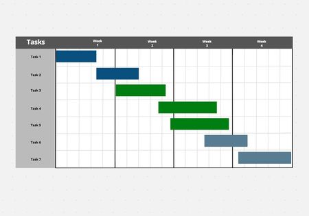
Few weeks ago, I was tasked to build a Gantt chart, but I didn’t have a clue on how to do it. So, I did it the “Old fashion way” using excel sheet and adding all the adjustments manually i.e., colors, timeline, dates and tasks. I completed the task, but I felt there was a way around it and that was when I discovered a visualization on Power BI where you can build a Gantt chart is just a matter of minutes. Let’s breakdown the step-by-step process to achieve this. Don’t worry if this is new to you🙂. Let’s get to the introduction.208KViews1like10Comments
Error in Excel : All the charts are removed
When i open any excel file that contains charts, I am getting an error that there is problem found in the file and if i want to restore the file. If i say yes, it removes all my charts in the excel file. I could not add any new chart to the excel (also in complete new excel sheet). I tried repairing it and I tried reinstalling it. that does not solve the problem. I did not had this issue before. I have attached pictures regarding this Issue? How can i solve it? I am using Excel 2016 Thanks in advance.3.9KViews1like4Comments
Excel chrashes while starting PowerMaps
Hello guys, we are using PowerMaps in our controlling department. At one of our computers (Microsoft Surface 3 with Windows 10 Pro x64 [1803] and Office ProPlus 2013 x86) we are starting the addin, excel freeze and crashes after about 20 seconds. In the eventlog is an error that indicates an failure with the WindowsCodecs.dll. I tried an re-install of the addins and a complete re-install of Office. I changed the WindowsCodecs.dll with one of a working client, but nothing worked at all. Does anybody know the problem and how to fix that? Thanks, Patrick641Views0likes0Comments
How to standardize x-axis units from real data in a line graph or scatter plot?
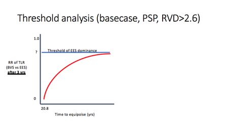
I am trying to chart a variable (called RR) against a real number of years and create a chart like the one below. Unfortunately, I had to capture the inputs by setting the RR variable in a model and deriving the corresponding year value. The resultant data seem impossible to chart the way I want: with the years value standardized in increments of 1 (year) across the x-axis. I hoped to force this via formatting the axis, but whatever data type I use, I cannot shift it. I think I need some function to extrapolate RR from the data for standard years 19, 20, 21, 22, etc. I tried applying the function the exponential trendline provides, but it's nowhere close to my data. Suggestions? Here are my data: RR years to event 0 21.59 0.1 22.115 0.15 22.3 0.2 22.535 0.25 27.392 0.3 28.014 0.35 28.408 0.4 29.12 Thanks for any help! Goal chart (with x-axis in regular intervals): Best I can do:9.4KViews0likes3Comments
Obtaining detailed support free or paid.
I have a number of questions about timeline creation. I need to know if Excel can do all that I need it to do. I have created a timeline but have a couple of issues and need some custom details. How can I find support free or paid. I need a consultant.826Views0likes1CommentCreating Multiple Timelines on in one Chart.
I am creating multiple timelines in one Chart. 1) I have the 3 series as three separate lines with the dates as a separate line at the bottom. I deleted all the lines dropping down to the main line/axis. 2) However, at some point, the dates at the bottom stopped reflecting the range I specified. 3) Also, I would like the label to be the actual task text. I can only get the series name and task date to show. If you can assist in remedying these issues, it would be much appreciated.27KViews0likes7CommentsExcel Timelines/Charts Import Custom Markers
Can I change the formulas in an Excel Timeline/Chart so that when I import from a database I can import custom symbols that we use to identify a characteristic of the task? I want that symbol to be the marker for each task in the timeline.569Views0likes0Comments
How to copy curve from excel scatter with smooth lines chart
I am interested in copying the curve from the excel scatter with smooth lines only to MS Visio using VBA code. I have tried selecting the curve from a excel XYScatterSmoothNoMarkers graph, but not able to just copy and paste just the curve, but the complete chart with the curve only. I have written some VBA code (taking pieces from various articles), to generate the chart and to make only the curve visible and copy this. This will work for me, I am able to insert it into Visio, but this method gives me two issues to resolve. If I am unable to just copy the curve itself, but need to copy the chart, then I need to resolve the following 2 issues: 1) I need the graph is have not distortion from having different scaling for the x and y coordinates. That is if I move on x axes 1 unit, that must be exactly the same as moving on y axes 1 unit. The x and y 1 unit must be the same or I have a distortion of the plot. I haven't found a way to control this with VBA, and the closes thing is manually doing. 2) The last issue is to located the start of the graph or curve and for me to adjust the placement of the chart to a certain location of shapes on my Visio drawing. The shape is a circle and I just need the curve touching the bottom part of the circle. If a solution can be found to do this with VBA code too, then copying the chart will work for me. I do have the (x,y) location of the connection location I want. Below if a sample of some VBA Code that I am able to generate the curve and making the chart invisible when pasted into Visio. But, the 2 issues need to be resolve unless I am able to copy the curve itself and determine the end points. Then I can write VBA Code to connect to my Visio drawing. Here is my sample VBA Code: Dim rng As Range Dim cht As ChartObject ' Your data range for the chart Set rng = ActiveSheet.Range("B31:C65") ' Create a chart Set cht = ActiveSheet.ChartObjects.Add(Left:=ActiveCell.Left, Width:=450, Top:=ActiveCell.Top, Height:=250) ' Determine the chart type cht.Chart.ChartType = xlXYScatterSmoothNoMarkers ' Give chart some data cht.Chart.SetSourceData Source:=rng ' Adjust y-axis Scale cht.Chart.Axes(xlValue).MinimumScale = 36.63 cht.Chart.Axes(xlValue).MaximumScale = 49.06 ' Adjust x-axis Scale cht.Chart.Axes(xlCategory).MinimumScale = 33.46 cht.Chart.Axes(xlCategory).MaximumScale = 40.58 ' Remove Gridlines cht.Chart.Axes(xlValue).MajorGridlines.Delete cht.Chart.Axes(xlValue).MinorGridlines.Delete ' Remove X-Axis cht.Chart.Axes(xlCategory).Delete ' Remove Y-Axis cht.Chart.Axes(xlValue).Delete ' Remove Legend cht.Chart.Legend.Delete ' Remove ChartArea border cht.Chart.ChartArea.Border.LineStyle = xlNone ' No background color fill cht.Chart.ChartArea.Format.Fill.Visible = msoFalse cht.Chart.PlotArea.Format.Fill.Visible = msoFalse I would appreciate any suggestion. I was referred to this site from MS community. Thank You,1.3KViews0likes0Comments