best practices
33 TopicsSharePoint Showcase: 10 Custom AI Skills Every SharePoint Site Owner Should Build
In this edition of SharePoint Showcase, we explore how skills work, how to create or install them, and ten practical examples to help SharePoint site owners get started. These examples are not an exhaustive list, but a curated starting point for identifying everyday processes that can become reusable, team-ready skills.10KViews4likes2Comments
Beyond Benchmarks: The Lifecycle of Measuring Agentic Quality in AI Content Management
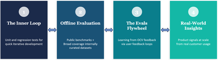
By Sujay Kumar Jauhar, Spriha Chandrayan, Natasha Gaitonde, Zhen Lei, Reed Pankhurst, Anush Sankaran, Amrit Shandilya, Ryen W. White Organizations put their most important content in OneDrive and SharePoint, trusting us to deliver AI experiences they can depend on. That trust runs across everything Copilot does with their content — surfacing the right information through retrieval, and, increasingly, driving agentic workflows that reason over documents and take action on their behalf. Living up to that trust is what we care about most, and it's why we put the quality of these experiences — and consequently the ways we measure that quality — at the center of how we build. It turns out that this is a non-trivial problem, because quality in AI is rarely binary. An agent can call exactly the right tools and still produce an answer that's subtly, confidently wrong. A search result can be technically relevant and still miss what the user was really after. An AI-generated page can be well-structured and fluent and still omit the one detail that mattered. Quality here is continuous, context-dependent, and multidimensional — and when these experiences are serving hundreds of millions of enterprise users, measuring it demands scientific rigor across the full lifecycle of building AI products. Across OneDrive and SharePoint — the knowledge platform for Copilot and Agents — we’ve spent the past year building a rigorous practice around evaluation: determining what to measure, developing the right methods to measure it, and learning how to act on those measurements to improve our systems and experiences. In software engineering, tests verify correctness and telemetry monitors health. The boundaries are well-defined: a function returns the right value or it doesn’t; a service meets its service level objective or it doesn’t. AI evaluation requires an analogous discipline, but the problem is structurally harder — there is rarely a single correct answer, and quality depends on factors that shift with every user, task, and context. This post describes the evaluation practice we are building across Copilot capabilities in OneDrive and SharePoint. It follows the arc of what we think of as the evaluation lifecycle — from rapid inner-loop validation, through rigorous offline measurement, to customer-grounded evaluation that evolves with real feedback, and ultimately to understanding whether our metrics predict what users actually experience. Each stage addresses a question the previous ones cannot, but they don’t run in a straight line. What we learn downstream can reshape the data and methodology of upstream measurements. That’s what makes this a lifecycle — and together they form a strategy for building AI systems that aim to earn user trust at enterprise scale. We're on a journey — learning and evolving as we build this practice. Some of the things we're actively working on, omitted from this blog post for the sake of brevity, are: holding ourselves to public, industry-standard benchmarks such as GAIA and GDPval, with more in the pipeline; and investing in the foundations that keep evaluation trustworthy, by generating realistic synthetic evaluation data so our test sets keep pace with new models, and monitoring the health of our benchmarks for saturation. The inner loop: "Did I break anything?" The first requirement of any AI development workflow is a fast feedback signal. Teams are experimenting constantly on internal builds — adjusting prompts, swapping model versions, rearchitecting retrieval pipelines — and they need to know within minutes whether a change helped or hurt. That is the role of our unit-level evaluations: a rapid inner loop for feature crews. A developer modifies a system prompt or adjusts the grounding context, runs it against a targeted set of test cases, and gets immediate feedback on whether key behaviors are preserved. These checks are fast, focused, and designed to catch regressions before they compound. The distinction from traditional unit testing is worth noting. In software, a test asserts an exact expected output. In AI, you are validating behavioral properties — coherence, completeness, tool selection, factual consistency — against approximate expectations. The pass/fail boundary is softer, but the engineering purpose is the same: give teams confidence to iterate without fear of silent degradation. One of the crews building Copilot's agentic features over SharePoint Lists knows this loop well. They keep a large set of prompts that engineers run whenever they change something — a tweak to a tool's description, a different setting passed to the model, a reworded prompt. Many of those questions run over the same synthetic data: lists of bakery orders, each row carrying details like the baker, the delivery agent, the profit on the order, and its status. The same lists come in a range of sizes, from a few thousand rows up to a million. The largest are used to push the system's limits but the inner loop lives at the lower end. There, most questions are ones the system has gotten right for a long time, so when a change quietly breaks one of them, it shows up right away. An engineer can try an idea, run the set quickly, and whether they've introduced a regression. Fast iteration checks are essential, but they only tell you whether something regressed. They cannot tell you how good the system actually is. Offline evaluation: "How good is this, really?" This is the domain of our offline evaluation practice. We maintain curated, scenario-focused benchmarks evaluated in a controlled harness that reflect the tasks and content types our enterprise users encounter, alongside public benchmarks that situate our systems in the broader AI landscape. The goal is to bring each AI scenario to a state of decision-readiness: explicit success criteria, representative evaluation datasets, metrics we attempt to validate against real outcomes, and systematic coverage of known failure modes. We try to do this rigorously by running evals against the real product. Each test case is a plan — a short script of things a user might ask for — paired with criteria (or assertions) describing what a good outcome looks like, sorted by how much each one matters: Critical, Expected, or Aspirational. An LLM plays the user: it drives the live product through the browser, sends the opening request, and then reacts the way a person would, confirming an action card here or answering a clarifying question there, so the system is exercised end to end. When the conversation finishes, the harness gathers the evidence of what actually happened — the responses in the chat, the state of the page, and screenshots where the judgment is visual. That evidence goes to a second model acting as judge — the increasingly standard "LLM-as-a-judge" approach — which scores the run against the original assertions. And because a model grading a model is only as trustworthy as its agreement with people, those scores are calibrated against human raters. Using a high-priority, curated slice of these evals, the team ran big proposed changes side by side to see which ones came out ahead. One of those comparisons looked at how the orchestrator is told about the tools it can use. At one extreme, you hand the model the full description of every tool up front; at the other, you give it only short, tweet-length summaries and let it pull a tool's full description and parameters only when it decides it needs them. Configuration Quality % Latency vs. default Cost vs. default Baseline 83.0 1.00x 1.00x Default tool discovery 90.3 1.11x 0.62x Rearchitected tool discovery 85.6 0.97x 0.73x Semantic tool search 92.8 0.95x 0.74x Hybrid 93.5 0.82x 0.62x Table 1: A comparison of the different approaches for tool selection we experimented with. Based on internal evaluation results using our internal test environment, and test configurations of the product. Quality was measured through LLM judgement of AI responses based on a set of criteria, latency was measured by the harness running the evaluations, and cost is based on publicly disclosed price heuristics for token usage for the LLM API being used for orchestration. Results were calculated from 500 scenario tests based on synthetic data. The table above summarizes our results from an internal offline evaluation on a curated slice. In this evaluation, we found that the baseline which loads everything up front was, predictably, the most expensive. The out-of-the-box tool-discovery method cut token usage sharply — but was a bit slower. Pushing further, a rearchitecting of the orchestrator for tool discovery did speed things up, but at the cost of quality. Meanwhile semantic tool search improved on both quality and latency relative to the baseline but wasn’t as cost-efficient as the default tool discovery method. Overall, in this evaluation, a strong balance of quality, token usage, and latency came from a hybrid — the standard tool-learning architecture with a few targeted semantic-search changes, which still resulted in a more than 35% reduction in token usage when compared with full tool descriptions. Offline benchmarks, however carefully constructed, have an inherent limitation. They represent a fixed snapshot — based often on what product teams believe will be important use cases, particularly for features that have not yet shipped to real customers. As the product evolves and real usage patterns emerge, the gap between what our benchmarks measure and what actually matters can widen. The evals flywheel: "Are we measuring what users care about?" This is the motivation behind what we call the Evals Flywheel: a closed-loop system that translates real user dissatisfaction directly into better evaluations and, ultimately, better systems. In software engineering, there is a well-established discipline of turning production bugs into tests. In the AI analog, user feedback provided with appropriate consent helps produce new evaluation data, systematic failure diagnoses, and targeted improvements. Take for instance a user that consents to share feedback with us (via a thumbs down). At first glance, this seems like a single interaction. But to us, it's an opportunity to learn. We investigate what happened, identify the underlying reason for the user dissatisfaction, and ask a critical question: was this an isolated mistake, or does it reveal a broader weakness in how the system understands documents like this one? Here's a representative example. A user uploaded a 120-page quarterly financial report packed with dense tables, nested headers, footnotes, and appendices. They asked a straightforward question: "What was our actual spending in Q3?" The answer seemed like it should be easy — the relevant numbers were all in the document. The assistant responded confidently with a figure from one of the summary tables; but it cited the budgeted amount, not the actual spend. The mistake stemmed from the document's complexity. The table spanned multiple pages, with a top-level "Q3" header extending across several sub-columns such as Budget, Actual, Forecast, and Variance. On its own, that's one mistake in one document. However, it pointed at something more general: whenever a table uses a heading that spans multiple columns, or stacks two rows of headers, or tucks a small table inside a larger one, then the link between a header label and its value turns fragile. Understanding the text is often not enough — the assistant must also accurately preserve and reason over intricate document structure, table relationships, and context that can span dozens of pages. Hence, instead of patching that single file, we built a family of evaluation documents that deliberately stress that exact structure. Each eval document pairs a question with the single correct answer and a short list of "tempting but wrong" answers which are the nearby values a confused reader would most likely grab. That last part is the key: an eval that only checks for the right answer can be passed by luck, but an eval that includes likely distractors tells you whether the system is genuinely reasoning or just guessing. This example reflects a repeatable method. The first step is resisting the urge to treat a user dissatisfaction as an isolated bug. Instead, we ask why it happened and not "what's the right answer for this question." That root-cause identification is what turns the user feedback into a useful signal. The payoff is a flywheel between real-world experience and offline evaluation. The improvement ships back into the product, where future interactions validate it — and surface the next gap. Each loop widens our coverage and, just as importantly, helps us prioritize the improvements that matter most to the people using the product. But it raises a deeper question: when our benchmarks are representative of user concerns, do improvements actually translate into better experiences in production? Real-world insights: "Does this actually matter to users?" It is possible to improve a benchmark score and have it mean nothing in practice. A model that scores five points higher on an offline evaluation may produce no detectable difference in user satisfaction or task success. Conversely, a change that barely moves the needle offline might transform the user experience in unexpected ways. This gap between offline measurement and real-world impact is the focus of our online evaluation work. Through production telemetry, we study user-AI interaction patterns at scale. The objective is not simply to monitor system health, but to develop an empirical understanding of how users experience our AI features in context. In traditional software, production telemetry provides crisp, well-defined signals: uptime, latency percentiles, error rates. In AI, the equivalent signals — satisfaction, intent alignment, task success — are inherently noisier and harder to define. The central challenge here is alignment: do our offline metrics predict real user value? Answering that depends first on being able to measure value reliably in production at all. Consider a recent experiment on one of our top-of-funnel entry points — the most common way users first reach the assistant. The team suspected that engagement was low (around 1%) simply because users weren't noticing the entry point. So they ran a user-level A/B test across a sample of 900,000 Copilot-licensed users over 21 days, swapping the entry point's icon for a more contextually relevant one. The effect was a statistically significant 42% lift in click-through, alongside a 1.7% increase in active users. That result is encouraging, but it also illustrates a subtle nuance. We moved an engagement metric sharply without touching quality at all — this tells us that we had an education gap, but didn’t inform our understanding of the AI system’s performance. To get closer to that distinction, we looked at kept rate: the share of AI responses where the user does something that signals the answer was worth keeping — copying the result, clicking through to a citation or a suggested follow-up, or providing a thumbs up. And because it's captured passively, from actions users take anyway, it scales to every response rather than the small fraction where someone leaves explicit feedback. Even an indirect, partial signal like kept rate lets us close the offline-online loop. Once we have a read on what users valued, we can start to ask how well it correlates with our offline benchmarks. When offline gains track with a rise in kept rate, for example, it's early evidence the benchmark is steering us toward something real; when they are uncorrelated, it's a warning that we may be hill-climbing in a wrong direction. Beyond quality Quality matters — but in production systems, it is entangled with cost and latency in ways that cannot be evaluated in isolation. A high-quality response that is unacceptably slow degrades the user experience regardless of its correctness. Or a frontier model that is marginally better than a smaller alternative may not justify the cost differential. This is the next frontier of our evaluation work: learning to reason about quality, cost, and latency as a tradeoff surface rather than independent dimensions. The goal is to build the instrumentation and frameworks that make these tradeoffs visible and deliberate, so that teams can make principled decisions about how they ship. To make this concrete, consider some early findings from our internal evaluations. We took a range of system configurations — models, reasoning levels, tool access — and, for a set of representative tasks — QA over lists, the AppWorld public benchmark, and a collection of complex multi-step plans that stress-test the Copilot in SharePoint agent — plotted each one by the quality it achieved against what it cost to run. The result is a Pareto frontier: the curve of the best quality reachable at each price, with everything below it dominated by something strictly better. Two things stand out. First, different tasks live in different performance regions. Simple, factual lookups like those in ListsQA cost fractions of a cent; harder, more agentic tasks like those in AppWorld and Copilot in SharePoint run to cents or dollars; there is no single answer to what "good" costs. Second, the shape of each curve tells you where spending more is actually worth it. Where the frontier rises sharply, additional cost buys real quality; where it flattens, you have hit diminishing returns, paying more for gains a user may not notice. In short, the decision stops being "is the quality good enough to ship?" and becomes "which point on this curve is right for this scenario?" given budget and latency constraints — a question a feature crew can answer, with the tradeoffs in front of them. What we've learned so far We are still early in this work. Models are improving rapidly, user expectations are evolving, and the definition of quality continues to shift. But several principles have become clear to us. No single evaluation approach is sufficient. Inner-loop checks catch regressions but cannot establish absolute quality. Offline benchmarks provide rigor but go stale. Customer feedback grounds evaluation in real needs but covers only the cases where dissatisfaction is expressed. Online metrics reveal real behavioral patterns but cannot always explain the mechanisms behind them. A credible evaluation practice requires all of these, operating in concert and informing each other. Evaluation is not a gate you pass before shipping — it is a continuous discipline that evolves with the product. The teams that build the best AI experiences are not necessarily those with the highest benchmark scores, but those with the clearest understanding of where their systems fall short and the most systematic approach to closing those gaps. And measuring what matters is itself a scientific problem, one that demands the same rigor we apply to the systems being measured. Developing evaluation methods that are reliable, predictive of real user value, and robust to the rapid evolution of AI capabilities is core to our mission across OneDrive and SharePoint. It is how we work to earn the trust of the enterprise users who depend on these experiences, and we are committed to advancing this work and sharing what we learn.1.6KViews2likes0CommentsSharePoint Intranet Festival | May 21, 2025 | Virtual
Get ready for the second SharePoint Intranet Festival, taking place virtually on Wednesday, May 21, 2025. The event is produced by https://www.swoopanalytics.com and is packed with expert insights to support your employee engagement strategy and enterprise-wide communication efforts. What makes this event special? It’s grounded in real-world intranet use cases designed for all employees, not just head-office. You’ll hear directly from leading organizations like Citi, Comcast, Prologis, Syngenta, Bauer Media, VELUX, NRMA, AustralianSuper, and Services Australia, who will share practical experiences and outcomes. It’s a rich blend of perspectives from both the private and public sectors.1.1KViews0likes0CommentsAnnouncing the release of SharePoint Workflow Manager for SharePoint Server
Microsoft is pleased to announce the release of SharePoint Workflow Manager, a new workflow engine to power the SharePoint 2013 Workflows platform for SharePoint Server and replace Service Bus and Microsoft Workflow Manager.24KViews5likes16CommentsJust One Week Away from Our Digital SharePoint Event!
Join us next week Wed, Jan. 29, 2025, at 9 AM – 10 AM PST for our upcoming SharePoint event! 📝Register today-https://aka.ms/SharePointEvent And now, a word from Jeff_Teper about what to expect from the event: From Concept, to Creation, to Impact! Join Jeff Teper, CJ Tan, & Melissa Torres to explore the latest SharePoint capabilities and see how our customers are leveraging some of the latest tools. Discover new features, tips, and tricks to push boundaries. Whether you create sites, publish news, manage workflows, collaborate, or just want to learn more, this event is for you! Skill up your SharePoint IQ with the latest on: Simpler authoring & more compelling content – Lower barriers to create professional-looking content and ensure you can harness the best of what the web has to offer for your intranet Greater engagement & reach – Scale your message to meet people where they work. Copilot and agents, powerful workflows, and automation– Build automated subject matter experts and save your team time while managing and automating content workflows. We will also have dedicated time during the event for live Q&A where you will get to interact with multiple product makers – bring your questions and feedback. Summary of event information Event name | SharePoint: From Concept, to Creation, to Impact + Live AMA Date/time | Wednesday, January 29, 2025, 9:00 AM – 10:00 AM PST. Location | Online - Register today: https://aka.ms/SharePointEvent. Add to calendar | Save this event to your calendar. Engage with us on social You can engage with our current social posts or show us your excitment using #SharePoint or #SharePointevent M365 LinkedIn SharePoint X social handle Related resources Jeff Teper announcement blog-https://aka.ms/SharePointEvent/Blog "Ignite 2024: Agents in SharePoint now in general availability” by Adam Harmetz. Microsoft Ignite 2024 breakout session: Reimagine content management with agents in SharePoint. Subscribe to the SharePoint blog. Follow us on social. Learn more about SharePoint.1.3KViews1like0Comments8 Components of SharePoint Information Architecture
What is Information Architecture (IA)? IA is the practice of organizing, structuring, and labelling content in an effective and sustainable way. It ensures that information is easy to find, manage, and use. In the context of SharePoint, IA involves defining site structures, navigation, content types, metadata, and governance policies. As a business decision maker, investing in robust information architecture can be transformative. The greatest benefit is the enhanced efficiency and productivity it brings to our organization. The goal is to reduce time spent searching while minimizing duplication. Establishing good information architecture early on is crucial. It lays the foundation for growth and scalability. We hope you can avoid the pitfalls of a cluttered and chaotic environment that can hinder productivity. Make your SharePoint intuitive and manageable, and one that can adapt seamlessly to evolving business needs. While designing, or redesigning, your own IA, consider establishing, optimizing, and utilizing the following eight key SharePoint components: Root Site Hub sites Home sites SharePoint start page Organization Assets Application Catalog Learning Hub and Viva Learning SharePoint Premium: Content Center We will spend the rest of this article explaining each component, including screenshots, links, plus tips and tricks along the way. Root Site The root site in SharePoint Online is a special site that is provisioned automatically when you set up your Microsoft 365 subscription. This site serves as the top-level site for your organization's SharePoint environment. The URL of the root site typically follows the format https://yourorganization.sharepoint.com, where "yourorganization" is the name of your organization – i.e., for Contoso, its https://contoso.sharepoint.com. This site is THE base element in information architecture in the cloud. If your environment was set up before April of 2019, then your root site is a Classic Teams Site. To best utilize the Root as your Intranet, we need to replace the Classic Teams Site with a modern communication Site. So, the Root Site has a special functionality which is available to SharePoint admins, and it is called replace site. 💡 Learn how to modernize your root site and then review the Home site information below. Hub sites A second key element is Hub Sites – the connective tissue between sites. Hub sites help organize sites based on any classification like departments/business units, Locations, Projects, etc. As part of Modern Architecture, it is not recommended to use Sub Sites, so if we have all independent site collections, Hub is the component which will establish relationships between sites. Below are some key benefits of using hub sites: Shared navigation and brand Roll-up of content and scoped, connected search A home (page) destination for the hub 💡 Learn more about SharePoint hub sites, and guidance for planning your hub sites. Home site The third key element of information architecture is Home Site. A SharePoint home site provides a customized landing experience that reflects the organization’s brand, voice, and priorities. A SharePoint home site also serves as the gateway to other portals in your organization’s intranet. Additionally, it provides 2 Major Capabilities – Global Navigation – The Navigation you have on your App Bar. So independent of where you are on SharePoint you always have access to Global Navigation. Viva Connections – Using Viva Connections you can design your Dashboard, and which can be directly rendered on teams, even we have capability to render your Intranet on Teams using Viva Connections. showcase how you can design your home site. 💡 Learn more about planning, building, and launching a SharePoint home site for your organization. SharePoint start page This is a page which is built on top of user context and is personalized based on user activity. Users can see the sites they are following, sites they frequently visit, and the latest news published on the site’s user has access to and featured links. This is a key element as it breaks the boundary of working on a specific device. Additionally, the SharePoint start page provides a start’ing point for people to create their own sites and pages. utilize the platform. Organization Assets The next key element in IA is Organization Assets, if your company is looking to save and manage files for the entire organization to use, you have the capability to define one or more libraries as an Organization Assets Library. Examples Images and Office Templates. When a user designs a Modern SharePoint Page by edit it and adding web parts, especially the ones which use file picker, when you have Organization Assets Library configured, users see an additional vertical called “Your Organization” which can store images and logos which can be used across organization. modern SharePoint page with an Image web part in Edit mode, helping people access and use organization images and graphic assets. Another capability is Office Templates, which enables users to select the tab for their organization where they see Office templates when they create a new Office document. an org-approved, published template which can be reused across the company to provide consistency and common branding. 💡 Learn more about Organization Assets Library. Application Catalog It is a special site collection that holds all custom built or third-party applications. The Application Catalog allows Tenant Administrators and Global Administrators to deploy custom code. For the very first time when a tenant is provisioned an Administrator needs to provision the application catalog. There can be 2 types of application catalogs - Tenant App Catalog Site Collection App Catalog Based on governance and information architecture it is a good idea to have a defined approach on which applications should be deployed at tenant level, and which one should be deployed at site collection level. If a custom application is meant to be used by multiple sites on the tenant, it is a good idea to deploy it on Tenant App Catalog. third-party components deployed. 💡 Learn more about Managing Apps on Application Catalog Additionally, for custom code locally scoped for a specific site collection, it is a good idea to use site collection app catalog. These are not created by default; they can be provisioned by running PowerShell cmdlets for any specific site collection. The Above Architecture Diagram explains how Application Catalogs are provisioned in Microsoft 365. 💡 Learn more about Provisioning and using site collection application catalog. Learning Hub Learning hub can be a distinct SharePoint site collection, created as a home for Learning and Trainings in your tenant. As a site collection administrator, one can use this site to host custom training content. t with a Hero Webpart. ument Library displaying multiple folders which are security trimmed based on Mail-Enabled Security Groups for that specific Department. Viva Learning can showcase your custom training modules alongside other paid training services you subscribe to, making learning part of daily work as Viva Learning right within Microsoft Teams. This is a great component while thinking about your IA. This can help in having consistent training methodology and better consumption and adoption of training content to increase knowledge and skill building. Viva Learning home page within Teams showing a blend of training from the SharePoint Learning Hub and LinkedIn Learning. 💡 Learn More about Viva Learning here Content Center Syntex Content Center is a site template which is another modern template apart from communication sites and modern team sites. This site template has a very specific function and is used to build and manage document processing models, applying models to document libraries to automatically classify files and extract information. This capability is part of SharePoint Premium and provides capability for processing a lot of documents as you consider planning and implementation across all content types and scale use cases. – Used to host document processing models. 💡 This comprises of 2 key elements Syntex in general and then specific details to learn about content center. Bringing it all together... Overall, these are the eight key elements which define your core information architecture for SharePoint in Microsoft 365. When we connect them together it would define an organized IA, and an expanded use of your SharePoint investment in Microsoft 365. A well-designed Information Architecture is crucial for any organization as it ensures that information is organized, structured, and labeled in an effective and sustainable way. This makes it easy for users to find, manage, and use the information they need, which in turn enhances efficiency and productivity. A well-designed IA involves defining site structures, navigation, content types, metadata, and governance policies. This reduces the time spent searching for information and minimizes duplication, ultimately leading to a more intuitive and manageable environment that can adapt seamlessly to evolving business needs. -Prakul10KViews10likes0Comments