sharepoint
4123 TopicsIntroducing a team knowledge base, curated by Copilot and agents
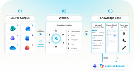
Collaboration is changing as teams of humans and agents now work together to get more done. That’s why we’ve evolved Copilot to empower these human-agent teams: just last month, we announced copilot in Teams, Autopilot as your digital teammate, and new tools in Copilot for managing a team’s content workflows. Today, we are taking the next step in human-agent team collaboration, designed to help address the problem of fragmented and outdated information and enable agent teammates to have the required team context they need to perform tasks and answer questions. In Frontier Preview, Copilot and agents in the newly announced Copilot app, Teams, and SharePoint will be able to create, contribute to, curate, and reference a team’s knowledge base in SharePoint. If the player doesn’t load, open the video in a new window: Open video Knowledge bases can support a range of team needs by bringing together the context people and agents need to do their best work. Here are some examples of how we are working with frontier teams to leverage a knowledge base: Legal: Collecting isolated knowledge from emails, files, and personal notes to help agents reference relevant context when creating agreements and contracts. Engineering: Combining technical specifications, user feedback, market research, and product history to give coding agents project context and support the onboarding of new engineers. Sales: Organizing account knowledge and history so sales agents can recommend relevant next steps or quickly provide account snapshots. Team members can explicitly contribute content— whether email, messages, meetings or content that is already on the SharePoint sites they work with. Copilot will organize all this information into an up-to-date knowledge base for the team, readable to people and grounding any agents that are working with the team. Turning raw content into synthesized knowledge At its core, the knowledge base is a specialized library of interlinked agent-friendly markdown files, created by Copilot using Work IQ’s native knowledge compilation engine. This content processing platform can help transform a team’s content into agent-ready knowledge to improve agent performance and results. In our early internal testing, we see that an agent’s responses were up to 4x faster and 30% more token-efficient with the knowledge base when retrieving content to answer questions and performing team tasks 1 . Figure 1: The knowledge base pipeline We believe this is the first step in transforming how human-agent teams work together by leveraging Work IQ’s knowledge compilation engine. As the science advances, the engine improves. By combining advances in content processing with the latest corpus enrichment innovations from our Applied Science research teams, we are continually improving how enterprise content is transformed into usable knowledge. The evidence is promising so far. For example, in a recent paper, we evaluated agents on the task of answering complex questions that require connecting information across multiple documents. We observed significant improvements in both cost efficiency and quality when compared with traditional agents that worked with the original documents or other enrichment methods. Figure 2: Retrieval quality and cost improvement when using the knowledge base corpus map. Note: Results are from a synthetic test environment and published in a public research paper. With millions of sites created by customers every day, SharePoint plays a critical role as the home for the content and knowledge of a team, whether as a vibrant site of pages, files, and lists or the backing content store for a Teams Channel or Modern Group. When enhanced with a knowledge base, the SharePoint site evolves from a content source to the context layer for a team that people, Copilot, and agents can use and reference together. What’s available now This is rolling out now to our Frontier preview tenants. You can start by adding a knowledge base to any SharePoint site— including those backing Teams Channels and Microsoft 365 Groups. You can further use Copilot in SharePoint and the newly announced Autopilot in the Copilot app to create, curate and use your knowledge base. And with the power of Autopilot, you can also use the knowledge base directly from within Teams, from email (by emailing your autopilot). If the player doesn’t load, open the video in a new window: Open video Note: While the knowledge base and its tools are available in Frontier public, the integration with Autopilot requires access to Autopilot, which is rolling out on a separate cadence. Knowledge base is currently available only to users enabled for usage-based billing. Administrators can manage access and spending through the Microsoft 365 admin center. Learn more about managing AI experiences enabled by usage-based billing and how to create the right policies for your organization. Because knowledge base capabilities are currently in preview, billing terms may change before general availability. What’s coming soon Next on our roadmap: Knowledge bases in more places you work, including tools in Cowork and Copilot in Teams, and custom agents created in Microsoft Copilot Studio. Deeper integration with M365 groups – to allow for easier bootstrapping knowledge bases from existing sources (channels, email). Automated, ongoing curation with the help of Microsoft Copilot Studio’s agent flows to help keep your knowledge bases up to date as your organization’s content changes. Greater content scaling, building on our corpus map approach to support larger volumes of content with higher quality at a lower cost. Integration with CLIs and coding agents via Work IQ to allow a broader range of agents to contribute to and work with a knowledge base. If the player doesn’t load, open the video in a new window: Open video More content AI innovation across the Copilot ecosystem Our content AI strategy is focused on helping organizations turn their content into knowledge that people and agents can use in the flow of work. We’re continuing to bring that strategy to life across the Microsoft 365 and Copilot ecosystem with knowledge bases in SharePoint. And we’re not done yet! Here are a few more recent updates in the content AI space: SharePoint tools in Work IQ are coming soon. Last month, we announced that SharePoint tools were coming to the new Copilot app through Work IQ. Copilot in SharePoint is now generally available, bringing Copilot directly into the place where your organization’s content lives. It helps you understand, create, organize, and act on content with AI. Learn more in last month’s blog. New capabilities to govern the content that powers AI. Copilot and agents perform best on well-governed content. The SharePoint Admin Agent is the centerpiece of our new capabilities for getting there. Admins can use natural language to get tenant-level analysis and guided remediation across permissions, content lifecycle, storage, and settings. They can also monitor cross-geo content moves (preview). Catalog management turns a sprawling tenant into structured, manageable content clusters, so admins can scale actions like site attestations, access reviews, and Restricted Content Discovery, and build rollout plans that better match how their organization works. A detailed file level EEEU permissions report enables targeted cleanup, insights on agent access show which agents are reaching SharePoint and OneDrive content, and Governance Hub helps site owners follow through on assigned actions. Today’s preview is just a first step, and we look forward to building this with you. Learn more about how you can be among the first to put the knowledge base to work for your teams and help shape what comes next by sharing feedback. You can either share in-product feedback using Copilot in SharePoint, Autopilot, or sign up here for an opportunity to go deeper with us on this journey. References: 1. Results are based on Microsoft internal testing, October 2026.10KViews6likes0CommentsAutoSave disabled when opening SharePoint-synced files from Finder after macOS Tahoe 26.6 update
Files stored in SharePoint Online and synchronized locally through OneDrive are opened as local documents when launched from Finder. Office applications display "Saved to my Mac" and AutoSave is turned off by default. However, opening the exact same files through Word/Excel > Open > Sites, or via SharePoint "Open in Desktop App", correctly identifies them as cloud documents. In that scenario, AutoSave is enabled and collaboration/version history features work as expected. Troubleshooting already performed: OneDrive reset and re-linked SharePoint library re-synced Signed out and back into both Office and OneDrive Removed Microsoft credentials from macOS Keychain and re-authenticated Recreated local OneDrive sync relationships Verified OneDrive File Provider extensions are enabled Verified Office applications and OneDrive are fully up to date Tested with newly created files and existing files Tested "Always Keep on This Device" with no change in behavior The issue appears to be specific to the Finder-to-Office launch path after upgrading to macOS Tahoe 26.6. Before upgrading to macOS Tahoe 26.6, opening the same SharePoint-synchronized files directly from Finder correctly preserved cloud document identity and AutoSave was enabled as expected. I discussed this issue in detail with Apple Support, but they quickly dismissed it, saying that the problem is not on Apple's side and that I should contact Microsoft instead.3.8KViews13likes39CommentsTracking File-Level Archiving Activity in SharePoint Online with PowerShell
File-level archiving is now generally available and can be applied to files automatically, by users through the SharePoint browser UX, or via a Graph API. The big problem with Purview retention processing is its black box nature, so to discover how effective retention labels with an archiving step are, we use the Microsoft Graph PowerShell SDK to check the archiving status of files and report the results via email. All in a nice script, of course. https://office365itpros.com/2026/10/14/file-level-archiving-report/15Views0likes0Comments
SharePoint - Stop sharing - new behavior or new bug?
It used to be possible for a user with Contribute permission in a library to upload a file, share it, and the stop sharing it. The result of sharing the file would be that unique permisions then apply to the file. That is, it would no longer inherit permissions from its parent container. If the user then stopped sharing the file, permisisons would be reset and again inherit permissions. This behavior has very recently changed. The person with Contribute permission who shared it can no longer stop sharing it (the Stop sharing button is grayed out). Only someone with Full Control permission can stop sharing it, and if they do, permissions for all members are removed from the fiile except for the site owners group. A user reported this new behavior to me after accidentally sharing with the wrong person, and being unable to undo their mistake. Anyone else concur with my understanding of this being a new behavior?174Views0likes3CommentsCopilot, Microsoft 365 & Power Platform Community call
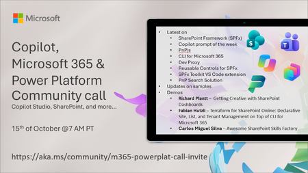
💡 Copilot, Microsoft 365 & Power Platform weekly community call focuses on different use cases and features within the Microsoft 365 and Power Platform - across Microsoft 365 Copilot, Copilot Studio, SharePoint, Power Apps and more. Demos in this call are presented by the community members. 👏 Looking to catch up on the latest news and updates, including cool community demos, this call is for you! 📅 On 15th of October we'll have following agenda: Latest on SharePoint Framework (SPFx) Latest on Copilot prompt of the week PnPjs CLI for Microsoft 365 Dev Proxy Reusable Controls for SPFx SPFx Toolkit VS Code extension PnP Search Solution Demos this time Richard Plantt – Getting Creative with SharePoint Dashboards Fabian Hutzli – Terraform for SharePoint Online: Declarative Site, List, and Tenant Management on Top of CLI for Microsoft 365 Carlos Miguel Silva – Awesome SharePoint Skills Factory 📅 Download recurrent invite from https://aka.ms/community/m365-powerplat-dev-call-invite 📞 & 📺 Join the Microsoft Teams meeting live at https://aka.ms/community/m365-powerplat-dev-call-join 💡 Building something cool for Microsoft 365 or Power Platform (Copilot, SharePoint, Power Apps, etc)? We are always looking for presenters - Volunteer for a community call demo at https://aka.ms/community/request/demo 👋 See you in the call! 📖 Resources: Previous community call recordings and demos from the Microsoft Community Learning YouTube channel at https://aka.ms/community/youtube Microsoft 365 & Power Platform samples from Microsoft and community - https://aka.ms/community/samples Microsoft 365 & Power Platform community details - https://aka.ms/community/home 🧡 Sharing is caring!136Views0likes0CommentsCopilot Extensibility community call - October 2026
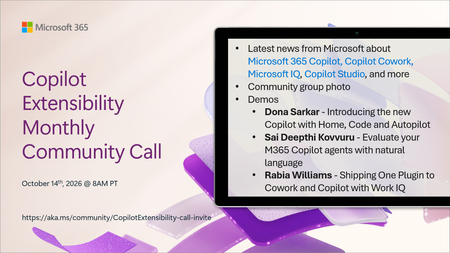
🚀 The Copilot Extensibility Monthly Community Call is a recurring virtual gathering designed to keep the global developer and maker community consistently connected, informed, and engaged with the latest advancements in Microsoft 365 Copilot, Copilot Cowork, Microsoft Scout, GitHub Copilot, Microsoft IQ, etc. and their extensibility ecosystem. 👏 Monthly Wednesday call is for all community members to see Microsoft PMs, engineering and Cloud Advocates showcasing the art of possible with the Microsoft AI technologies. 📅 On the 14th of October we'll have following agenda: News and updates from Microsoft Community group photo Dona Sarkar – Introducing the new Copilot with Home, Code and Autopilot Sai Deepthi Kovvuru - Evaluate your M365 Copilot agents with natural language Rabia Williams - Shipping One Plugin to Cowork and Copilot with Work IQ 📞 & 📺 Join the Microsoft Teams meeting live at https://aka.ms/community/CopilotExtensibility-call-join 🗓️ Download recurrent invite for this weekly call from https://aka.ms/community/CopilotExtensibility-call-invite 👋 See you in the call! 💡 Building something cool with Microsoft AI technologies (Copilot, Cowork, Copilot Studio, Microsoft IQ, etc)? We are always looking for presenters - Volunteer for a community call demo at https://aka.ms/community/request/demo 📖 Resources: Previous community call recordings and demos from the Microsoft Community Learning YouTube channel at https://aka.ms/community/youtube Labs and training material about Microsoft 365 Copilot Extensibility - https://aka.ms/copilotdevcamp Microsoft 365 & Power Platform samples from Microsoft and community - https://aka.ms/community/samples Microsoft 365 & Power Platform community details - https://aka.ms/community/home 🧡 Sharing is caring!204Views0likes0CommentsCopilot, Microsoft 365 & Power Platform product updates call
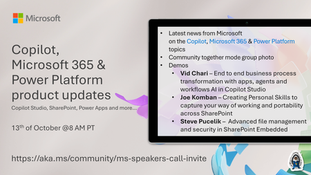
💡Copilot, Microsoft 365 & Power Platform product updates call concentrates on the different use cases and features within the Microsoft 365 and in Power Platform. Call includes topics like Microsoft 365 Copilot, Copilot Studio, Microsoft Teams, Power Platform, Microsoft Graph, Microsoft Viva, Microsoft Search, Microsoft Lists, SharePoint, Power Automate, Power Apps and more. 👏 Weekly Tuesday call is for all community members to see Microsoft PMs, engineering and Cloud Advocates showcasing the art of possible with Microsoft 365 and Power Platform. 📅 On the 13th of October we'll have following agenda: News and updates from Microsoft Together mode group photo Vid Chari – End to end business process transformation with apps, agents and workflows AI in Copilot Studio Joe Komban – Creating Personal Skills to capture your way of working and portability across SharePoint Steve Pucelik – Advanced file management and security in SharePoint Embedded 📞 & 📺 Join the Microsoft Teams meeting live at https://aka.ms/community/ms-speakers-call-join 🗓️ Download recurrent invite for this weekly call from https://aka.ms/community/ms-speakers-call-invite 👋 See you in the call! 💡 Building something cool for Microsoft 365 or Power Platform (Copilot, SharePoint, Power Apps, etc)? We are always looking for presenters - Volunteer for a community call demo at https://aka.ms/community/request/demo 📖 Resources: Previous community call recordings and demos from the Microsoft Community Learning YouTube channel at https://aka.ms/community/youtube Microsoft 365 & Power Platform samples from Microsoft and community - https://aka.ms/community/samples Microsoft 365 & Power Platform community details - https://aka.ms/community/home 🧡 Sharing is caring!136Views0likes0CommentsSharePoint AI innovations hit GA, powering new Copilot app and agents
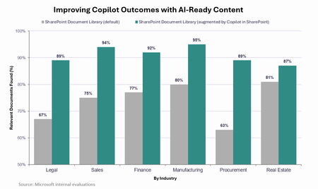
SharePoint AI innovations hit GA, powering new Copilot app and agents Today we announced the new Copilot app, bringing together how people assist, delegate, build, and automate work in one experience powered by Work IQ. Because Work IQ grounds these experiences in your work and organizational context, the quality and structure of knowledge behind them matters more than ever. The better that content gets, the better Copilot gets: in Microsoft evaluations, responses in the Copilot app improved by an average of 17 percentage points when the underlying content had been enriched and structured by Copilot. That’s why over the past year we’ve invested in Copilot’s content experiences and tools – both in the Copilot app and inside the content repository itself with the Copilot in SharePoint preview. In just the past month, millions of users have tried this preview, applying it to real-world challenges to translate complex content into tangible business value and accelerate their organization’s AI transformation.9.6KViews4likes3CommentsI built a free, open-source M365 security assessment tool - looking for feedback
I work as an IT consultant, and a good chunk of my time is spent assessing Microsoft 365 environments for small and mid-sized businesses. Every engagement started the same way: connect to five different PowerShell modules, run dozens of commands across Entra ID, Exchange Online, Defender, SharePoint, and Teams, manually compare each setting against CIS benchmarks, then spend hours assembling everything into a report the client could actually read. The tools that automate this either cost thousands per year, require standing up Azure infrastructure just to run, or only cover one service area. I wanted something simpler: one command that connects, assesses, and produces a client-ready deliverable. So I built it. What M365 Assess does https://github.com/Daren9m/M365-Assess is a PowerShell-based security assessment tool that runs against a Microsoft 365 tenant and produces a comprehensive set of reports. Here is what you get from a single run: 57 automated security checks aligned to the CIS Microsoft 365 Foundations Benchmark v6.0.1, covering Entra ID, Exchange Online, Defender for Office 365, SharePoint Online, and Teams 12 compliance frameworks mapped simultaneously -- every finding is cross-referenced against NIST 800-53, NIST CSF 2.0, ISO 27001:2022, SOC 2, HIPAA, PCI DSS v4.0.1, CMMC 2.0, CISA SCuBA, and DISA STIG (plus CIS profiles for E3 L1/L2 and E5 L1/L2) 20+ CSV exports covering users, mailboxes, MFA status, admin roles, conditional access policies, mail flow rules, device compliance, and more A self-contained HTML report with an executive summary, severity badges, sortable tables, and a compliance overview dashboard -- no external dependencies, fully base64-encoded, just open it in any browser or email it directly The entire assessment is read-only. It never modifies tenant settings. Only Get-* cmdlets are used. A few things I'm proud of Real-time progress in the console. As the assessment runs, you see each check complete with live status indicators and timing. No staring at a blank terminal wondering if it hung. The HTML report is a single file. Logos, backgrounds, fonts -- everything is embedded. You can email the report as an attachment and it renders perfectly. It supports dark mode (auto-detects system preference), and all tables are sortable by clicking column headers. Compliance framework mapping. This was the feature that took the most work. The compliance overview shows coverage percentages across all 12 frameworks, with drill-down to individual controls. Each finding links back to its CIS control ID and maps to every applicable framework control. Pass/Fail detail tables. Each security check shows the CIS control reference, what was checked, what the expected value is, what the actual value is, and a clear Pass/Fail/Warning status. Findings include remediation descriptions to help prioritize fixes. Quick start If you want to try it out, it takes about 5 minutes to get running: # Install prerequisites (if you don't have them already) Install-Module Microsoft.Graph, ExchangeOnlineManagement -Scope CurrentUser Clone and run git clone https://github.com/Daren9m/M365-Assess.git cd M365-Assess .\Invoke-M365Assessment.ps1 The interactive wizard walks you through selecting assessment sections, entering your tenant ID, and choosing an authentication method (interactive browser login, certificate-based, or pre-existing connections). Results land in a timestamped folder with all CSVs and the HTML report. Requires PowerShell 7.x and runs on Windows (macOS and Linux are experimental -- I would love help testing those platforms). Cloud support M365 Assess works with: Commercial (global) tenants GCC, GCC High, and DoD environments If you work in government cloud, the tool handles the different endpoint URIs automatically. What is next This is actively maintained and I have a roadmap of improvements: More automated checks -- 140 CIS v6.0.1 controls are tracked in the registry, with 57 automated today. Expanding coverage is the top priority. Remediation commands -- PowerShell snippets and portal steps for each finding, so you can fix issues directly from the report. XLSX compliance matrix -- A spreadsheet export for audit teams who need to work in Excel. Standalone report regeneration -- Re-run the report from existing CSV data without re-assessing the tenant. I would love your feedback I have been building this for my own consulting work, but I think it could be useful to the broader community. If you try it, I would genuinely appreciate hearing: What checks should I prioritize next? Which security controls matter most in your environment? What compliance frameworks are most requested by your clients or auditors? How does the report land with non-technical stakeholders? Is the executive summary useful, or does it need work? macOS/Linux users -- does it run? What breaks? I have tested it on macOS, but not extensively. Bug reports, feature requests, and contributions are all welcome on GitHub. Repository: https://github.com/Daren9m/M365-Assess License: MIT (free for commercial and personal use) Runtime: PowerShell 7.x Thanks for reading. Happy to answer any questions in the comments.5.4KViews2likes4Comments