Forum Discussion
histogram for a frequency
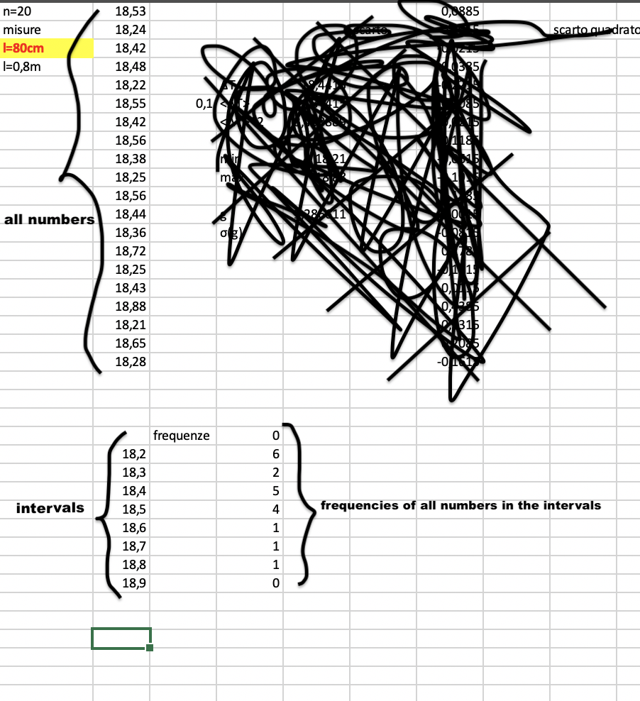
Good Morning, in my worksheet I have a series of numbers of which I have successively calculated their frequency in a series of intervals, but then I wanted to create the graph, in which in the ordinates I would have put the numbers from 1 to 10, while in the abscissas I would have put the numbers that I had previously found, only that when I select the data I can't understand how to go on, below I leave the photo of my worksheet, thanks for the answers
pier
(p.s. sorry for my English)
7 Replies
- Riny_van_EekelenPlatinum Contributor
Pier_The_Excelman Perhaps the attached workbook can point you in the right direction. It contains a histogram of a list of random numbers between 18.2 and 18.9, just like in your example, where each bin spans an interval of 0.1.
 Pier_The_ExcelmanCopper Contributor
Sorry to bother you, but do you know how to do more than three intervals? Riny_van_Eekelen
- Riny_van_EekelenPlatinum Contributor
Pier_The_Excelman No problem! I guess that the histogram defaults to three bins in your case. Right-click on the data series and select "Format Data Series...". Here you can specify the bin settings. Set "Bins" to Bin width (i.e. not Auto) and set "Bin width" to 0.1 to set your interval.
- Pier_The_ExcelmanCopper Contributor
Riny_van_Eekelen amazing, thank you very much!