Forum Discussion

OneNote To Do tag changed to a radio button
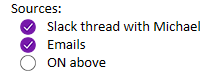

The screenshots show OneNote changed the built-in To Do tag from a square checkbox to a circular checked control resembling a radio button. Its behavior has not become radio-button behavior: Microsoft still documents To Do as an interactive tag that can be checked independently, and Ctrl+1 applies or clears it. The circle is a presentation change, not mutual-exclusion logic. Test three tagged lines and confirm selecting one does not clear the others; that distinguishes semantics from the icon. Microsoft documents no supported preference for restoring the square glyph. A custom tag can approximate the old appearance, but may not preserve every built-in To Do behavior or search grouping. If the ambiguity affects accessibility or training, use Help > Feedback and include both screenshots, OneNote version, platform, and update channel. Continue using the built-in tag where task searching and shortcuts matter, and describe the circle as a checkbox-style task control.

Agreed that the behavior hasn't changed, and that's exactly the problem. In UI design, the presentation of the visual control communicates the expected behavior before the user interacts with it, and as you said, OneNote changed it to a control "resembling a radio button." In so doing, they've introduced a mismatch between what the control looks like it will do and what it actually does. That mismatch constitutes a UX error. The icon isn't decoration. It's a signal to the user.