Forum Discussion

Spacing on stacked bar charts
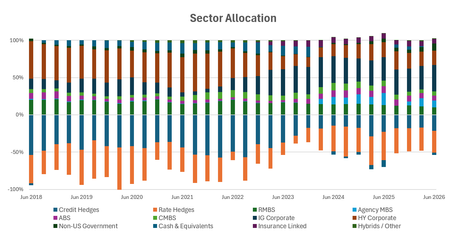

Played around a bit with your problem and some random number series. Please try the following:
Step 1: Set the x-axis to a Date axis with Auto bounds and both Major and Minor Units to 1 Month. Your dates are already quarterly. What other quarterly grouping would you want? (Note I'm set to European date format dd/mm/yyyy).
Also set a custom label format to mmm-yy.
The chart will look like this:
Step 2: Now switch the axis type to Text and choose the Overlay and Gap Width that suits you. I took 100% and 15% respectively. The chart then looked like this.
Fiddling with the Min and Max bounds (Step 1) causes the chart to be compressed into the left part of the chart area, after switching to a Text type axis.
Can't explain why. Sorry.
Perhaps better to Unpivot the data first with Power Query and then load to a Pivot Chart. Without changeing too much in the default settings, you can create something like this:
 Excellerator1Jul 22, 2026Copper Contributor
Thank you for taking the time to make a meaningful reply. I will try this in a couple days when I am done with meetings - but your chart looks good and I will try to replicate the success.