Forum Discussion

Spacing on stacked bar charts
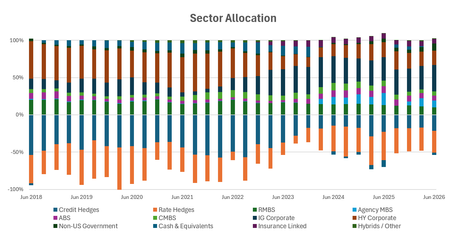

Hi, Excellerator1. The date axis is preserving the actual time gaps between your dates, so if there are missing dates or uneven intervals, you'll end up with extra white space. If your goal is simply to compare values by month, a text axis is usually the better choice, but make sure the source data is sorted chronologically and the labels are true dates (or consistently formatted text).
 Excellerator1Jul 16, 2026Copper Contributor
Hi Henry,
I can confirm - as the screenshots above attest to that there are no gaps between the dates and the intervals are all even.
I think I found the source of the issue/glitch/missing feature: Excel only lets you toggle between days, months, and years for the intervals, not quarters - which is a very common interval in finance or any public business (since financials are reported on quarterly.) Is there a way we can contact someone at Microsoft to add in a Quarterly feature to the below drop down? In this case, Excell thinks there are 2 missing month between each quarter when there really is not. The text axis thing just plain does not work, the data is sorted chronologically with the same format - so that doesn't seem like a relevant path to go down.