excel
43987 Topics
Excel 2016 copy/paste issue is back after KB5002934 update
Is anyone else experiencing copy/paste issues in Excel 2016 after the KB5002934 update? We're seeing this issue on workstations across our organisation. What's frustrating is that this is the same issue we encountered before, which was supposedly fixed in a previous update. Now it's back, barely a few weeks later. For now, we're using an uninstall script to temporarily remove the update from affected workstations. However, this isn't a reliable long-term solution because Windows Update will push the update again. Is anyone else experiencing the same thing? Has Microsoft provided any explanation for why this issue keeps coming back? Has anyone found a more permanent solution that doesn't involve repeatedly uninstalling the update? I'd like to know if other organisations are dealing with this and how they're handling it.26Views0likes2Comments
Formatting depending upon results form a vstack
I have a dynamic VSTACK being displayed. I want to format an adjacent cell in each line of the VSTACK with a boarder that appears or disappears according to changing number of rows in the VSTACK. I would appreciate any help in achieving this.118Views0likes5Comments
Can't edit cells in Excel 2010 since Sept 2026 patch Tuesday
I can't edit cells in Excel 2010 spreadsheets since Sept 2026 patch Tuesday. How do I reverse this back to the former working software. There was one comment that said it might be caused by a Windows 10 security update. Since Windows 10 isn't supposed to get security updates anymore, how can that be an issue? Ron48Views0likes1Comment
copy paste issue in excel 2016
Dear Team, the copy paste issue comming since yesterday 14 oct 2016 after updating security update kb5127648 and security update for microsoft excel 2016 kb5002934, if i copy any cell from sheet2 and paste it on sheet1 it work well but if copy any cell from sheet1 and paste on the other sheet or on the same sheet is not performing while it paste normaly in notepad file, also copy anything from notepad and paste in the sheet1 is work well71Views0likes1Commentcopy paste issue in excel 2016
Dear Microsoft Team, We have been experiencing a copy-paste issue in Microsoft Excel since 14 October 2026, following the installation of Windows Security Update KB5127648 and Microsoft Excel 2016 Security Update KB5002934. The issue is specific to Sheet1 in the affected Excel workbook. The observed behavior is as follows: Copying any cell from Sheet2 and pasting it into Sheet1 works correctly. Copying any cell from Sheet1 and pasting it into another sheet or even within the same sheet does not work. No action is performed, and no error message is displayed. Copying content from Sheet1 and pasting it into Notepad works correctly. Copying text or content from Notepad and pasting it into Sheet1 also works correctly. Based on these observations, the issue appears to be specific to copying cells from Sheet1 rather than a general clipboard malfunction. Kindly investigate this issue and advise on a permanent resolution, as it started after the installation of the aforementioned security updates.156Views0likes1CommentVlookup to multiple columns
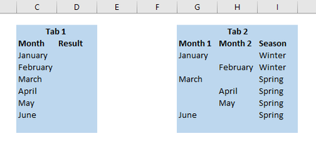
Hello! I was wondering if there was a formula to do a vlookup referencing 2 different columns? In the below example I have 2 tabs of data; on tab 1 I want to do a vlookup based off of column C however on Tab 2 the "month" can be found in either column G or H. Is there a formula that says vlookup column c and look to column G and H and return the result of I? Thank you!56KViews0likes5CommentsExcel 2016 & 2019 - Conditional Formatting Affecting Pasting with Formats
As of this week, I'm having a problem with conditional formatting preventing me from pasting copied cells with any paste options that include formatting. This issue is occurring on three Win 10 and 11 computers with Excel 2016 and/or Excel 2019. For example, I can open a new excel workbook, input data into cells, format the cells and then copy and paste to new cells with the formatting pasted. But if I add conditional formatting anywhere in the sheet, I cannot paste any cell (with or without the conditional formatting) when formatting is included in the paste option is included. For, example, I can paste-values, paste-formulas, but not regular paste or paste-formatting. If I clear the conditional formatting from the sheet, the problem still exists. However, if I clear the conditional formatting from the sheet, save the file and then reopen it, the pasting of the formats gets restored. A similar issue occurred a few windows updates ago and I rolled back the update for excel and/or applied the patch KB5002914. But this is a new issue and that patch doesn't work -- the message I receive is that "The update is already installed on this system". Is this happening to anyone else? Is there a solution to fix this behavior in excel with conditional formatting? Thanks!104Views0likes2Comments
Pivot Table sorting is not working. Name are sorting like month names.
I have a pivot table with Names and Data for each name. I select the LastName column as the first Row in the pivot table. Excel sorts the name March to the top of the list thinking it is a data with the month of March. I have made sure there are no hidden characters, turned off custom sort lists. Nothing works. This is a serios issue because if I need data for Mr March and scroll down to where it should be, I would conclude ther is no data for him. This should work as expected and not have to try some work around like i was an IT expert. Nothing has worked even applying the knowledge I have about programming. Any ideas?Solved107Views0likes5Comments