Forum Discussion
Seeking help to create a bar chart where the bar changes colour when low, med or high
Hey all, I'm using Excel on Mac and am seeking to replicate a file I've been given. It has bar charts that are red when in the low category, green when med and blue when high. The bar just changes colour. How could I make this happen please? Thanks so much for assisting:)
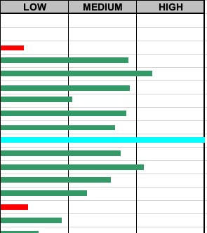
down-to-earth This requires a few extra steps by which you dynamically categorise each value in the groups for Low, Med or High. Then you create a stacked bar chart of the three series and format each series to the desired colour. See attached for an example chart.
3 Replies
- Riny_van_EekelenPlatinum Contributor
down-to-earth This requires a few extra steps by which you dynamically categorise each value in the groups for Low, Med or High. Then you create a stacked bar chart of the three series and format each series to the desired colour. See attached for an example chart.
 down-to-earthCopper ContributorThanks Riny, fantastic- this was extremely helpful and exactly what I needed to know. THANK YOU SO MUCH! :). My apologies for my delayed reply I was unwell last week so had to take time out. Thanks, this is most helpful. 🙂
- Riny_van_EekelenPlatinum Contributor
down-to-earth You're welcome!