Forum Discussion
MS Office 2016 Charts.
Dear,
I am from Belgium, and normaly i speak in the dutch language.
But i will try to explain me as well.
I have 2 problems:
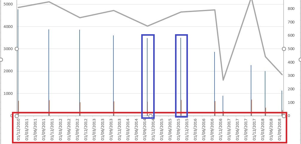
1) In my spreadshead i have data, as you can see below in Appendix named "bron".
When I create a chart of this data see my chart look like
attached with red border. How come that all these dates see?
2) The columns in my chart are thin sticks, I want the normal columns where I can insert a (vertical) value. See annex with blue edges.
3 Replies
Hi Rolle_007,
if I understand you well and you are meaning a chart like shown in the image below, then changing the axis type to Text axis should work.Best,
Mourad
 Rolle_007Copper Contributor
Hello Mourad,
Thank you for these informations, and i did it with succes !!!!!
Rolle.
- EricStarkerFormer Employee
I'm moving this to the Excel space for better visibility.