Forum Discussion
How to come up with the percentage and chart?
Thanks much! @mathetes
So I've attached my spreadsheet (thanks for pointing that out) and created a new sheet (sheet2) based on the info you advised.
I think it's starting to make more sense now. I just started to learn excel, so I will need to review more materials to get a better understanding of pivot table (I just know that pivot let's you rearrange, sort data in a much efficiently way but I haven't really used it before).
But as for charting, do you have any recommendation, of what I can do? I just want to show the audience the difference of impact per the system environment (version, hardware etc) using charts.
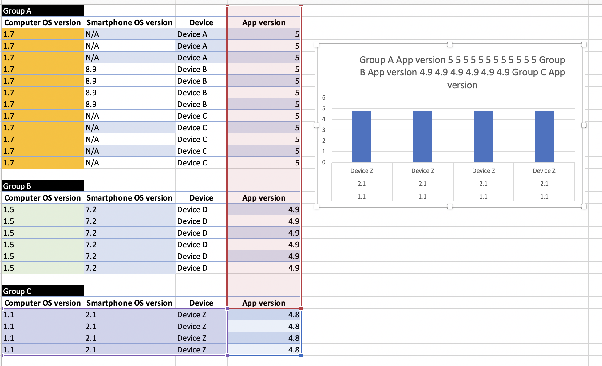
There are now two pivot tables on your last sheet here. And a graph. And a large text box describing what I did.
I really think you'll enjoy Pivot tables. You'll quickly see that Excel can work with a database such as you now have to do the kind of summary analyses that you were trying to do.
There are on-line resources that could help you learn the ins and outs of Pivot Tables. YouTube has, I've discovered, lots of very good resources.
Here, as well, is an on-line resource I've found helpful. https://exceljet.net/excel-pivot-tables