power bi
91 TopicsMGDC for SharePoint FAQ: How to use Excel for analytics
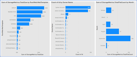
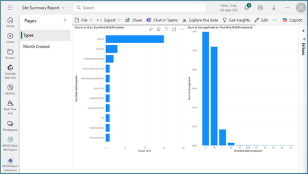
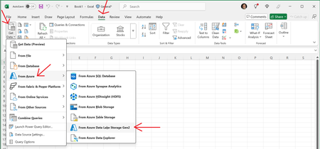
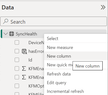
MGDC for SharePoint – Dataset types and features In this post, we’ll discuss how to use Microsoft Excel to consume the data from Microsoft Graph Data Connect (MGDC) for SharePoint. If you’re new to MGDC, get an overview at https://aka.ms/SharePointData. 1. Introduction In most examples on how to analyze the data from MGDC for SharePoint, we use Azure Synapse in combination with Power BI Desktop, which is a very capable tool that can turn your data into coherent, visually immersive, and interactive insights. But keep in mind that, when pulling datasets from MGDC with Azure Synapse, the data becomes available in an Azure storage account as a set of JSON files. From there, you can use many different tools beyond Power BI. In this article, we will focus on how to read and analyze that data using Microsoft Excel. 2. Get the data into Azure storage The first step in the process is to get your data from MGDC. I have a blog post that describes that process at Step-by-step: (Synapse) Gather a detailed dataset on SharePoint Sites using MGDC. Section 1 if that blog shows how to setup the Microsoft Graph Data Connect and section 2 describes how to run an Azure Synapse pipeline to pull the data. If you complete these first two sections, you will end up with your SharePoint Sites data in Azure. You can skip section 3 of that blog, that describes how to get the data into a Power BI dashboard. You will replace that section with the information in this article, which takes the data to Microsoft Excel instead. 3. Bring the data from Azure storage to Excel Next, you need to bring the data in the JSON files from the Azure storage account to your Excel spreadsheet. Fortunately, Excel has the perfect set of tools to bring in that data. You should start with a blank spreadsheet. Select the “Data” tab in the ribbon and use the option to “Get Data”. Then select the option “from Azure” and choose “From Azure Data Lake Storage Gen2”. This will make sure that you’re getting the data in your ADLS Gen2 storage account. > Get Data --> From Azure --> From Azure Data Lake Storage Gen2 Next, you will need to provide the URL to the ADLS Gen2 storage. Provide the full path, with the container and folder in the format: https://account.dfs.core.windows.net/container/folder. The account name is in step 1d of the at step-by-step guide mentioned before. The container and folder names are in step 1f of the guide. You can also find the URL in the Azure Portal, under the Settings/Endpoints section of the storage account. Once you provide the URL and click OK, you will need to authenticate. Select the option to use the storage account key and type in the key you saved in step 1d of the at step-by-step guide. You can find the key in the Azure Portal, under the “Security + Networking” / “Access Keys” section of the storage account. Once you have typed the account key, click “Connect”. At this point, you want to click on the “Transform Data” button to filter for the specific files you want. This will open the “Power Query Editor” window, where you can apply specific steps to filter the data coming in. The easiest way to filter out the metadata files is to scroll right until you find the “Folder Path” column and filter that column for paths that do not contain the word “metadata”. > down arrow --> Text filters --> Does not contain... After that, you can scroll left to the “Content” column and click on the button to “Combine files”. After that, the query will pull in the content of the files and expand all the columns from the JSON. > Content --> Combine files Finally, you can click on the “Close & Load” button to bring the data into a sheet. & Load With that, you can play with the data in Excel. 4. Create PivotTables Once the data is imported into your Excel spreadsheet, you will be able to create data visualizations from it. The most interesting way to do this is to use Excel PivotTables. For instance, here’s a pivot table with storage (Storage Used) by site type (RootWeb.WebTemplate) on the different dates you pulled data (SnapShotDate). See the sample PivotTable below after some adjustments and formatting. 5. Tips Here are a few additional comments. Distinct types of authentication: As you might have noticed, there are multiple ways to authenticate to get access to the Azure storage account. In addition to using a key to the entire storage account as shown here, you could use Azure to grant specific permissions to a user and log in as that user. This will help restrict access to specific folders and grant limited permissions (like read-only). Create custom columns: To help with your data analysis, you might want to add a few custom or calculated columns. You can in many ways, including transformations in Power Query, formulas in the Excel sheet or in the pivot table itself. You can read more about it at How to create custom columns in Power BI (this says Power BI but applies to Excel as well). More than one million rows: If you’re using this to visualize data from the SharePoint Sites dataset, you are likely to have fewer than one million rows, which is the Microsoft Excel limit. If you’re one of the few tenants that will have more than one million sites or if you’re analyzing a larger dataset like Permissions or Files, you can only pull the first one million rows into a sheet. To overcome this, you can load the data into a model and use that to drive your pivot tables. You can read more about it at Loading CSV/text files with more than a million rows into Excel (this says text files but applies to JSON as well). 6. Conclusion I hope this post helped you understand how to use Microsoft Excel to pull JSON data from an Azure storage account used by MGDC for SharePoint. For more information, visit https://aka.ms/SharePointData.Information Oversharing v2 Template with Microsoft Fabric
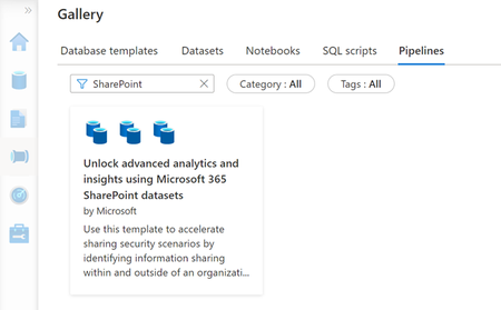
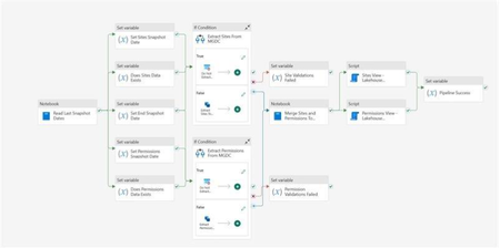
1. Security Scenario One of the most common scenarios for Microsoft Graph Data Connect (MGDC) for SharePoint is Information Oversharing. This security scenario focuses on identifying which items are being widely shared within the tenant and understanding how permissions are applied at each level. The MGDC datasets for this scenario are SharePoint Sites and SharePoint Permissions. If you’re not familiar with these datasets, you can find details in the schema definitions at https://aka.ms/SharePointDatasets. To assist you in using these datasets, the team has developed an Information Oversharing Template. Initially published as a template for Azure Synapse, we now have a new Microsoft Fabric template that is simpler and offers more features. The SharePoint Information Oversharing v2 template, based on Microsoft Fabric, is now publicly available. 2. Instructions The template comes with a set of detailed instructions at https://aka.ms/fabricoversharingtemplatesteps. These instructions include: How to install the Microsoft Fabric and Microsoft Graph Data Connect prerequisites How to import the pipeline template from the Microsoft Fabric gallery and set it up How to import the Power BI template and configure the data source settings See below some additional details about the template. 3. Microsoft Fabric Pipeline After you import the pipeline template, it will look like this: The Information Oversharing template for Microsoft Fabric includes a few key improvements: It uses the new UserCount and TotalUserCount properties in the SharePoint Permissions dataset, which means you do not need to pull the SharePoint Groups or the three Microsoft Entra ID Group datasets to calculate the number of users being granted access. This optimization will greatly reduce the cost to get a report of the sites shared with the most users. The new template also uses delta datasets to update the SharePoint Sites and SharePoint Permissions datasets. It keeps track of the last time the datasets were pulled by this pipeline, requesting just what changed since then. As the previous template, this one also flattens the SharePoint Permissions dataset, creating one permission row for each "Shared With" inside the permission. So, if a file is shared with three people, the SharePoint dataset will show one row, but the flattened data stored in Microsoft Fabric will show three rows. You can find details on how to find and deploy the Microsoft Fabric template in the instructions (see item 3). 4. Microsoft Fabric Report The typical result from this solution is a set of Power BI dashboards pulled from the Microsoft Fabric data source. Here is an example: These dashboards serve as examples or starting points and can be modified as necessary for various visualizations of the data within these datasets. The instructions (see item 3) include details on how to find and deploy a few sample Power BI Information Oversharing templates. 5. Conclusion I hope this provides a good overview of the Information Oversharing template for Microsoft Fabric. You can read more about the Microsoft Graph Data Connect for SharePoint at https://aka.ms/SharePointData. There you will find many details, including a list of datasets available, other common scenarios and frequently asked questions.