MRTK3 represents a significant step forward in the maturity of our user interface design tooling in MRTK. Over the last year (and more) we've invested significant resources into modernizing our design systems for UI in mixed reality, as well as overhauling the component libraries and tooling for building out these UI designs in Unity. If you've had experience with MRTK in the past, you'll know that building beautiful, modern user interfaces for mixed reality applications has never been an easy task. High-quality volumetric UI requires unique tools and systems, and organizing all of it under a cohesive design language is even harder. Throughout the course of developing more mature design systems, we've run into and overcome several categories of UI tooling challenges with our existing setup, ranging from the human challenges (usability, workflow, keeping a large design team consistent) to the engineering challenges (layout engines, 3D volumetric interactions, analog input, rendering/shaders).
In the next generation of UI tooling for MRTK3, we've sought to significantly improve the developer experience with more powerful engineering systems, improve the designer experience with more modern design features, and improve the user experience with more delightful, immersive, and "delicious" microinteractions and design language.
Variant Explosion
In previous versions of MRTK, designing 3D UI often meant manual calculations, back-of-the-napkin math for alignments and padding, and a lot of hand-placed assets that couldn't respond to changes in layout or dimensions. Most of these limitations were due to the fact that the main way of building UI in MRTK2 didn't use the typical UI tooling available in Unity. Later versions of MRTK2 explored building 3D UI with Canvas and RectTransform layouts, but it was never the preferred/primary way to build UI in MRTK.
Internally at Microsoft, as we've built bigger and more ambitious applications for MR devices, we've hit the scale where we need more modern design tooling, workflows, and methods for managing highly complex UI layouts. When you have 100+ engineers, designers, and PMs, keeping design language and layouts consistent is a significant challenge! If we were still using the manual methods of aligning, sizing, and designing UI, we'd quickly hit a wall of hundreds of slightly misaligned buttons, off-by-a-millimeter issues, exponentially exploding numbers of prefab variants and assets... a true nightmare.
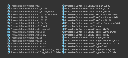
External customers of MRTK in the past might have experienced miniature versions of this problem, notably from the huge number of prefabs and prefab variants required to describe all possible configurations and sizes of UI controls. We had an exponentially-nasty number of variants, where we required variants for every permutation of button style, configuration, layout, and even *size*! (That last one was particularly frustrating...)
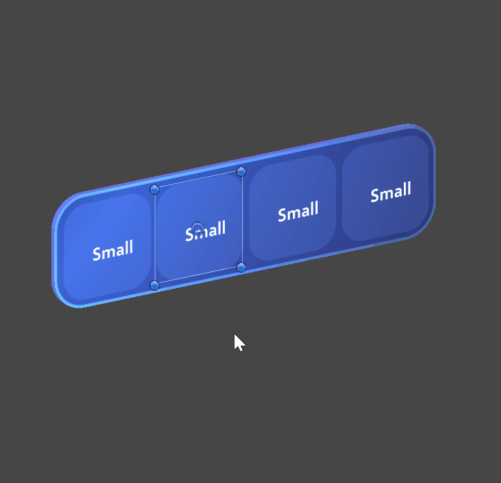
With MRTK3, we've drastically reduced the number of prefabs. Instead of needing prefab variants for sizes and configurations, we can use a single prefab and allow the user to freely resize the controls, add and remove their own sub-features within the control, and even expand button groups/lists/menus with dynamic layout.
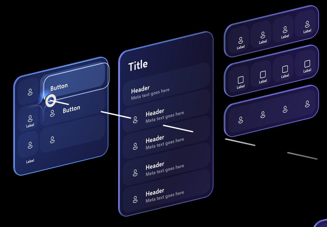
(Nearly) every button you generally work with in MRTK3 will be the same prefab. All UI elements are resizable and can be dynamically fit both to their surrounding containers and to the content they wrap. None of this is really an MRTK-specific invention; we're just ensuring that all of our UX is built to the same standards that Unity's own UI is built, with compatibility for all of the existing layout groups, constraints, and alignement systems.
Every single button you see on this UI tearsheet is actually, in fact, the exact same prefab:
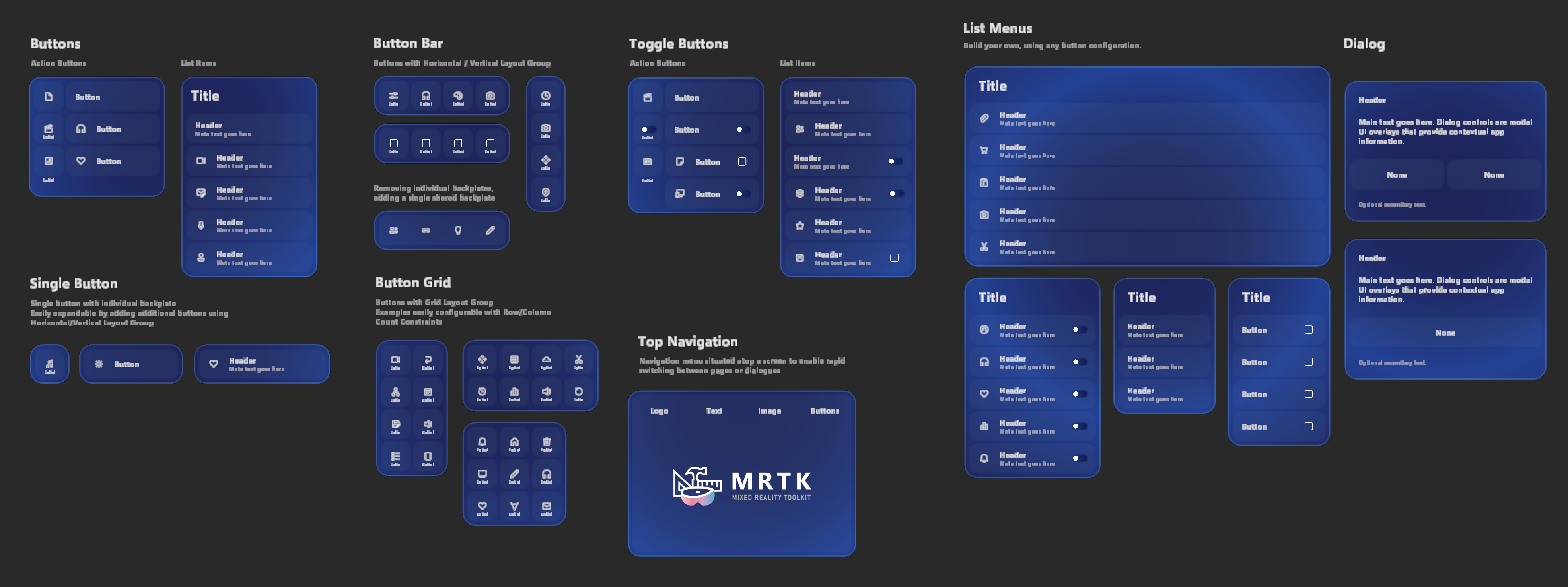
The speed at which designers can build UI templates is drastically accelerated. It's actually *fun*, now, to build UI in MRTK... simple building blocks, combined together, to form more complex layouts.
Measurements
Another problem with working with UI at scale is that there are very specific requirements from the design language/library for measurements, both for usability concerns (minimum touch targets, readability, etc) as well as design (padding, margin, corner radii, branding). This was one of the most critical areas where our design in mixed reality had departed from the typical workflow that most designers are used to in 2D contexts. In the past, we had not only specified everything in absolute coordinates without any sort of flex or alignment parameters, but we used physical, real-world units for everything. All UI was designed in millimeters; branding guidelines were in millimeters, margin, padding, gutter, spacing, all in millimeters. Even fonts were specified in millimeters!
This had some advantages: notably, we were working in a real, physical environment. UI in mixed reality isn't just some abstract piece of information on a screen somewhere; it's essentially a real, physical object that exists in the real, physical world! It must have a defined physical size with physical units, at some point in the development process. We also have very strict requirements for usability with holograms; we have user research telling us that certain touch target sizes (32mm x 32mm, or 24mm at the absolute smallest) is acceptable for performing 3D volumetric pressing interactions with our fingers.
However, this attachment to physical units also had drawbacks. Primarily, this is an alien working environment to typical front-end designers, who are used to non-physical design units like em, rem, %, vh, or “physical” units that aren’t even really physical to begin with (px, pt). Traditional 2D design has a concept of DPI, or screen density, as well; but in mixed reality, there’s a much closer relationship between design and the physical world. (I like to think about it as something closer to industrial design, or physical product design: you’re building real, physical affordances that sit on a real, physical object!)
The most direct drawback was that in this system of everything being specified in absolute physical units, there was zero room at all for scaling. In mixed reality, there are still some circustances where the entire UI layout or design should be scaled up or down; this is common when reusing UI layouts for faraway, large objects (or reusing UI layouts for near or far interaction!) For UI elements like stroke, outline, and corner radius, we use shader-driven rendering techniques. When these are specified only in absolute physical units (like, say, a "1mm" stroke, or a "5mm" corner radius), there is no way for these measurements to remain proportionally consistent with the rest of your design. If your 32mm x 32mm button is scaled up 5x, your 1mm and 5mm design elements will still remain 1mm thick and 5mm wide. They will be proportionally incorrect, despite being specified in absolute units.
This gets pretty confusing, but the core of the issue is this: without RectTransforms or Canvas, there is no such thing as a dimension. There is only scale. For elements like stroke, or corner radius, we had to specify them "absolutely" so that they were consistent across the scaling operations used to adjust their size and shape. However, when the overall UI layout needed to be scaled up or down, those absolute measurements would become proportionally incorrect.
Here, let's take a look at some visual examples to make this a bit less confusing. First, let's see what happens to a non-RectTransform-based Dialog control when we want to "scale it up":
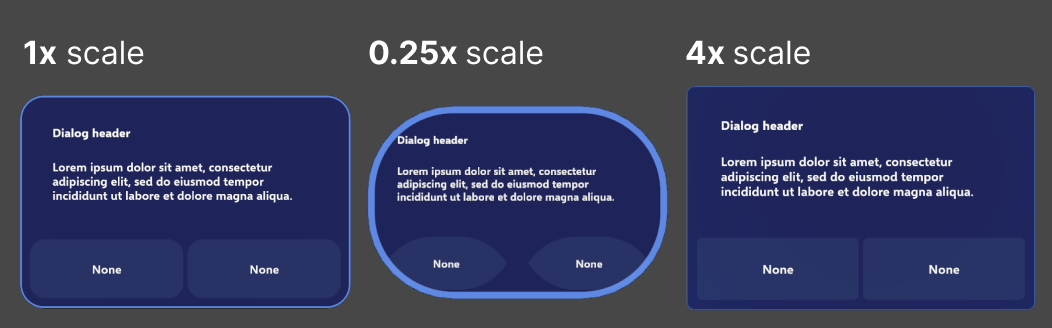
You can see that all of the strokes, corner radii, etc, that were absolutely specified in their physical units stayed "physically correct"; i.e., the strokes were always exactly 1mm. However, as the rest of the design scaled up and down, they became out of proportion!
You might say "just specify all of the elements as *relative* to the overall design scale... " The issue is that, without RectTransform/Canvas, there is nothing to be relative to! If everything is just scaling operations on top of scaling operations, there's no way to define any sort of true relative measurement. Every relative measurement would be relative to its parent, which would have any number of destructive scaling operations applied to it. There is no "root" of the design, and no "DPI" that could be used to specify a relative measurement unit.
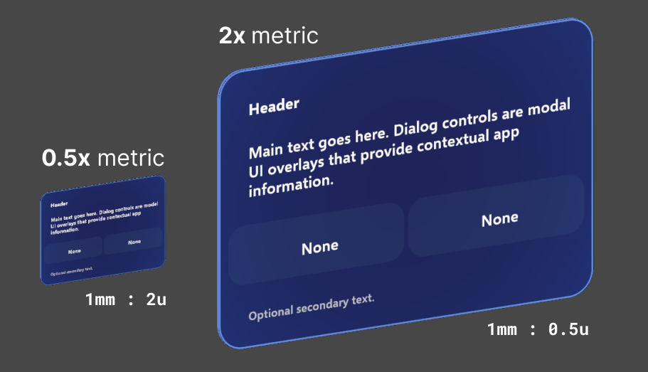
How do you solve this? The answer is non-physical design units, with a certain "scale factor" (similar to a display's DPI, except now we're applying this to the relative size of a hologram to the physical world!). Non-physical units and design scale factors are only possible with Canvas and RectTransform layout, where the Canvas itself serves as a "design root", and individual UI elements are not scaled, but instead sized.
UI is designed in an arbitrary, non-physical unit. Let’s call it u for now, for lack of a better name! (Internally, we generally call it px, but that’s quite the overloaded term… it’s not pixels, not on any actual physical device!)
We’ll also define a scale factor, or metric. MRTK3’s component library uses a 1mm to 1u scale metric by default, but other component libraries at Microsoft have used other metrics, like 1mm to 3u. In MRTK3, our trusty 32mm button is now measured 32u x 32u. At the default scale (of 1mm : 1u) we get our standard, recommended 32mm touch target! However, most critically, we also have the freedom to rescale our measurements whenever we want, so we can scale up and down entire designs while maintaining design integrity.
Here's a RectTransform-based Dialog control, showing how even when we scale it from 0.5x to 2x, all of the branding and visual elements remain proportionally correct.
Now, when designers build layouts in external tools like Figma, they can deliver redlines to engineers or tech designers that can actually be implemented! By using design units rather than physical units, along with powerful realtime layout, flex, and alignment systems, we can implement much more modern and robust designs without resorting to manual placement and napkin math.
Volumetric UI in a Flat World
Interacting with 3D user interfaces, while at the same time following traditional 2D interface "metaphors" like clipping and scrolling is difficult. Our UI controls in MRTK3 are fundamentally real, solid objects, with depth, volume, and thickness.
Containing these objects within UI metaphors like "scroll views" can be tricky; what does "clipping" look like in a volumetric context? Normally, UI has raycast/hit targets that are represented as 2D rectangles (or even alpha-tested bitmaps/hitmaps) that can overlay and intersect, and can be clipped by a 2D clipping rectangle.
With 3D volumetric UI, what does that even look like? Unity UI generally functions with image-based raycast hit testing, as described above; that generally doesn't cut it for our volumetric UI, as we need full, physicalized colliders for our 3D pressing interactions and free-form 3D layout. Colliders can't easily be "clipped" like an image-based raycast target, right?
As part of our effort to adopt existing Unity UI constructs like LayoutGroups and RectTransform hierarchy-based clipping, we've developed systems to clip volumetric UI and its corresponding physical colliders in a component-for-component compatible way with the existing Unity UI scroll view system. Colliders are clipped in a depth-correct (planar) way that allows 3D UI with thickness and volume to accurately conform to the bounds of a Unity UI scrollview/clipping rectangle, even when objects and colliders are partially clipped, or intersecting the edges of the clipping region.
In previous iterations of MRTK, we've simply enabled or disabled colliders as they leave the footprint of the clipping region. This resulted in users accidentally pressing buttons that were 90% invisible/clipped, and buttons that were still visible being unresponsive. By accurately clipping colliders precisely to the bounds of the clipping region, we can have millimeter-accurate 3D UI interactions at the edge of a scroll view. Even better, this is all based on the existing Unity UI layout groups and scroll components, so all of your scrolling physics remains intact, and is simultaneously compatible with traditional 2D input like mouse scroll wheels, multitouch trackpads, and touchscreens.
Input
Our 3D volumetric UI sits at the intersection of a huge number of input methods and platforms. Just in XR, you have
- Gaze-pinch interaction (eye gaze targeted, hand tracking pinch and commit), with variable/analog pinching input
- Hand rays, with variable/analog pinching input
- Pressing/poking with hand tracking (any number of fingers!), with volumetric displacement
- Gaze-speech ("See-It-Say-It")
- Global speech (keyword-based)
- Motion controller rays (laser pointer), with analog input
- Motion controller poke (same volumetric displacement as hands!)
- Gaze dwell
- Spatial mouse (a la HoloLens 2 shell, Windows Mixed Reality shell)
The list expands even further when you consider flat-screen/2D input...
- Touchscreen/multitouch
- 2D mouse
- Gamepad
- Accessibility controllers
- Keyboard navigation
Unity's UI systems are great at 2D input. They offer out-of-the-box touchscreen, mouse, and gamepad input. They even offer rudimentary point-and-click-based XR input. However, when you look at the diversity and richness of the XR input space we try to solve with MRTK, basic Unity UI input is unfortunately inadequate.
Unity UI input is fundamentally two-dimensional. The most obvious gap is with volumetric 3D pressing/poking interactions; sure, pointer events could be emulated from the intersection of a finger with a Canvas plane, but XR input is so much richer than that! Your finger can be halfway through a button, or your gaze-pinch interaction could be halfway-pinched, or maybe any number of combinations of hands, controllers, gaze, speech... When UI is a real, physical object with physical characteristics, dimensions, and volume, you need a richer set of interaction systems.
Thankfully, MRTK3 leverages the excellent XR Interaction Toolkit from Unity, which is an incredibly flexible framework for describing 3D interaction and manipulation. It's more than powerful enough to describe all of our complex XR interactions, like poking, pressing, pinching, and gazing... but, it's not nearly as equipped to handle traditional input like mice, touchscreens, or gamepads. Hypothetically, we could re-implement a large chunk of the gamepad or mouse input that Unity UI already provides, but that sounds pretty wasteful! What if we could combine the best parts of XRI's flexibility with the out-of-the-box power of Unity's UI input?
We do just that with our component library, in a delicate dance of adapters and conversions. Each MRTK3 UI control is both a UnityUI Selectable and an XRI Interactable, simultaneously! This gives us some serious advantages vs only being one or the other.
Our XRI-based interactors can perform rich, detailed, 3D interactions on our UI controls, including special otherwise-impossible behaviors like analog "selectedness" or "pressedness" (driven by pinching, analog triggers, or your finger pressing the surface of the button!). At the same time, however, we get touchscreen input, mouse input, and even directional gamepad navigation and input as well, without needing to implement any of the input handling ourselves.
We achieve this by translating incoming UnityUI events (from the Selectable) into instructions for XRI. The XRI Interactable is the final source of truth in our UI; the only “click” event developers need to subscribe to is the Interactable event. However, using a proxy interactor, we translate UnityUI events (like OnPointerDown) into an equivalent operation on the proxy interactor (like an XRI Select or Hover). That way, any UnityUI input, such as a touchscreen press or gamepad button press, is translated into an equivalent XRI event, and all codepaths converge to the same OnClicked or OnHoverEnter result.
The flow of how these events get propagated through the different input systems and interactors is detailed in this huge diagram... feel free to open in a new tab to read closer!

What this means for your UI is that you can use the exact same UI prefabs, the exact same events, and the exact same UI layouts across a staggeringly huge number of devices and platforms, all while retaining the rich, volumetric, delightful details that MRTK UX is known for.
Wrap-up
This post could go on for several dozen more pages about all of the new MRTK3 UX tooling and features… but, the best way to explore it is to go build! https://docs.microsoft.com/windows/mixed-reality/mrtk-unity/mrtk3-uxcomponents/packages/uxcomponents/button, and learn how to set up your own new MRTK3 project https://docs.microsoft.com/windows/mixed-reality/mrtk-unity/mrtk3-overview/setup Alternatively, you can directly check out our sample project by cloning this git repository at the mrtk3 branch https://github.com/microsoft/MixedRealityToolkit-Unity/tree/mrtk3.
In the future, I’ll be writing some more guides, teardowns, and tutorials on building volumetric UI with the new tooling. In the meantime, you can https://www.youtube.com/watch?v=g2HF5HMy-2c, where I go over most of the topics in this post, plus a breakdown of building a real UI layout.
I hope you've enjoyed this deep dive into some of the new UI systems we've built for MRTK3, and we can't wait to see what you build with our new tools. Personally, I love gorgeous, rich, expressive, and delightful UI, and I can't wait to see all of the beautiful things that the community can cook up.