Guest post by Lucas Valtl , M.Sc Student at UCL.
About Me
My name is Lucas and I recently completed my master thesis (which is the topic of this post) for my M.Sc in Computer Science at University College London. Before that I graduated with a BSc in International Business from Maastricht University and worked at a venture capital fund in São Paulo and Berlin.
Introduction
Data visualisation is closely tied to the state of technological advancement. One of the first applications of automated data visualisation was made possible by the invention of cathode ray tubes (CRT) and emerged at the end of the 19th century: oscilloscopes were combined with CRTs to visualise an input signal as a 2-dimensional plot over time.
Since then, data visualisation has always been bound by the two dimensionality of the available display technology. This is about to change with the emergence of mixed reality holographic devices such as the Microsoft Hololens. In contrast to conventional display technology, the Hololens is able to plot data as a 3-dimensional hologram that is placed right in front of you.
This could have implications to the way that we use and see data. The additional dimension gives the viewer a much greater depth perception, allowing for differences in size to be perceived much more clearly. With this in mind, more data can be displayed at the same time because data points can be placed among three dimensions. More data simultaneously visualised in a comprehensible form could facilitate data analysis and pattern recognition.
In order to explore data visualisation in the context of mixed reality, I developed an application together with the University College London Hospital (UCLH) that allows you to visualise and manipulate multidimensional data on the Microsoft HoloLens.
Project Background
The Centre for Cancer Outcomes, which is the part of the UCLH responsible for analysing Cancer Data, is exploring ways in which the Hololens could improve their data visualisation and analysis efforts. The traditional data visualisation techniques used by the Centre for Cancer Outcomes are limited by the two dimensions a regular screen is able to display. In light of the three dimensional capabilities offered by the Microsoft Hololens, the team of the Centre for Cancer Outcomes was eager to explore how this new tool can help augment the benefit that their data analysis efforts have on their multitude of stakeholders.
Hence the goal of this project was to visualise cancer data (cancer waiting times data in specific) for the Centre for Cancer Outcomes. In order to do so, an application for the Hololens was built. In order to make this project more generally applicable, it was built to accept any data from the start, not just cancer waiting times data. Hence, it can be seen as a general purpose data visualisation tool.
Design and Implementation
In order to successfully create the required application several different tools were used. These are shown below.

The application consists of three interdependent components. One component handles the data importation and storage functions. Another component is responsible for plotting the data while the last one is responsible for grouping the data according to user defined dimensions. The logical flow of the application can be seen below.

Given that the data used for this project (cancer waiting times data) is best visualised as a bar chart, and that the bar chart is one of the most widely applicable chart types, it was decided to solely focus on bar charts as a visualisation device. In addition, given that the Centre for Cancer Outcomes uses a lot of excel data, it was decided to use CSV as an input file format. Further, JSON data is also accepted in order to allow for a more secure file format.
The Hololens is a fairly new device, as such not many libraries and frameworks exist for it yet. Therefore, most of the functionalities of the application had to be self-written. Only the CSV and JSON parsers were re-used, but the data storage, manipulation (grouping) and plotting functions are entirely proprietary.
Results
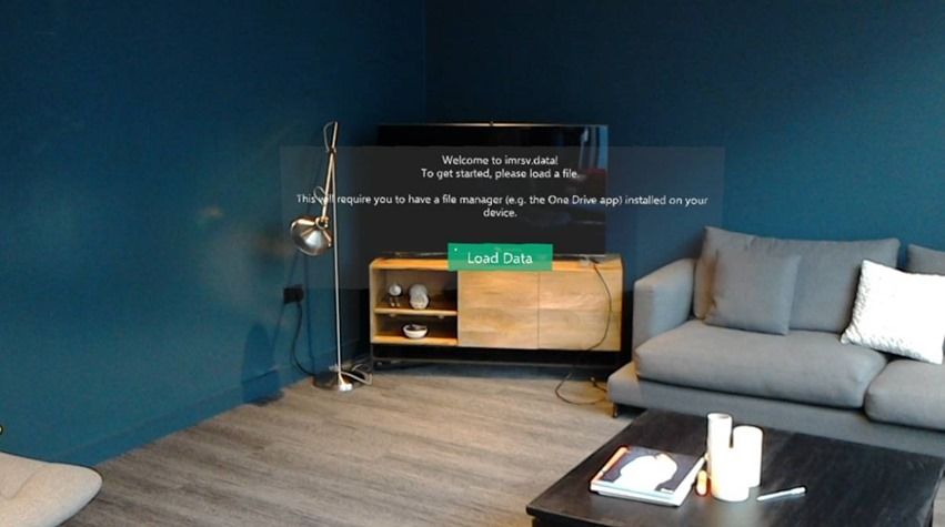
The resulting application is can be used to visualise any JSON/CSV file (given that it conforms to a certain format) as a 3-dimensional bar graph. The application can be seen in action below.


VIDEO
The application was shown to the Hololens UK team and after incorporating some of their feedback it has been submitted to the Microsoft Store. It can be downloaded under this link:
https://www.microsoft.com/de-de/store/p/imrsvdata/9msxxfl8hj21
Final Thoughts
Developing for the Microsoft Hololens has been an amazing and challenging experience. This project has shown me the potential of mixed reality and enabled me to sharpen my C#/Unity development skills. I really appreciate the chance to get feedback from Microsoft as well as showcase my work here on this blog.
 Microsoft