Forum Discussion
InPrivate theming
Hello Insiders! We've heard a lot of cool ideas and requests for themes in the browser but I wanted to start a discussion around InPrivate + Themes specifically. Theming refers to the color of the browser frame (tabs/favorites bar) and transient surfaces (right click menu, notifications). How would you expect themes to effect your InPrivate window frame and menus? Would you prefer themes from a regular browsing window to carry into InPrivate browsing? What are your thoughts on the current InPrivate theme?
The current theming experience for InPrivate is that the frame of the browser is dark regardless if you're in light or dark theme in a normal window. So if you're normally in a light mode and you open InPrivate, this is what you'd see:
Likewise, if you're normally in a dark mode and you open InPrivate, this is what you'd see:
Thanks for taking the time to give us your feedback and helping us build great experiences!
InPrivate team
Thank you to everyone's comments and feedback! I think we found some great ideas here that we'll be doing some design iterations and further testing on. Stay tuned, and if you have any other feedback about InPrivate or Edge, you can send us your thoughts through the browser at any time.
40 Replies
 Brian_MacAree-1Copper Contributor
Tabs of black against black background make the active tab very hard to see. This is very difficult if not impossible to distinguish especially for older, like me or eyesight disabled users. It effectively excludes these people from using the tab as an identifier. The function should not be prejudice against these groups. If the tab was red or had a border it could solve the problem.
 Jackie_TerreroCopper Contributor
I wish to change the them to light color I dont like the dark theme how do I change this?
 BillipCopper Contributor
ShirleyNg As per some comments below, I feel it would be useful to have the [InPrivate] marker moved to the front of the line for the respective page/tab/window. When a user has mutliple tabs open it is difficult to locate the InPrivate tab(s) quickly. Moving the marker to the front would assist with faster identification and location. Thank you.
 Michael-ParisCopper Contributor
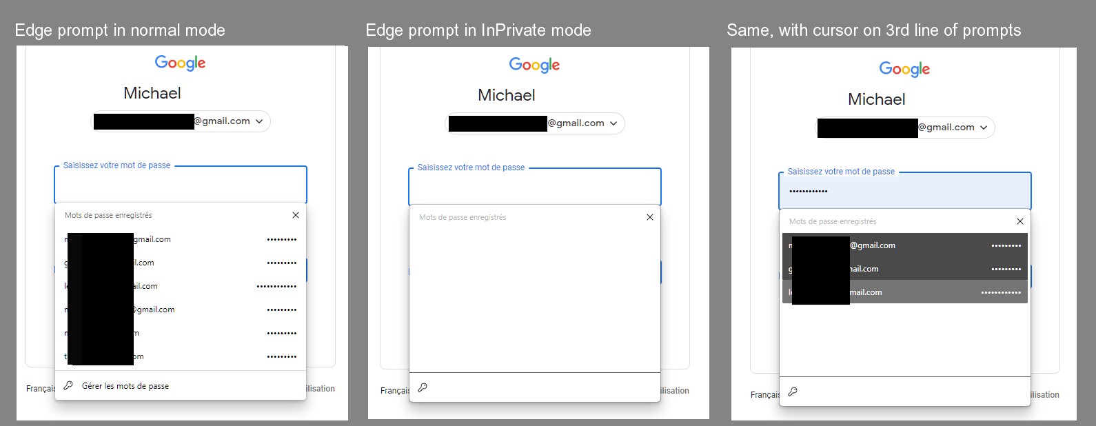
Sorry about this late comment, but I've had a nagging problem with the (relatively) new interface of InPrivate mode, and have been looking around it if had been addressed. Briefly: whenever I open in InPrivate mode a web site which requires identification, the popup windows showing the saved password(s) is white and the list of logins (and asterisks for the passwords) is totally or almost totally unreadable (white or very pale): I have to move the cursor over each entry to see it and then the full list gradually appears, This is not the case in normal mode (nor in other browsers (see screen shots); the list is immediately visible. Is there a way to fix it? My version of Edge is 96.0.1054.34 (64 bits).
- ShirleyNgFormer Employee
Michael-Paris Hey Michael thanks for the comment! This is addressed in our Canary channel now and will be in Dev shortly. I will discuss bringing the fix to other channels quicker with the team as well.
- Michael-ParisCopper Contributor
ShirleyNg Thanks, these are good news. Meanwhile, I got https://answers.microsoft.com/en-us/microsoftedge/forum/msedge_other-msedge_win10/edge-autofill-list-unreadable-in-inprivate-mode/2fc7b492-03e0-4633-96ef-8fb2002537ca?messageId=489fddc8-51b8-46e2-bd59-be49aad7bdbe which allowed me to correct this by changing the appearance (however, then the distinction between InPrivate and not InPrivate is not easily visible).
 LordKinderCopper Contributor
ShirleyNg Persona;;y I would like a contrast between normal and InPrivate but I find White and black too strong a contrast. Perhaps blue or green?
- ShirleyNgFormer Employee
Thank you to everyone's comments and feedback! I think we found some great ideas here that we'll be doing some design iterations and further testing on. Stay tuned, and if you have any other feedback about InPrivate or Edge, you can send us your thoughts through the browser at any time.
 CharlieManBrass Contributor
Question: We're all concerned about InPrivate here because it "looks the same" as regular mode. Is there no concern for accidentally just using the wrong profile in general?
(For example, if two people share a computer, or if you have a work profile installed and your employer can now monitor everything on it - a privacy concern I raised here.)
Why is this only an issue for InPrivate? Whatever works for one should work for the others. Maybe give each user a unique browser accent color.
 WolfIcefangIron Contributor
We've brought up "the chip" a lot, and I want to add a bit more about it.
#1: Chip color = Accent color. In Edge Legacy, the chip color was always blue, but everything in Edge was blue. In Chromium Edge, the Title Bar's color is determined by my Windows Accent Color, and I believe the color of the inPrivate chip (along with other parts of the UI) should play along with this.
#2: Incognito tabs are still tied to the profile of the window you opened them from, but the profile icon inside of the chip is always a faded version of the default profile icon, not my profile icon. I hadn't thought about this previously, but it's impossible to tell the difference between incognito tabs for two different profiles.
I believe that the user's profile picture should appear within the chip instead of a generic icon. People wouldn't want to save personal incognito favorites to their spouse's or work's profiles!
#3: I don't have any issue differentiating when the contents of the tabs in inPrivate mode are substantially different from normal mode. When the contents of my current inPrivate browsing tab is the same as the contents of my regular browsing window, and I am in dark theme, I can accidentally use the wrong window. (This has happened when testing Google Docs link settings). I believe a user-definable choice of in-private address bar accent color would be the best solution. (I am, like some others here, partial to dark purple, but do not want to speak for everyone when I say that.) ShirleyNg
- hussain5416Steel ContributorDark acrylic would be go for it for incognito
- pneenkoalabearSteel Contributor
I expect the app mode (dark or light) to carry over. So I want menus to be light in light mode. I like that currently the toolbar is dark without a theme in light mode as it differentiates them. Maybe themes could have both normal and InPrivate themes (if not already)? Maybe users could set separate themes for normal and InPrivate windows? I also dislike the prominent blue badge whose shape doesn't fit in with Edge.
The user profile button and incognito/InPrivate browsing badge used to be in the top left in the titlebar/tab strip before Chrome 69. Where the badge is positioned may lead people to incorrectly assume that is a new profile when it is not. This is a case for using the theme in InPrivate windows (current behaviour). A simple tweak would be adding which profile the incognito window is for to the popup.does this have any relevance?
https://bugs.chromium.org/p/chromium/issues/detail?id=915491