Forum Discussion

Why Metro design should make a grand return
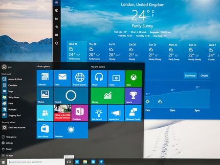

Totally agree, pixels are square... documents, photos and videos are rectangles, the OS is called Windows, not Portholes.
The only things I didn't like about Metro were the oversized truncated labels, touch spacing and the occasional button that didn't look clickable. The flat design, bold colors, squared corners, and emphasis on typography were all beautifully honest and brutally purposeful.
It somehow managed to be playful and serious at the same time without being ornate like Vista and Windows 7 or reminiscent of plastic children's toys with overly bold fonts an no sharp corners like XP and Windows 11.
Metro managed to be elegant and consistent without really trying, most UI elements in Windows "legacy" GDI applications were already squared off, all that was needed was to present them how they were designed originally.
I'm pretty sure it's not coming back, but it should.