Updated Feb 27, 2026
Version 4.0
AnavSilverman Microsoft
 MicrosoftMicrosoft

100% agree with the previous comment below:
This is a HORRIBLE "upgrade". Please provide the option to revert to the previous version.
The three Task/Attachments/Comments tabs mean we literally cannot see all of the information at once. Previously we simply had to nudge the scroll wheel on the mouse to see all of the information. Now we have to click a tab! Three tabs! And if we are a bit sleepy and forget what was on one tab, we have to re-select it instead of merely adjusting our gaze.
I fail to understand how ANY UX developer could think of this "upgrade" as helpful. Again, it is HORRIBLE.
Please stop trying to fix what isn't broken.
---
Planner was perfect as an easy to use, super functional task / mini project tracking system. If you wanted bells and whistles you bought and used Planner premium or project. What you've done to it makes it unusable for what it was great at. I used to be able to see all my in flight mini-projects across the team on one screen and within each project the status, checklist, attachments last comment in one view - super easy to get a 3 second view of the portfolio and of an individual project. Now its impossible to do either.
Just continuing Microsoft's track record of taking a great product in the productivity space and stuffing its function for the sake of form (here's looking at you To-Do as Wunderlists dirt-poor cousin).

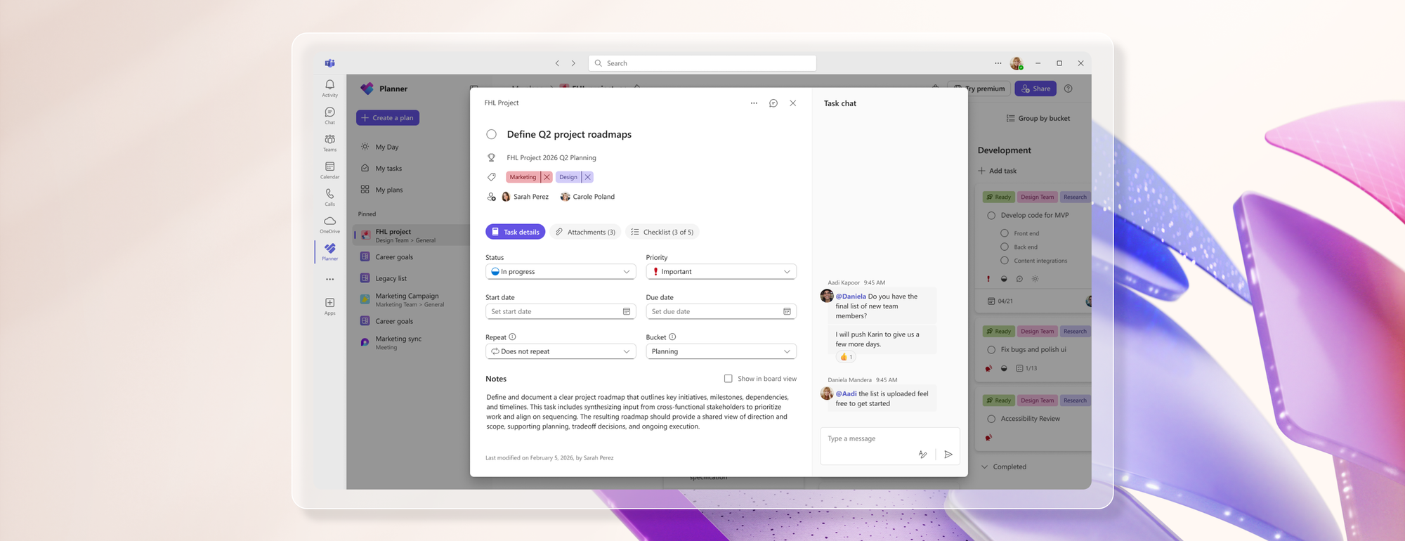
I had the same complaint about the three different tabs for Task/Attachments/Comments when I first got the update, but a day later it changed to just 2 tabs like shown below. I'm curious if others experienced the same change.

We just got the horrible "upgrade" yesterday afternoon and still have a comments section, but it only has comments from before the upgrade.

I see the same. I think the Comments tab only showed for tasks that had the old-style comments, you know, the ones it seems everyone wanted and had built automations around. For new tasks just two tabs, which seems to make tabs even less needed if there are only two.