Updated Feb 27, 2026
Version 4.0
AnavSilverman Microsoft
 MicrosoftMicrosoft

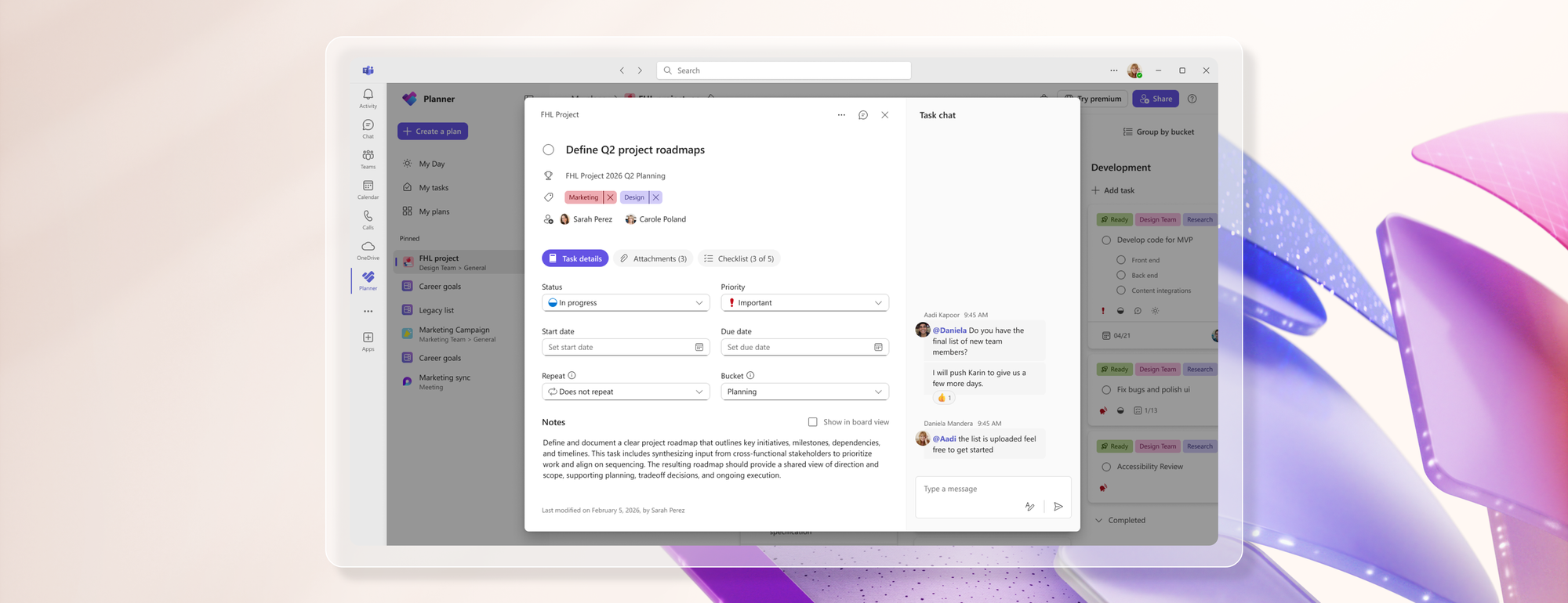
So instead of improving Planner, you turned it into an Easter egg hunt. The old card view showed the task, comments, attachments, and updates all in one place, at one glance. Now its a clicky mess.
And the comments section? It used to be a clean running log. Now it’s basically Teams group chat cosplay with @mentions flying everywhere.
I’m literally in the middle of designing and implementing a company-wide tracking system around Planner, and this update gets forced out with no opt-out, no legacy mode, and apparently zero user testing from anyone who actually uses Planner for real work.
AnavSilverman this update is hot garbage and zero customer consideration was given before rolling it out. I honestly might not use it anymore. Maybe i should @mention you in a task so you can see me commenting on an article you wrote.

WRONG

Wrong how? It's an opinion. And a good one that most users agree with.
just plain wrong mr richards
Insightful!
It's hardly an easter egg hunt relax