armchair architects
39 Topics
From Prompt to Production: Building Azure Architecture Diagrams with AI
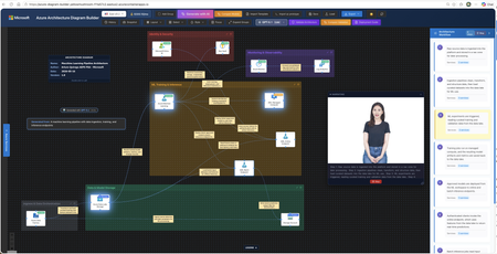
Author: Arturo Quiroga, Senior Partner Solutions Architect — Microsoft Cloud architects spend significant time translating ideas into architecture diagrams. They toggle between Visio, draw.io, pricing calculators, and documentation. According to the 2024 Stack Overflow Developer Survey, 61% of developers spend more than 30 minutes a day searching for answers or solutions, time lost to context-switching rather than design. What if you could describe your architecture in plain English and get a diagram, cost estimate, and deployment guide in minutes? The Challenge: Fragmented Architecture Workflows Designing Azure architectures today typically involves multiple disconnected steps: Sketch the architecture in a diagramming tool Look up official Azure icons and drag them into place Research pricing across regions using the Azure Pricing Calculator Validate the design against the Well-Architected Framework (WAF) Write deployment documentation and Infrastructure as Code templates Compare alternative designs manually Each step lives in a different tool, and keeping them in sync as designs evolve is costly. The Azure Architecture Diagram Builder brings these workflows together in a single browser-based experience. How It Works Describe your architecture in natural language, for example "A HIPAA-compliant healthcare platform with FHIR APIs, event-driven processing, and multi-region disaster recovery", and the AI generates a diagram with grouped services, data flow connections, and logical organization. Figure 1. Enter a natural-language prompt describing your architecture. Curated example prompts help you get started, and you can optionally upload an existing diagram for the AI to analyze. The tool uses Azure OpenAI to power generation across multiple models, enabling you to choose the model that best fits your scenario — from fast iterations to deeper reasoning. Key Features AI-Powered Architecture Generation Describe what you need in plain English, and the AI creates an architecture diagram with: 714 official Azure service icons across 29 categories Smart grouping: services are logically organized (Frontend, Backend, Data, Security) Data flow connections: labeled edges showing how data moves through the system 13 curated example prompts: from simple web apps to complex enterprise scenarios like Zero Trust networks, Industrial IoT with 5,000+ sensors, and global multiplayer gaming backends Figure 2. A generated industrial IoT architecture. Top: the clean diagram view as initially produced. Bottom: the same diagram with per-service monthly cost overlays toggled on, plus a running subscription total in the toolbar. Architecture Image Import Already have an architecture on a whiteboard or in a screenshot? Upload the image and let the AI analyze it, mapping services to official Azure icons and recreating the architecture as an editable, interactive diagram. Figure 3. Upload a photo of a whiteboard sketch (top-right reference panel) and the AI recreates it as an editable diagram with official Azure service icons and labeled data flow connections. ARM Template Import Import existing ARM templates to visualize your current infrastructure. The AI parses resource definitions and dependencies, groups related resources into logical layers, and produces a meaningful diagram of what you actually have deployed — a fast way to document an inherited environment or sanity-check a template before deployment. Figure 4. ARM template import in action. Top: the parser status banner while resources and dependencies are being analyzed. Bottom: the resulting diagram, with resources auto-grouped into logical layers (Web Tier, Data Layer, Container Platform, Observability & Logging) and a Generated from: ARM Template badge linking the diagram back to its source file. Well-Architected Framework Validation Validate your architecture against all five WAF pillars — Security, Reliability, Performance Efficiency, Cost Optimization, and Operational Excellence. The validator provides: An overall WAF score with pillar-level breakdowns Specific findings with severity levels Actionable recommendations you can select and apply Select the recommendations you agree with, and the AI regenerates an improved architecture incorporating those changes. Figure 5. WAF validation results showing the overall score, per-pillar breakdowns, and individual findings with severity badges. Tick the recommendations you want and the AI rebuilds the diagram with those changes applied. Multi-Model Comparison Run the same architecture prompt through multiple AI models side-by-side and compare: Architecture Comparison: service counts, connection counts, groups, token usage, and latency Validation Comparison: WAF scores across models, severity breakdowns, and finding counts Apply Winner: pick the best result and apply it to the canvas with one click Present Critique: a talking avatar narrates the AI-generated ranking with live closed captions Figure 6. Multi-model comparison. Top: select the models and reasoning effort, then enter the prompt. Bottom: side-by-side results across all selected models with service counts, latency, token usage, and Fastest / Cheapest / Most Thorough badges. Multi-Region Cost Estimation Get cost estimates from the Azure Retail Prices API across 8 Azure regions: East US 2, Australia East, Canada Central, Brazil South, Mexico Central, West Europe, Sweden Central, and Southeast Asia. Features include: Color-coded cost legend (green / yellow / red thresholds) SKU and tier information for each service Export options: CSV, JSON, plain-text summary, and an analysis report with top cost drivers, Reserved Instance flags, and a ranked multi-region comparison table Figure 7. The cost legend overlay shows per-service pricing with color-coded thresholds. The region selector in the toolbar lets you re-price the entire architecture in any of eight Azure regions. Deployment Guide Generation with Bicep Generate step-by-step deployment documentation including: Prerequisites and Azure resource requirements Step-by-step deployment instructions Bicep templates for each service (Infrastructure as Code) Post-deployment verification steps Security configuration recommendations Figure 8. Each generated Deployment Guide opens with the architecture name, an estimated deployment time, and a prerequisites checklist covering subscription roles, CLI versions, Microsoft Entra ID permissions, and region requirements, followed by numbered, copy-ready deployment steps. Figure 9. The Infrastructure as Code section produces a main.bicep orchestrator plus a per-service module (Log Analytics, Key Vault, Cosmos DB, SQL Database, Event Hubs, Azure Functions, and more). The Download All Templates button packages everything into a ready-to-deploy folder. Workflow Animation & Avatar Presenter Visualize how data flows through your architecture with step-by-step animations that highlight services on the canvas as each step plays. When the Azure Speech Service is configured, a photorealistic talking avatar can narrate the workflow or present model comparison results, with live word-by-word closed captions in a draggable, resizable panel. Figure 10. A workflow step is highlighted on the canvas as the Avatar Presenter narrates that step. Live word-by-word closed captions appear in a draggable, resizable panel, useful for accessibility and stakeholder demos. Export Options Figure 11. A single-slide PowerPoint export, available in dark or light theme, ready to drop straight into a stakeholder deck. Format Use Case PNG Documentation, presentations SVG Scalable vector graphics PPTX Single PowerPoint slide (dark or light theme) Draw.io Edit in diagrams.net JSON Backup, version control CSV / ZIP Cost analysis with multi-region comparison Highlights The Azure Architecture Diagram Builder unifies the architecture design lifecycle in a single tool: End-to-end workflow: from natural-language description to deployable Bicep templates without tool switching Official Azure icons: 714 icons across 29 categories, mapped directly from the Azure service catalog Live pricing: queries the Azure Retail Prices API at design time rather than relying on static estimates WAF-integrated validation: architectural best practices built into the design loop rather than applied after the fact Multi-model flexibility: choose the AI model that best suits each task, with fast models for iteration and reasoning models for complex designs Open source: the source code is available for customization and contribution One-Command Deploy with Azure Developer CLI The fastest way to get your own instance running is with azd : # Install azd (once) brew tap azure/azd && brew install azd # macOS winget install microsoft.azd # Windows # Clone, configure, and deploy git clone https://github.com/Arturo-Quiroga-MSFT/azure-architecture-diagram-builder cd azure-architecture-diagram-builder azd auth login azd env set AZURE_OPENAI_ENDPOINT "https://your-resource.openai.azure.com/" azd env set AZURE_OPENAI_API_KEY "your-key" azd up # Provisions infrastructure + builds + deploys (~8 min) azd up provisions the following via Bicep: Resource Purpose Azure Container Registry Stores the Docker image Azure Container Apps Runs the app (nginx + token server) Log Analytics + Application Insights Monitoring and telemetry Azure Speech (S0) Avatar Presenter (optional, keyless auth via managed identity) Try It Today The Azure Architecture Diagram Builder is available now: Live demo: https://aka.ms/diagram-builder Source code: GitHub repository Documentation: See the Getting Started Guide for detailed setup instructions We welcome feedback and contributions. Use the GitHub Issues page to report bugs, suggest features, or share your experience. Tags: artificial intelligence · application · apps & devops · well architected · infrastructure5.8KViews3likes4CommentsFrom Features to Flow: How Real-World Adoption Reshaped the Azure Architecture Diagram Builder
In May, I introduced the open-source Azure Architecture Diagram Builder as a way to move from a natural-language prompt to an Azure architecture diagram, cost estimate, Well-Architected assessment, and deployment guidance. In July, I shared how the project had become agent-ready through Model Context Protocol (MCP). Those posts described what the tool could do. The more interesting story came next: what happened when people actually used it. As adoption grew, the central product question changed. It was no longer simply, Can AI generate an Azure architecture? It became: How do we help an architect choose how to begin, improve a result without losing their work, validate it responsibly, and turn it into something another person can use? That question reshaped the Azure Architecture Diagram Builder from a collection of capabilities into a guided workflow: Create → Refine → Validate & Improve → Share or Build This post explains what we learned, what changed in the product, and why the hardest part of AI-assisted architecture is not the first diagram. It is everything that comes after it. TL;DR. Growing adoption created a feedback loop. Aggregate usage showed that people moved beyond generation into validation, recommendations, exports, and deployment guidance. Privacy-safe feedback revealed recurring problems with diagram integrity, preservation of human edits, cost credibility, export quality, and validation continuity. Those signals led to a four-stage architecture journey that keeps human judgment and professional review at the center. The same lesson now shapes agent access and the next product boundary: distinguish logical proposals from evidence-backed physical architecture. Adoption created a product feedback loop As of August 5, 2026, the first two Azure Architecture Blog articles had accumulated approximately 12,100 combined views. A refreshed view of deduplicated application telemetry through August 13 recorded: Activity Aggregate count Architecture generation and refinement events 5,023 Well-Architected validations 960 Recommendations applied 175 Diagram exports 2,020 Deployment guides generated 212 As of August 13, the public repository had reached 45 stars and 14 forks. In GitHub’s current rolling 14-day window, the repository recorded 277 unique visitors and 67 unique cloners. These numbers measure different things and should not be added together. Article views are not unique readers. Application activity uses anonymous telemetry identifiers, not verified people. GitHub traffic is a rolling aggregate window. The signals are useful because of the pattern they reveal, not because they can be combined into one headline user count. Activity also accelerated during the period following the second article. Compared with the May 19–July 9 baseline, daily activity from July 10 through August 13 was approximately 7.0 times higher for architecture generation and refinement, 5.6 times higher for Well-Architected validation, and 5.9 times higher for recommendation application. The timing coincided with publication; it does not prove that the article alone caused the growth. The important product lesson was simpler: people were not stopping after the first diagram. They were testing alternatives, validating designs, applying recommendations, exporting artifacts, and asking how to move toward implementation. Generation was the entry point, not the complete job. The first guided-journey signals reinforce the need for more than one starting path. Through August 13, the new journey instrumentation recorded 880 interactions from 174 anonymous identifiers across 241 sessions. At first start, structured brief/image generation and Guided Chat were selected at almost the same frequency (158 and 156 events), while template and live-Azure import added another 68 selections. These are interaction counts, not unique people or conversion rates, and the window is still too early to claim that the journey improves completion. They are enough to show that architecture work does not begin in one uniform way. In-product Start Here panel showing the four-stage Azure Architecture Diagram Builder journey: Create, Refine, Validate and Improve, and Share or Build. Figure 1. The in-product Start Here panel explains one complete architecture loop. The stages are recommendations, not gates, and direct access to every tool remains available. Stage 1: Create — make the starting choice explicit As capabilities accumulated, the first screen became harder to interpret. Architecture Chat and structured generation were both useful, but they competed for attention. Importing an existing architecture was available, yet easy to miss. The new starting experience makes three paths explicit: Starting path Best suited for Guided Chat Exploring requirements conversationally and refining them over multiple turns Generate Diagram Providing a structured brief or image and producing a first architecture quickly Import Existing Opening an existing architecture or infrastructure artifact for analysis and editing This is not a marketing landing page placed in front of the tool. It is a small decision point inside the authoring experience. Once a path is selected, the user lands on the real canvas. The distinction matters because different architecture tasks begin with different levels of certainty. Sometimes the architect knows the target services. Sometimes the problem needs discovery. Sometimes the architecture already exists and the work is to understand or improve it. The product should acknowledge those differences instead of pretending every design starts with a perfect prompt. Start chooser presenting Guided Chat, Generate Diagram, and Import Existing as three equal entry paths. Figure 2. Three starting paths reflect three different architecture situations: discovery, structured generation, and analysis of an existing design. Stage 2: Refine — preserve human work One of the clearest feedback themes was not about adding another AI capability. It was about preventing AI from casually undoing human effort. An architect might spend time arranging a one-page diagram for a review, resizing groups, moving labels, or emphasizing a specific boundary. A subsequent AI refinement could improve the service selection while disrupting that carefully prepared layout. The design principle that emerged was straightforward: AI acceleration should preserve deliberate human work by default. Refinement now retains existing node positions, group geometry, sizes, and viewport context whenever possible. The model can change the architecture without treating every turn as permission to redraw the entire document. The same principle applies beyond geometry: Preserve the prior validation result when recommendations change the architecture. Preserve the active light or dark theme in exported artifacts. Preserve the distinction between the authoring canvas and the presentation deliverable. Preserve user-configured pricing assumptions rather than replacing them with one fixed estimate. This is a broader lesson for AI-assisted tools. A generated result is not the only source of value. The edits, judgments, and communication choices a person adds afterward are part of the artifact too. Before-and-after AADB canvases showing an AI refinement that adds Azure Front Door and WAF while retaining the positions of eight existing services and the anchors of four existing groups. Figure 3. In this controlled synthetic refinement, all eight existing service positions and four group anchors remained unchanged. The containing Application group expanded to accommodate the new edge tier, so preservation does not imply that every group dimension stays fixed. Quality is structural, not only visual A diagram can look polished while still being architecturally confusing. Early feedback exposed cases where a generated service appeared disconnected because a model referenced a display name instead of the service identifier used by the canvas. The correction was not another prompt instruction alone. The application now resolves connection endpoints across identifiers, normalized service names, and service-type aliases. It repairs valid edges, drops invalid or self-referential edges, detects remaining orphan nodes, and records aggregate integrity signals. That creates a more useful definition of diagram quality: Are the services connected as intended? Were any generated edges repaired or dropped? Are there orphaned nodes? Did refinement preserve the existing layout? Did an architecture change receive a fresh validation? Visual polish still matters, especially when an artifact leaves the editor. But structural integrity gives the product something deterministic to test and monitor. Stage 3: Validate & Improve — treat validation as a lifecycle The Azure Well-Architected Framework is most useful when validation becomes iterative rather than ceremonial. The Diagram Builder can assess a proposed design across the five Well-Architected pillars, surface findings, and apply selected recommendations. But that workflow exposed an important state-management problem: when the architecture changed, the prior validation result disappeared along with the obvious route back to revalidation. The updated experience keeps the previous report, marks it Revalidate Needed, and makes clear that the score describes an earlier state of the architecture. A new validation replaces it only after the updated design has been assessed. This distinction prevents a stale score from looking current. It also clarifies what an architecture-level assessment can and cannot prove. A diagram may show that a WAF, cache, backup service, or secondary region exists. It usually cannot prove that purge protection, diagnostic routing, encryption settings, role assignments, health probes, or failover policies are configured correctly. That is why validation findings need to distinguish between: Pattern-level gaps — missing or misplaced architectural components Configuration-level gaps — required settings that must be verified in Infrastructure as Code or the deployed environment Generated scores and recommendations help architects review a design; they do not replace an Azure Well-Architected Review, security review, deployment validation, or professional judgment. Validation result retained after architecture recommendations are applied, with a Revalidate Needed status and action. Figure 4. Architecture changes make a previous validation historical, not useless. The result remains available while the interface clearly asks for a fresh validation. Stage 4: Share or Build — design for the artifact’s destination The editing canvas and the final deliverable serve different purposes. Canvas dots, handles, navigation controls, and selection states help during authoring. They can make an exported diagram feel unfinished. The Diagram Builder now separates those concerns with Plain, Dots, and Grid export backgrounds while preserving the active light or dark theme. The same AADB architecture shown first on the editing canvas with the export menu open and then as the resulting Plain PNG without authoring controls. Figure 5. Authoring and delivery are different contexts. The upper view shows the editable canvas and its real export controls; the lower view is the Plain PNG produced from that same canvas, without editing chrome. Cost language is deliberately qualified. Azure services often combine fixed, usage-based, and configuration-dependent charges. A baseline that includes six numerically priced services but excludes 20 usage-based items is not the total cost of the architecture. The output identifies those exclusions rather than treating missing values as zero. The final stage also includes deployment guides and Infrastructure as Code. Here, honesty about artifact coverage is essential. A generated Bicep file may be a useful starter while still omitting private endpoints, diagnostic settings, failover configuration, or service-specific resources. The artifact should state what it implements, what remains conceptual, and whether Azure Resource Manager validation passed. AI-generated diagrams, costs, validation results, deployment guides, and Infrastructure as Code should all be reviewed and validated before production use. The same journey now extends to agents The MCP server introduced in the previous article makes the Diagram Builder available to agent experiences such as Microsoft Scout. The four-stage journey provides a useful way to think about agent orchestration too: Import or create one canonical architecture. Refine it without silently changing the intended topology. Validate it, apply supported improvements, and revalidate. Render or generate artifacts with explicit coverage and limitations. The current MCP surface exposes 12 tools, three resources, and three reusable prompts. It can normalize an existing architecture, validate and harden it deterministically, estimate regional costs from a dated pricing snapshot, render presentation/technical/cost views, and generate Bicep, Terraform, and deployment guidance. The calling agent still owns orchestration and reasoning; the MCP server is intended to remain a deterministic architecture capability, not a second hidden agent. The native MCP renderer can project one canonical architecture into three communication profiles: Presentation emphasizes the primary request path, reduces supporting labels, and removes pricing. Technical preserves complete connection detail for engineering inspection. Cost retains the focused composition while adding service-level pricing assumptions, a fixed-priced baseline, and explicit exclusions. These are MCP-generated SVG views, not Blueprint diagrams or screenshots of the editable web canvas. The services, connections, and groups remain the same; only the information treatment changes. The AADB MCP renderer projecting the same canonical architecture into presentation, technical, and cost SVG profiles. Figure 6. Native AADB MCP output from one 8-service, 9-connection, 4-group architecture. Presentation prioritizes the story, Technical exposes connection detail, and Cost foregrounds pricing assumptions and exclusions. Recent work on the MCP renderer added purpose-built presentation, technical, and cost profiles. More importantly, testing agent-generated artifacts reinforced an accountability principle: a polished diagram and a compiled Bicep file do not prove deployability. An agent workflow should report whether topology changed, whether validation improved, which services are represented only conceptually, and whether the generated IaC passed Azure preflight. That is more useful than an unsupported claim that a design is production-ready. Trust also includes the tool boundary itself. The hosted MCP endpoints now require a bearer token for real session operations; missing or incorrect credentials are rejected. A shared token is appropriate for the current controlled integration, but it is not the end state for enterprise multi-user access. Entra ID/OAuth, per-client authorization, rotation, and revocation remain future hardening work. Microsoft Scout response after an authenticated Azure Architecture Diagram Builder MCP workflow, showing the tools used, initial and final validation scores, cost scope, Bicep classification, rendered architecture, artifact links, coverage gaps, and no-deployment warning. Figure 7. The guided lifecycle extends beyond the web application. In this synthetic Scout run with GPT-5.6 Sol, the agent used authenticated AADB MCP tools to validate, harden, cost, render, and generate starter artifacts while explicitly reporting coverage gaps and that nothing was deployed. Learning from adoption without identifying people Product learning does not require reconstructing individual identities. The findings behind this article use aggregate, deduplicated application telemetry, public article counters, public repository totals, and paraphrased feedback themes. They do not correlate Application Insights identifiers, feedback records, GitHub accounts, or email addresses. Written feedback remains submittable without contact information. When someone explicitly opts into follow-up, the email address is stored with the feedback record in Cosmos DB and is not sent to normal product telemetry. The current 180-day expiry field is a retention marker; automated deletion must be implemented and verified before describing that retention period as enforced. Those boundaries matter for both product design and public writing: Aggregate activity rather than profiling individuals. Paraphrase themes rather than publishing comments without permission. Keep optional contact consent separate from telemetry. Avoid presenting anonymous identifiers as confirmed people. Avoid claiming that publication timing proves acquisition causality. This is not a claim of legal compliance. It is a product discipline: collect less, preserve user agency, and make only the claims the evidence supports. What changed The guided journey is the visible result, but the deeper change is how the project now evaluates progress. Earlier question Better question Did the model generate a diagram? Did it generate a connected and understandable architecture? Did the user click Validate? Was the current architecture validated, and was it revalidated after changes? Did export start? Did a professional artifact finish generating successfully? Does the IaC compile? What does it actually implement, and does Azure preflight pass? How many features exist? Can an architect understand the next useful step? The model portfolio continued to evolve as well. The production selector now contains 15 configured entries, including MAI-Thinking-1 (Public Preview). But the more consequential changes in this article are deliberately model-independent: preserve human work, keep state and provenance explicit, qualify generated artifacts, and authenticate the tools agents can call. The goal is not to remove flexibility. Architects can still open any tool directly, rearrange the canvas, reject recommendations, change pricing assumptions, or export at any point. The goal is to make the workflow coherent without pretending architecture itself is linear. The next boundary: logical versus physical architecture Recent feedback points to a harder problem than adding another model or export format. Architects working with private Azure AI landing zones need to distinguish shared platform resources from project-owned resources, preserve VNet and subnet boundaries, and reason about CIDRs, NSGs, route tables, private endpoints, DNS, and managed identities. The current Topology mode can show services and relationships, but it should not imply exact physical fidelity when those facts are absent. A useful logical diagram answers what exists and how it interacts. A physical or low-level design must answer where it is deployed, how it is isolated, and which values came from evidence. That is the next technical direction I am exploring: an evidence-aware Physical Architecture view backed by deterministic reconstruction from Terraform plan/state, ARM, or a live Azure inventory. Exact fields would be labeled as observed or resolved; AI suggestions would remain explicitly proposed; unsupported or missing inputs would be reported instead of silently invented. This capability is not shipped today, and it will require its own schema, validation rules, layout, security review, and evaluation set. That distinction matters. The lesson from adoption is not to put every architecture concern into one crowded canvas. It is to make each artifact’s purpose and evidence boundary clear. Try it, challenge it, help shape what comes next The Azure Architecture Diagram Builder remains open source, and the live experience is available today: Live app: https://aka.ms/diagram-builder Source code: github.com/Arturo-Quiroga-MSFT/azure-architecture-diagram-builder Getting started: Documentation and deployment guidance The next phase is to measure whether the guided journey helps people complete the full loop, especially recommendation-to-revalidation and artifact-generation success. In parallel, I am beginning the narrower physical-architecture investigation described above. Both efforts will use aggregate signals, reviewed fixtures, and sufficiently large cohorts rather than individual journey reconstruction. Try the workflow with a real architecture problem. Tell me where the handoffs are unclear, where the diagram loses intent, or where an artifact claims more than it implements. Those are the gaps worth fixing next. Measurement note: Article views are rounded public counters observed August 5, 2026. Application figures use deduplicated retained telemetry through August 13 and anonymous identifiers. GitHub totals and rolling 14-day traffic were observed August 13. The comparison windows are May 19–July 9 and July 10–August 13. These signals have different populations and must not be added together. Timing comparisons show concurrent activity, not causal attribution.1.1KViews1like2CommentsCloud Native Platforms: Run
Audience: SREs (Site Reliability Engineers), platform engineers, engineering managers running production systems Reading time: 8 minutes Series: Cloud Native Platforms. Build, Run, Evolve. This is Part 2 of 3. Most systems are designed thoughtfully. Most operations are inherited reactively. The systems that survive are not the ones built with the most care. They are the ones operated with the most discipline. Production has a way of revealing every shortcut taken during design and every assumption left unverified. This post is about what it takes to operate a platform once the build is done. How they are run, not how they are built Systems are not defined by how they are built. They are defined by how they are run. A well-designed system that is operated reactively will fail in production. A modestly designed system that is operated with discipline will outperform it. Five operational disciplines decide which side of that line a platform lives on. Each one is engineering work, not a checklist for someone else to handle. Figure 1. The incident lifecycle as a state machine. The states are not optional steps. They are the contract between the team and the system. 1. Observability is the backbone of reliability Without observability, every operation becomes a guess. As systems grow, the cost of guessing rises faster than the cost of seeing. Part 1 of this series argued that observability is a design property: instrumentation contracts, request id propagation, structured logging schemas. Production is where those design choices either pay off or do not. Strong observability in production is a contract that lets any engineer answer three questions in minutes: what failed, why it failed, and what the impact was. The shape of that contract matters more than the tool that implements it. (This three-question framing is community-popularised through the SRE community and writers such as Charity Majors. See Honeycomb's What is Observability for the canonical articulation of the three-pillars and question framing; the substance is older than the framing.) Dashboards organised around user journeys, not infrastructure components Service level indicators (SLIs: the specific measurements you care about, e.g., success rate, p99 latency) chosen from the user's perspective, not the database's Alerts that page only on burn-rate against an SLO (Service Level Objective: the target value of an SLI, e.g., 99.9% of requests complete in under 800ms over a rolling month) using a multi-window strategy. A short window catches fast burns; a long window catches slow drifts. This is what makes SLOs operational rather than decorative. Sampling and retention tuned for cost, but never for blind spots The distinction between MTTA (mean time to acknowledge: how fast someone notices) and MTTR (mean time to restore: how fast service returns) tracked separately. Conflating them hides whether the team's bottleneck is detection, response, or fix. In practice The pattern that works: rebuild the operational view around two or three user journeys (sign-in, place order, view history) rather than per-component charts. Tie alerts to error budget burn rather than raw threshold crossings. Track MTTA and MTTR separately so the team's actual bottleneck (detection, response, or fix) is visible. The investment is rethinking what to measure, not buying a new tool. The return is that incidents stop being discovered by customer complaints first. Teams that make this shift typically find their existing telemetry was sufficient; only the questions being asked of it were wrong. If a dashboard cannot answer "what is the user experiencing right now", it is not an observability dashboard. It is decoration. 2. Alerts are signals, not notifications More alerts do not mean better monitoring. In practice, the opposite is true. Once alerts outpace the team's ability to act, important signals start getting missed. Effective alerting works to a small set of rules: Severity that maps to action, not to technical category Ownership baked in, never inferred at runtime Thresholds tied to user impact, not raw metric values Noise treated as a defect, with a regular review cadence Suppression and grouping for known multi-alert patterns In practice The pattern that works: audit every alert against one test, "what action would I take in the next five minutes if this fires now?" Demote alerts with no answer to dashboards. Remove alerts where the answer is the same as another alert's. Group related alerts so one incident produces one page, not twelve. Most teams discover their alert volume drops by an order of magnitude after a thorough audit, and the alerts that remain start getting trusted again. Trust is the precondition for every other operational practice. Without it, on-call rotations decay into noise filtering and the real signals get missed. Figure 2. From raw events to pages, in approximate orders of magnitude. The numbers vary by team and workload; what does not vary is that each stage needs to remove one to two orders of magnitude of noise. Teams that page on raw events end up with on-call rotations nobody trusts. 3. Incident response is a practiced muscle Failures are inevitable. Unstructured response is not. The teams that recover quickly do not improvise during incidents. They follow a structure that has been practiced when nothing was on fire. The structure is intentionally simple, because incident time is the worst time to negotiate roles. Clear roles: incident lead, communications lead, scribe, subject matter expert (the RACI model, Responsible-Accountable-Consulted-Informed, adapted for incident response) Defined escalation paths with clear handoff criteria. Escalation means re-paging to a higher tier or specialist, not returning to detection. The lifecycle diagram in Figure 1 makes the distinction explicit. Runbooks for the top failure modes, kept short enough to actually be read Status communication on a fixed cadence, even when there is nothing new to say. Customer comms and internal comms are tracked separately. Blameless postmortems (focus on the system that allowed the failure, not the person who pushed the button) that produce action items the team actually completes Game days: scheduled exercises that simulate failure modes (region outage, dependency unavailability, traffic spike) under controlled conditions, so gaps in runbooks are found before incidents do In practice The pattern that works: name the incident lead and the comms lead before the first message goes out. Write runbooks short enough to be scannable at 3 AM. Run blameless postmortems with action items that actually get tracked to completion. Schedule game days quarterly so the runbooks are exercised before real incidents. Teams that operate with this structure do not have more engineers; they have engineers who are not single points of failure during recovery. The deepest experts stay the deepest experts, but the platform stops depending on whether they happen to be online. Implementation note A short, well-structured runbook outperforms a long, exhaustive one. The goal during an incident is not to think. It is to act on a procedure that has been thought through in calmer times. # Runbook header pattern (keep it scannable in incident time) title: High latency on order API slo_protected: # this runbook protects two SLOs - order-completion-success - order-completion-latency severity: # derived from burn rate, not declared fast_burn: P1 # 14.4x budget burn over 1 hour => page now slow_burn: P2 # 6x budget burn over 6 hours => investigate owner: payments-team indicators: # triggers for evaluation, not severity - p99 (99th-percentile) latency exceeds the SLO target for 5 min - error rate exceeds the SLO target for 3 min on order-completion first_actions: - Open the order-journey dashboard. Confirm impact in business terms. - Check Service Bus queue depth and dead-letter rate (the most common cause of API latency under load is downstream backpressure) - Verify Cosmos DB RU/s saturation and partition hotspots - Inspect the most recent deployment for behavioural changes escalate_if: - Latency does not recover in 15 min - Error rate exceeds 5% (fast burn against the SLO) - Customer reports arrive before our own signals do rollback_path: - Feature flag "new-order-pipeline" can be disabled per-tenant - Last known good deployment id is in the release tracker note_on_scaling: # CPU is rarely the cause of latency in this service. Scale only after # confirming the bottleneck is compute, not a downstream dependency or # queue depth. Adding capacity to a saturated downstream amplifies the # incident; it does not resolve it. The general principle behind that last note travels beyond this runbook: scale-out is the right remediation for compute saturation, not for downstream saturation. When latency rises because a database, queue, or external dependency is saturated, adding capacity in front of the bottleneck moves more requests into the bottleneck and makes the incident worse. This is one of the most common operational mistakes when the dashboard shows red and the on-call instinct says "add more". 4. Release confidence is engineered Releases get harder as systems grow. The platforms that ship confidently at scale have engineered the path, not learned to fear it. The patterns that change the math: Feature flags that allow change without deploy Canary deployments (releasing the new version to a small slice of traffic first, watching error budget burn before continuing) that surface problems on a small slice Gradual rollouts with automated rollback triggers Database migrations split from application releases Release coordination that scales with services, not with team size In practice The pattern that works: every change ships behind a feature flag, canary deployments take a small slice of traffic first, and rollback is a one-click step in the pipeline rather than a procedure to be invented during an incident. The cost is the discipline of building rollback paths and exercising them. The return is releases that stop being events. Issues that previously triggered full rollbacks get isolated to a slice and rolled back automatically before they reach most users. The willingness to ship smaller, more frequent changes follows directly from the confidence that bad changes can be undone fast. Big releases feel safe because they are rare. They are actually risky because every change rides together. 5. Reliability is continuous, not a milestone Reliability is not achieved through tools alone. It requires continuous refinement, feedback-driven improvement, and a budget that the team can spend on operational work without negotiating each time. The disciplines that keep systems reliable over years are codified well in the SRE-book framing of service level objectives and error budgets (the canonical reference is the Google SRE Book chapter on Service Level Objectives, with the operational follow-up in the SRE Workbook chapter on alerting on SLOs). The names matter less than the practice they enable. SLOs chosen from the user's perspective, with two or three per service rather than ten. More SLOs means none of them shape behaviour. Error budgets: the inverse of the SLO, expressing how much unreliability the team is willing to spend in a window. Used up early in the month means slow down on releases. Healthy means feature work keeps moving. Multi-window burn-rate alerting turns SLOs from dashboards into pages: short window catches catastrophic failures, long window catches slow drift. Without burn-rate alerting, SLOs are observation, not operation. (The pattern is documented in the SRE Workbook.) Reliability work has its own backlog, prioritised against features. Not a wishlist after every incident. Regular game days that exercise failure modes (region failover, dependency outage, traffic spike) before they happen for real Capacity planning informed by data, not by anxiety In practice The pattern that works: define two or three SLOs per service, expressed from the user's perspective. Compute the error budget weekly. When the budget is healthy, ship feature work. When the budget is burning fast, slow down and fix the cause. The conversation about which incidents matter and which can wait becomes possible because there is a shared number to point at. Reliability becomes a quantified property of the platform, not an opinion debated at every retrospective. Teams that adopt this discipline stop having the recurring "how reliable do we need to be?" argument and start having data-grounded trade-off discussions instead. A scenario that ties it together A platform was launching a new region. The build had gone well. Day 1 was clean. Two weeks in, latency started creeping up during peak hours. Alerts fired on raw thresholds, but no one could tell which ones to trust. Incident calls turned into long debugging sessions because three different teams owned overlapping pieces of the request path. The team did not start by buying a new tool. They started by treating operations as engineering work. The dashboard was redesigned around the user journey. Alerts were audited and most were demoted or removed. Roles for incident response were written down. A short runbook covered the top failure modes. Releases were broken into canary slices behind feature flags. None of this was new. It was discipline applied consistently to work that was previously assumed to be someone else's. The next region launch took half the effort, and the team's mean time to restore on the failures that did happen was measurably lower. What teams get wrong The common pattern is treating Day 2 as the cost of Day 1. Teams design beautifully, ship fast, then quietly absorb the operational debt. Dashboards proliferate. Alerts grow louder. Postmortems pile up. The fix is not more dashboards. It is treating operations as engineering work with the same rigour as feature delivery. Operability is a property the system either has or does not. It is not earned by adding monitoring. It is earned by designing for visibility and operating with discipline. Where to start The most concrete starter from this post: an alert audit. List every alert that fires in the next week and apply a single test to each one: "what action would I take in the next five minutes?" Demote the alerts that have no answer. Remove the alerts where the answer is the same as another alert's. The audit takes a morning. The result usually halves alert volume and lifts trust on what remains, which is the precondition for every other operational practice in this post. The shift The most important shift in maturity is not technical. It is in stance. The shift is from shipping software to operating systems: Operations is not a phase that follows engineering. It is engineering. Reliability is not a milestone reached. It is a discipline practiced. Incidents are not interruptions to the work. They are the work. The teams that internalise this shift run platforms that are smaller, calmer, and more trusted. They do not have fewer incidents because their systems are more advanced. They have fewer incidents because their operational discipline is more consistent. Part 3 of this series argues that the same discipline applies again, in a different domain: the practices that make platforms operable are the practices that make AI useful in delivery. Want to discuss? What is the one operational practice your team adopted that changed how you sleep at night? Drop a comment with patterns you have seen in your environment. Every reply gets read. Previously in this series: Building Cloud Native Platforms That Scale: Patterns That Actually Work. The first post covered the design choices that make scale possible. Next in this series: AI-First Platform Engineering: From Copilot to Agentic Delivery. Cloud helped us scale infrastructure. The next post looks at how AI is now changing how we build and run platforms.Cloud Native Platforms: Build
Audience: Cloud architects, platform engineers, engineering leaders making design decisions Reading time: 8 minutes Series: Cloud Native Platforms. Build, Run, Evolve. This is Part 1 of 3. Most engineering teams can build systems. Few can scale them without rebuilding them. As platforms grow, complexity does not increase linearly. It multiplies across users, services, tenants, regions, and integrations. The systems that struggle and the systems that scale are rarely separated by which cloud they run on. They are separated by a handful of design choices made early and applied consistently. This post is about those choices. The differentiator is not the cloud Scalable platforms are not built with the right tools. They are built with the right design choices. Cloud services have closed the gap on infrastructure. The differentiator is no longer which managed service a team picks. It is whether the platform is designed to absorb change, tolerate failure, and support visibility from day one. Five engineering disciplines determine whether a platform scales gracefully or collects technical debt while it grows. Figure 1. The five disciplines compound into platform scale. Any one neglected becomes the constraint that forces a rewrite later. 1. Flexibility is the foundation of scale Hard-coded systems work until they do not. The first request to add a tenant, a region, a SKU (a sellable product variant), or a regulatory variant is the moment a rigid design starts to bend. Each subsequent request adds weight. Scalable platforms move behavior out of code: Configuration replaces conditional logic Feature flags enable safer, tenant-scoped rollouts APIs evolve through versioning, not breaking changes Schemas evolve additively. Breaking changes go through versioned contracts with a deprecation window long enough that consumers can migrate without downtime. In practice The pattern that works: configuration in a managed store, feature flags with tenant scope, and APIs versioned per consumer contract. Cost is the discipline of treating configuration as code (versioned, reviewed, audited). The return is that releases stop being events and start being routine. A change that previously needed a coordinated deployment can be executed in minutes, gated to a single tenant for verification, and rolled out broadly only after the signal is clean. Most platforms reach this state by retrofit, not by design. Doing it earlier costs less than waiting. If a change requires a redeploy, it should require a very good reason. 2. Failures are normal. Resilience is a choice. Distributed systems will fail in unpredictable ways. The real question is not how to prevent failure. It is how the system responds when failure happens. Resilience is engineered, not inherited from the platform. The patterns that move the needle are well known and consistently applied: Idempotent operations (safe to call multiple times with the same result) that make retries safe Reliable messaging patterns such as the transaction outbox (writing the message to the same database transaction as the business change, then publishing asynchronously) to avoid lost or duplicated events Decoupled services that contain blast radius (the scope of damage when one component fails) Timeouts, retries, and circuit breakers (a wrapper around a dependency that stops calling it for a cool-off window after repeated failures) tuned per dependency Bulkheads (isolation pools, often a separate compute or queue lane per workload class) that keep noisy neighbours from starving critical paths of resources In practice The pattern that works: every write that can be retried carries an idempotency key, every queue consumer is safe to replay, every event published goes through an outbox in the same transactional unit as the business change. When peak load triggers retries, duplicates collapse cleanly instead of producing duplicate orders, double-charged customers, or split-brain state. The contract changes outwards: callers can retry without thinking, queues can be at-least-once instead of exactly-once, and recovery moves from a manual cleanup task to a property of the system. Most teams that adopt this pattern stop seeing certain classes of incident entirely. Implementation note An idempotent API is not just a design preference. It changes how the rest of the system can be built. Once writes are safe to repeat, retries become cheap, queues become trustworthy, and recovery becomes automatic. The naive implementation (read the key, if absent process and save) has a race. Two concurrent requests with the same key both miss the lookup, both call the processor, and both attempt to save. That is the failure mode idempotency exists to prevent. The pattern that survives production is an atomic reserve-then-execute: insert a row keyed by the idempotency key with a unique constraint before doing any work. The first writer wins. Concurrent callers either wait for the original to complete and read its result, or they receive a conflict response. // Contract for the idempotency store. The two key methods are TryReserveAsync // (atomic insert with unique-key constraint) and CompleteAsync (record the // result of the first writer). GetCompletedResultAsync polls until the first // writer commits or returns 409 Conflict if the in-flight window exceeds the // configured deadline. public interface IIdempotencyStore { Task<Reservation> TryReserveAsync( string idempotencyKey, string requestHash, CancellationToken ct); Task CompleteAsync( string idempotencyKey, OrderResult result, CancellationToken ct); Task<OrderResult> GetCompletedResultAsync( string idempotencyKey, CancellationToken ct, TimeSpan? maxWait = null); } public readonly record struct Reservation( bool IsFirstWriter, string RequestHash); // Idempotency via atomic reserve-then-execute. // First writer wins; replays return the original result; concurrent // duplicates lose the race and read the winner's outcome (or get 409). public async Task<OrderResult> CreateOrderAsync( Order order, string idempotencyKey, CancellationToken ct) { var requestHash = StableHash(order); // canonical content hash // Atomic insert: succeeds for the first caller, fails for the rest. var reserved = await _store.TryReserveAsync( idempotencyKey, requestHash, ct); if (!reserved.IsFirstWriter) { if (reserved.RequestHash != requestHash) throw new IdempotencyKeyReusedException(); // A previous run committed (return its result) or is in-flight // (poll with a bounded deadline; 409 if exceeded). return await _store.GetCompletedResultAsync( idempotencyKey, ct, maxWait: TimeSpan.FromSeconds(5)); } // We are the first writer. Execute, persist, mark complete. var result = await _processor.ProcessAsync(order, ct); await _store.CompleteAsync(idempotencyKey, result, ct); return result; } Three production details matter: TTL or compaction on the idempotency record. Without it, the store grows forever. Most teams retain records for the request retry window plus a safety margin (commonly 24 to 72 hours). Stable content hash, not the default object hash code. The request hash detects key reuse with a different body, so a client that reuses an idempotency key with a different payload receives IdempotencyKeyReusedException rather than silently getting the wrong result. Canonicalise field ordering, locale, and null handling before hashing. Bound the in-flight window explicitly. The genuinely hard case is when the processor succeeded but the store write failed. Production-grade implementations either run the side-effect and the store write in the same transaction (when the processor and store share a database) or use the transaction outbox pattern to bridge them. The poll-with-deadline in GetCompletedResultAsync handles the duplicate-arrives-mid-flight case; the transactional boundary handles everything else. 3. Observability is not optional Without observability, teams operate blind. As systems grow, the price of guessing rises faster than the price of seeing. At build time, observability is a design property. The decisions made before the system reaches production are what determine whether it can be operated at all. The dashboards, alerts, and incident practices covered in Part 2 of this series rely on instrumentation choices made here. The build-time work that pays off in production: Request identifiers propagated through every service hop, every queue, every async boundary, so a single user action can be traced end to end Structured logging with a consistent schema (event name, correlation id, tenant, severity) rather than free-form strings Metrics emitted at the boundaries that matter (every external call, every queue read or write, every database operation), not only at the entry point Tracing libraries integrated at the framework or middleware layer so coverage is automatic, not opt-in Schemas designed so business signals (orders, sessions, transactions) and system signals (CPU, latency, errors) share the same identifiers and can be correlated later In practice The pattern that works: a single request id flowing through every service hop, every queue, every async boundary, propagated automatically at the framework layer rather than per-call. Add one structured logging schema across services (event name, correlation id, tenant, severity), so that a single query joins business events with system events. The investment is hours of upfront framework wiring. The return is that production diagnosis stops being archaeology. Cross-service questions become single dashboards; postmortems shrink from days to hours; and the dashboards in Part 2 actually work because the data underneath is shaped to support them. 4. Delivery practices set the ceiling Scaling teams requires scaling delivery. Small inefficiencies in pipelines, environments, and release coordination compound into measurable drag. Delivery maturity that pays off at scale: Pipelines as code, reviewed and versioned like application code Parallel deployments across services and regions where dependencies allow Infrastructure as code with shared modules, not hand-managed environments Automated quality gates: tests, security scans, dependency checks Trunk-based development (developers commit to a single shared branch many times a day) with short-lived feature branches and progressive delivery. Important caveat: trunk-based works only when test automation and feature flags are already in place. Adopting it before those foundations exist tends to amplify production incidents rather than reduce them. In practice The pattern that works: pipelines run in parallel where dependencies allow, infrastructure provisioning is templated rather than per-environment, and quality gates run automatically rather than as discretionary steps. Sequential deployment of a multi-service platform across three environments takes hours; parallelised deployment of the same change takes minutes. The payback is not only release speed. It is the compounding cost reduction of every wait state for every engineer on every release. Teams that treat pipelines as a product feature, not an afterthought, ship more confidently and recover from bad changes faster because the rollback path was exercised, not invented during an incident. Slow pipelines are not a tooling problem. They are a design problem. 5. Cost discipline is engineering work Cloud platforms can become expensive quickly when cost is treated as someone else's problem. Cost is a property of the design, not a quarterly review. The teams that get this right treat cost the same way they treat performance: Elastic compute and storage tiers chosen per workload pattern Non-production environments with automated scale-down windows (the easiest savings to leave on the table) Tagging discipline so cost can be attributed to a service, a feature, a tenant Egress and data-tier choices, not compute, dominate cloud bills past a certain scale. Right-size storage tiers (hot vs cool vs archive), eliminate cross-region chatter, and watch egress on the data plane more closely than compute on the request path. Budgets and usage alerts wired into the same channels as reliability alerts Cost reviews built into design discussions, not deferred to FinOps (Financial Operations: the practice of managing cloud spend as an engineering concern) In practice The pattern that works: non-production environments scale down automatically outside business hours, storage tiers match access patterns (hot, cool, archive), and tagging is enforced so every dollar can be attributed to a service or feature. Cost reviews happen at design time, not after the bill arrives. The biggest savings come from data plane decisions, not compute: cross-region egress, oversized storage tiers, and forgotten test environments dominate cloud bills past a certain scale. Treat cost as a first-class non-functional requirement, alongside latency and availability, and the discipline compounds in every design discussion that follows. A scenario that ties it together Figure 2. A reference architecture that puts the disciplines into one shape. The request path is decoupled, the data layer is purpose-fit, identity is brokered by managed identity throughout, private endpoints isolate the data tier from public networks, and observability runs as a first-class lane. Picture a multi-tenant platform at a growth inflection. Onboarding a new tenant takes weeks because tenant-specific behaviour is hard-coded across services. Every release carries risk because there is no way to roll out a change to one tenant without affecting the rest. Incidents linger because logs and metrics live in different tools and nobody can correlate them in production. Do not start with a rewrite. Start with the smallest set of changes that unlocks the next year of growth: extract configuration out of code, introduce tenant-aware feature flags, wire a unified observability view into the existing services, and parallelise the pipelines. None of these are architectural revolutions. They are design choices applied with discipline, in the order the disciplines compound. Eighteen months in, onboarding a tenant takes hours instead of weeks. Releases move from monthly events to weekly increments. Incidents are caught earlier and resolved faster. The platform did not get bigger. It got more capable. The five disciplines did the work; the team made the choice to apply them. What teams get wrong The common pattern is architecting for the system you have, not the system you are growing into. It looks like progress because the current sprint ships. Pillars get postponed because they feel like overhead. The cost surfaces later. Each shortcut becomes a constraint. The constraints compound, and three releases later the team is debating a rewrite. The fix is not premature abstraction. It is small, deliberate investments in flexibility, resilience, observability, delivery, and cost from day one. The discipline is to make these investments before they are urgent. Where to start when you cannot do everything at once Five disciplines is a wall, and real teams cannot fund all five at once. The right order depends on whether the platform is being built fresh or already running. For a system already in production and already in pain, the SRE community's hierarchy of reliability needs gives the most defensible starting order: monitoring and observability first (you cannot fix what you cannot see), then incident response (close the bleeding cleanly), then resilience patterns (idempotency, retries, decoupling) so the bleeding has fewer reasons to start, then flexibility and delivery so safe change can travel at speed. Cost discipline runs alongside throughout, never as the headline. For a system being built fresh, the order in this post (flexibility, resilience, observability, delivery, cost) reflects the Azure Well-Architected Framework's emphasis on designing for change, failure, and visibility before scaling teams or workloads. Both orders are defensible. What is not defensible is leaving any of the five for later. The most concrete starter from this post: request id propagation. A single correlation identifier travelling through every service hop, every queue, every async boundary, costs hours up front and pays back every time someone has to debug production for the rest of the platform's life. It is the smallest unit of the observability discipline and the foundation that the dashboards, traces, and incident response in Part 2 all depend on. The shift The most important transformation in scaling a platform is not technical. It is mindset. The shift is from project thinking to platform thinking: Build reusable capabilities, not one-off solutions Design systems for long-term evolution, not the next release Enable other teams, not just deliver for one team Tools change. Cloud services evolve. The architectural fashions of this year will not be the architectural fashions of the next. What persists is the discipline behind the choices. Scalable systems are not built by tools. They are built by teams that treat design as continuous work. The same discipline shows up again in Part 2 (operating these systems) and Part 3 (using AI to augment that work). The tools change. The disciplines do not. Want to discuss? What single design choice has paid the most dividends in the platforms you run? Drop a comment with patterns you have seen in your environment. Every reply gets read. Next in this series: Running Cloud Native Platforms: Why Day 2 Decides Everything. Building is half the journey. The next post looks at what it takes to operate these platforms once they are in production.972Views2likes1CommentWAR, Azure Advisor, and Us (Azure Arch Diagram Builder): Three Ways to Score an Azure Architecture
Author: Arturo Quiroga, Azure AI services Engineer - Senior Partner Solutions Architect — Microsoft A few days ago I published From Prompt to Production: Building Azure Architecture Diagrams with AI, introducing the open-source Azure Architecture Diagram Builder. One feature got more follow-up questions than any other: the Well-Architected Framework (WAF) validation. Architects from partners and customers — many of whom already use Azure Advisor and the Well-Architected Review — wanted to know exactly what scoring algorithm we use, how it compares to Microsoft's official tools, and whether they should be using all three. This post is that answer. It's a deep dive into how design-time WAF validation works, how Microsoft's two official WAF assessment algorithms work, and where each fits in the architecture lifecycle. TL;DR. Microsoft ships two WAF assessment vehicles — the Well-Architected Review (questionnaire, scored from human answers) and the Azure Advisor score (healthy-resources-÷-applicable-resources weighted per subcategory, with Defender Secure Score for Security and cost-weighted math for Cost). Both require either a human filling in a form or live Azure telemetry. Our app runs at design time on a diagram, before anything is deployed, using a hybrid pipeline: a deterministic rule pre-scan followed by an LLM refinement pass. Same five WAF pillars, different lifecycle stage. Complementary, not competitive. Why design-time validation matters Every cost overrun, reliability gap, and security incident I've ever debugged was cheaper to fix on a whiteboard than in production. Yet most WAF tooling assumes the architecture already exists — either because there are deployed resources to scan (Advisor) or because someone has built enough of it to answer 60 specific questions about it (WAR). That leaves a gap. Between "rough sketch" and "deployed resource group" there is no algorithmic WAF feedback loop. That's the gap the Diagram Builder fills. Microsoft's two official WAF assessment algorithms Before describing our approach, it's worth being precise about what Microsoft already ships, because the term "WAF assessment algorithm" can mean either of two very different things. 1. Azure Well-Architected Review (WAR) — questionnaire-based The Well-Architected Review is a free self-assessment hosted on Microsoft Learn. Aspect Detail Input Human answers to ~60 questions mapped to the WAF pillar checklists Workload variants Core WAR, plus AI/ML, IoT, SAP on Azure, Azure Stack Hub, SaaS, Mission Critical Scoring Derived from the answers — each "no" or unanswered question subtracts from the pillar score Output Per-pillar maturity score + prioritized recommendations + optional Advisor integration Improvement tracking "Milestones" (point-in-time snapshots) When to use Periodic deep reviews; greenfield design baselining; brownfield audits WAR is human-driven. The algorithm is essentially "how many of the recommended practices have you confirmed you do?" — which is exactly the right algorithm when the assessor is the workload team itself. 2. Azure Advisor Score — telemetry-based The Advisor score is the closest thing Microsoft ships to a real, deterministic WAF algorithm. It runs continuously over your deployed Azure resources. The math: Pillar-specific overrides: Security uses Microsoft Defender for Cloud's Secure Score model. Cost weights by retail $ cost of healthy resources, plus age-of-recommendation weighting; postponed/dismissed items are removed from the denominator. Reliability / Performance / Operational Excellence use the healthy-resources ratio above. Key terms: Healthy resource — a deployed resource with no open Advisor recommendation against it for that pillar. Total applicable — resources Advisor was able to evaluate (excludes dismissed/snoozed). Advisor is the right tool once you're in production. It cannot help you before deployment, because there is nothing to count as "healthy" or "applicable." The missing stage: design time Here's the lifecycle, with each tool's domain shaded: Design / Diagram — Diagram Builder validation runs here. Operate / Observe — Azure Advisor runs here continuously. Periodic Review — WAR runs here, typically quarterly or at major milestones. These three stages are sequential and complementary. Our app does not replace Advisor or WAR — it adds a feedback loop earlier in the lifecycle, where corrections are cheapest. How design-time validation works in the Azure Architecture Diagram Builder The validator is a two-phase hybrid pipeline: deterministic local rules first, then LLM refinement. The full source lives in three files: src/services/architectureValidator.ts — orchestrator and prompt src/services/wafPatternDetector.ts — topology + service rule engine src/data/wafRules.ts — the rule knowledge base Phase 1 — Deterministic rule pre-scan (~1 ms, no LLM) When you click Validate Architecture, the validator runs a fully client-side rule engine against the diagram's services, connections, and groups. There are two kinds of rules: Architecture-pattern rules These fire when a topology anti-pattern is detected: Pattern Detection trigger single-region No global LB (Traffic Manager / Front Door) with ≥3 services single-database Exactly one database service, no replication signal no-cache Compute + database present, no Redis/CDN no-monitoring No Azure Monitor / App Insights / Log Analytics no-identity No Microsoft Entra ID no-waf Public web tier without WAF / Front Door / App Gateway direct-db-access An edge from a frontend service directly into a database no-key-vault 4+ services and no Key Vault no-backup Database present, no Azure Backup / Recovery Services no-api-gateway 2+ compute services and no APIM / App Gateway / Front Door Service-specific rules Every service in the in the generated Azure Architecture diagram is matched against SERVICE_SPECIFIC_RULES by normalized type — App Service, Functions, AKS, Cosmos DB, SQL Database, Storage, Key Vault, and 22 more. The knowledge base at a glance Metric Count Total rules 73 Architecture-pattern rules 10 Service-specific rules 63 Distinct Azure services covered 29 Rules tagged Reliability 18 Rules tagged Security 34 Rules tagged Cost Optimization 5 Rules tagged Operational Excellence 7 Rules tagged Performance Efficiency 9 The preliminary score Each finding has a severity, and severity drives a fixed point deduction from a starting score of 100: Severity Deduction critical −12 high −7 medium −3 low −1 Result is floored at 10 (so even a deliberately bad architecture scores at least 10) and ceilinged at 95 (no findings ≠ perfect — there's always something the model might still catch). This is the deterministic baseline before the LLM ever sees the architecture, and it's what makes the pipeline reproducible. Phase 2 — LLM contextual refinement The pre-scan output, the topology, and the optional natural-language description are folded into a focused prompt sent to one of seven Azure OpenAI models (GPT-5.1 through 5.4, GPT-5.x Codex variants, DeepSeek V3.2 Speciale, Grok 4.1 Fast). The system prompt gives the model explicit scoring guardrails: Score based on what IS present, not what COULD be added. A well-connected architecture with appropriate services should score 60–80. Score below 50 only for critical gaps (no auth, no monitoring, single points of failure). Findings are improvement suggestions, not reasons to penalize the score severely. The model returns strict JSON: { "overallScore": 0-100, "summary": "2–3 sentence assessment", "pillars": [ { "pillar": "Reliability | Security | Cost Optimization | Operational Excellence | Performance Efficiency", "score": 0-100, "findings": [ { "severity": "critical | high | medium | low", "category": "...", "issue": "...", "recommendation": "...", "resources": ["service-name-1", "service-name-2"], "source": "rule-based | ai-analysis" } ] } ], "quickWins": [ /* same shape as findings */ ] } Two things to call out: Every finding is tagged rule-based or ai-analysis . That tag is the credibility lever. You can always see what the deterministic engine produced versus what the model contributed on top. If you don't trust the AI layer, you can ignore it entirely — the rule layer still stands. The LLM is given pattern hints, not the entire rule catalog. The prompt stays small and focused, which is roughly 3–5× faster and cheaper than asking the LLM to do everything from scratch. What the user sees On every run the modal reports: Overall WAF score (0–100) Per-pillar score × 5 (0–100 each) Severity breakdown — counts of critical / high / medium / low across all findings Quick wins — high-impact, low-effort items the model surfaces separately Hybrid metadata — local findings count, patterns detected, KB rules used, preliminary score, local elapsed ms AI metrics — model used, reasoning effort, prompt/completion/total tokens, elapsed time App Insights telemetry — an Architecture_Validated event with model, overall score, finding count, elapsed time Worked example Take this prompt, which I've used in demos with partners: "A multi-region web application: Azure Front Door in front of two App Service instances in West US 2 and East US 2, both reading from an Azure SQL Database with geo-replication, with Application Insights for telemetry. No Entra ID, no Key Vault." After generation, Validate Architecture runs: Phase 1 — pre-scan (deterministic), ~1 ms Patterns detected: no-identity , no-key-vault Findings produced: 8 (1 critical, 1 high, 3 medium, 3 low) Preliminary score: 100 − 12 − 7 − (3×3) − (1×3) = 69 Phase 2 — LLM refinement, ~6–9 s depending on model The model accepts the two pattern hints, validates them in context, and adds three more findings of its own: Finding Source Pillar Severity No Microsoft Entra ID for authentication rule-based Security critical No Key Vault for secret management rule-based Security high App Service slots not used for safe deploys ai-analysis Operational Excellence medium SQL DB geo-replication present but RTO/RPO not documented ai-analysis Reliability medium No CDN for static assets behind Front Door ai-analysis Performance Efficiency low Final scores returned by the model: Pillar Score Reliability 78 Security 52 Cost Optimization 80 Operational Excellence 70 Performance Efficiency 75 Overall 71 The Security score is the lowest because two of the highest-severity findings landed there — exactly what a human reviewer would flag first. Multi-model comparison Because the deterministic floor is identical across runs, the Validation Comparison view becomes a fair shootout of what each LLM adds on top of the same baseline. The same diagram is scored by all seven models, and the UI surfaces: Overall score per model Per-pillar score per model Severity-count deltas Number of ai-analysis findings each model contributed Quick wins each model identified This is genuinely useful for two reasons. First, it shows that LLM scores vary — typically by ±5–10 points on the same architecture — which is exactly why we publish the rule-based vs ai-analysis tag. Second, it lets architects pick the model whose review style matches their own. How we align with Microsoft's algorithms Alignment point What it means Same five pillars Identical names and scope to the official WAF Same source material Rules derived from WAF docs and Azure Architecture Center service guides Severity-graded findings Map conceptually to Advisor's high/medium/low impact recommendations Per-pillar + overall scoring Mirrors WAR/Advisor output shape, so the results feel familiar Where we deliberately differ — and why Concern Microsoft Diagram Builder Why we differ Needs deployed resources Advisor: yes No — works on a diagram We're a design-time tool; the architecture doesn't exist yet Needs human Q&A WAR: yes No — derived from the diagram One-click validation inside the design flow Healthy/Applicable ratio Advisor: yes No No resource-health signal exists pre-deployment Subcategory fixed weights Advisor: yes No explicit weights Severity is the de-facto weight (12/7/3/1) Defender Secure Score for Security Advisor: yes No Defender requires deployed resources Cost-weighted scoring Advisor: yes No (separate Cost Estimation feature) Cost is a separate pipeline in our app AI/LLM refinement Neither Yes Catches context-specific issues a static catalog misses, and explains findings in natural language Multi-model comparison Neither Yes Lets architects see scoring variance across models Honest limitations I'd rather you hear these from me than discover them in production: LLM scores drift. ±5–10 points across models on the same diagram is normal. Treat the score as directional, the findings as actionable. The rule-based tag is your anchor. No live telemetry. We can't know if your App Service is actually using availability zones — only that you have App Service in the diagram. Advisor will tell you the truth post-deployment. Generic ruleset. No specialized workload branches yet (AI/ML, IoT, SAP, SaaS). WAR has those. No milestone tracking. Each validation run is independent. Compare runs manually using the Validation Comparison view. Rule coverage is finite. 29 services and 73 rules is a strong start but not exhaustive — the LLM layer exists in part to compensate for that gap. How to use all three together A lifecycle that actually works: Design — Use the Diagram Builder to sketch the architecture and validate at design time. Iterate until the per-pillar scores look reasonable and the critical/high findings are addressed. Deploy — Generate Bicep from the diagram, deploy, and let Azure Advisor start scoring real resources. Operate — Use Azure Advisor continuously. Use Defender Secure Score for security posture. Periodic review — Run a Core WAR every quarter or at major milestones to capture the things only humans know (business context, tradeoffs, planned debt). None of these three replace the others. They cover different stages of the same loop. What's next A few things on the roadmap I'd love feedback on: Milestone tracking so design-time scores can be compared over time the way WAR milestones work. Workload-specific rulesets mirroring WAR's branches — starting with AI/ML. Direct Advisor handoff — once a diagram is deployed, surface the corresponding Advisor recommendations in the same UI to close the loop. Try it, fork it, tell me where it's wrong Live app: https://aka.ms/diagram-builder Source: github.com/Arturo-Quiroga-MSFT/azure-architecture-diagram-builder Useful references: Azure Well-Architected Framework pillars Azure Well-Architected Review tool Azure Advisor score — calculation Use Azure WAF assessments (Advisor) Complete an Azure Well-Architected Review assessment If you're a partner or customer architect who's already living in Advisor and WAR, I'd genuinely value your reaction — does the design-time stage feel like a real gap to you, or are you already covering it some other way? Open an issue on the repo or reply on LinkedIn. Posted on the Azure Architecture Blog · Comments and issues welcome on the repo.762Views0likes0CommentsAdvancing to Agentic AI with Azure NetApp Files VS Code Extension v1.2.0
The Azure NetApp Files VS Code Extension v1.2.0 introduces a major leap toward agentic, AI‑informed cloud operations with the debut of the autonomous Volume Scanner. Moving beyond traditional assistive AI, this release enables intelligent infrastructure analysis that can detect configuration risks, recommend remediations, and execute approved changes under user governance. Complemented by an expanded natural language interface, developers can now manage, optimize, and troubleshoot Azure NetApp Files resources through conversational commands - from performance monitoring to cross‑region replication, backup orchestration, and ARM template generation. Version 1.2.0 establishes the foundation for a multi‑agent system built to reduce operational toil and accelerate a shift toward self-managing enterprise storage in the cloud.546Views0likes0CommentsDeploy PostgreSQL on Azure VMs with Azure NetApp Files: Production-Ready Infrastructure as Code
PostgreSQL is a popular open‑source cloud database for modern web applications and AI/ML workloads, and deploying it on Azure VMs with high‑performance storage should be simple. In practice, however, using Azure NetApp Files requires many coordinated steps—from provisioning networking and storage to configuring NFS, installing and initializing PostgreSQL, and maintaining consistent, secure, and high‑performance environments across development, test, and production. To address this complexity, we’ve built production‑ready Infrastructure as Code templates that fully automate the deployment, from infrastructure setup to database initialization, ensuring PostgreSQL runs on high‑performance Azure NetApp Files storage from day one.765Views1like0CommentsWhat's New with Azure NetApp Files VS Code Extension
The latest update to the Azure NetApp Files (ANF) VS Code Extension introduces powerful enhancements designed to simplify cloud storage management for developers. From multi-tenant support to intuitive right-click mounting and AI-powered commands, this release focuses on improving productivity and streamlining workflows within Visual Studio Code. Explore the new features, learn how they accelerate development, and see why this extension is becoming an essential tool for cloud-native applications.409Views0likes0CommentsStreamline Azure NetApp Files Management—Right from Your IDE
The Azure NetApp Files VS Code Extension is designed to streamline storage provisioning and management directly within the developer’s IDE. Traditional workflows often require extensive portal navigation, manual configuration, and policy management, leading to inefficiencies and context switching. The extension addresses these challenges by enabling AI-powered automation through natural language commands, reducing provisioning time from hours to minutes while minimizing errors and improving compliance. Key capabilities include generating production-ready ARM templates, validating resources, and delivering optimization insights—all without leaving the coding environment.385Views0likes0Comments