One of the main new components promised in the “ Resource Kit ” was a Visio diagram of the data model. I’m pleased to announce the release of that data model diagram today in an updated Job Aids download package . The new Job Aids package now includes the following:
- Model Visio diagram
- Architecture Visio diagram
- Visio Stencils for designing SM deployment topologies
- EnumCreator Excel workbook for creating enums (aka List Items) in bulk
- Change management Visio workflow diagrams
- Incident management Visio workflow diagrams
- Excel sizing tool for determining the optimum deployment topology
That completes the delivery of all the content that was promised in the “Resource Kit”. The Tools/Downloads page that was announced here will be coming later this week.
Here is a quick guide to the Model Visio diagram.
Here is a very small portion of the model which describes users:
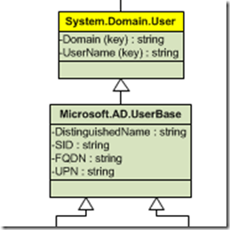
Each class is represented by a box in the diagram. The bold name at the top indicates the ID of the class. Each of the items below the ID is a property of the class. The ID of the property is indicated followed by the data type of the property. If the property is a key property that will be indicated by the text ‘(key)’ being included in the ID.
Black thin lines which have an arrow head on them like those above indicate class inheritance where the arrow points from the child class to the parent class.
Classes which have their name highlighted in yellow like the above are the more commonly used classes. They are highlighted to make them easier to see.
The class boxes are color coded to make it easier to distinguish types of classes. This is the key:
- Green = Configuration Items
- Pink = Work Items
- Black = Collections like queues
- Darker Blue = Supporting Items like action logs, comments, etc.
- Purple = Information like file attachments
- Lighter Blue = Amin Items like global settings, announcements, etc.

Relationships are indicated by colored lines between classes. The relationship ID is shown next to the line. In some cases class or relationship type names are too long to be displayed neatly in the diagram and will be shortened (MS = Microsoft, SC = SystemCenter, SM = ServiceManager, CM = ConfigurationManager, and so on). Relationship types are color coded depending on their base type as follows:
- Orange = System.Reference
- Red = System.Containment
- Green = System.Hosting
- Blue = System.Membership

If you see an ‘(a)’ in the ID of a class that means it is abstract.
There are two places in the model diagram where you will see relationship type properties called out like this:

A few other notes:
- Not all of the classes in the system are in the diagram. Only the most commonly used classes are represented.
- This model diagram does not include the GRC classes or classes from any other solutions produced by Microsoft (like Exchange connector) or partners (like Provance, etc.)
- Although I have meticulously validated this diagram against the actual model created by the product installation there may be some inaccuracies. If you find any please leave a comment here and we’ll get it fixed.
-
A few hints about navigating a large Visio diagram like this:
- Use the scroll wheel on your mouse to scroll up/down in the diagram.
- If you have a Microsoft mouse with a tilt wheel you can pan left/right in the diagram by leaning on the scroll wheel to the right or left.
- Hold down the CTRL key and mouse wheel up/down to zoom in/out
- Hold down the CTRL + SHIFT key and drag-select a portion of the Visio diagram to zoom into that portion of the diagram.
- Hold down SHIFT + arrow keys to quickly move around the diagram
- Hold down CTRL + arrow keys to move to the top/bottom/right/left of the diagram