The current Notebook cover design has a fundamental UX logic problem that I'd like to flag.
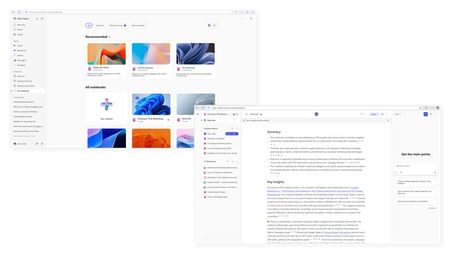
You've chosen to display a prominent, colorful cover image on each Notebook card. This is a visual-first design — it signals to users that each Notebook has a distinct visual identity. Great. But then you give users zero control over what that image actually is. The covers are abstract, randomly assigned, and carry no semantic meaning tied to the Notebook's content or purpose.
This creates a weird middle ground that satisfies nobody:
- If the goal is visual identity — then let users pick or upload their own cover image, the way Notion, Loop, or even OneNote section colors do. A user-chosen cover reinforces recognition and ownership. A random abstract texture does not.
- If the goal is simplicity — then drop the cover image altogether. Use a clean text-based card, a folder icon, or a subtle color tag. That would be honest and functional.
What you've shipped instead is decoration without agency. You made an aesthetic decision on behalf of the user, for every single Notebook, with no opt-out and no override. That's not minimalism — that's just taking away a choice the user should have had the moment you decided covers were part of the design.
Please either:
- Add the ability to customize or remove the cover image (upload, pick from gallery, or select a solid color).
- Or simplify the card design to not feature a cover at all.
Don't ship a visual feature and then lock users out of it. That's not a design principle — it's an oversight.

 Microsoft
