Sticky Navigation for Joined Communities

Sticky Navigation for Joined Communities
4

Upvotes

Upvote

 Aug 26 2016
7 Comments (7 New)
Completed

Navigation between communities is woefully bad at the moment.  Way too many clicks to get from Point A to Point B, or to know what community you are in.  I am feeling quite lost navigating the forum.


Taking from the good things in Yammer and potentially minimizing negative feedback.  If you look at the left nav of Yammer, this is a great navigation strategy for how 10,000's of users have interacted with communities.


Following requests (for authenticated users):

  • a sticky menu of favorited/joined communities that is visible on the page at all times

    • this could be tucked into the hamburger menu maybe, but there has to be a better way that navigating to 3ish pages to drill down to a particular community
  • a highlighted color of some sort that shows you what community you are currently viewing

  • show the unread/new message numbers you currently are in the rounded boxes
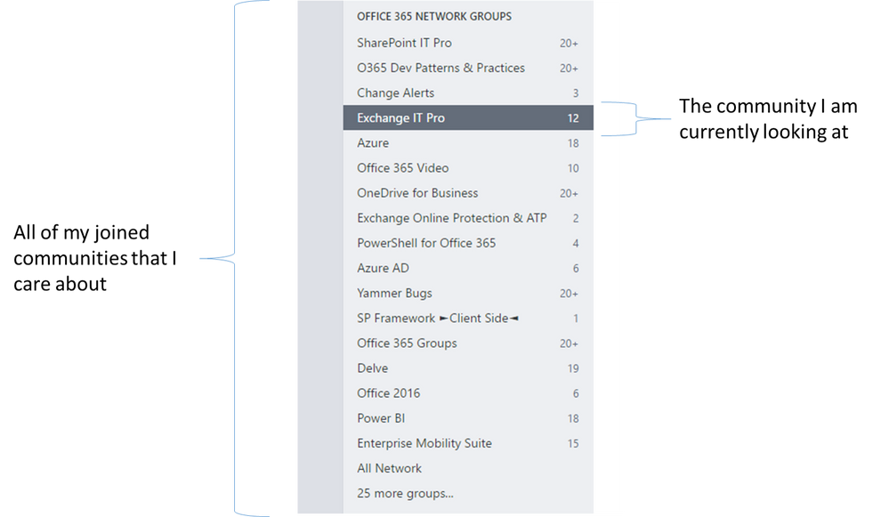
 

yammernav.png

Comments
Microsoft

Thanks @Brent Ellis all things we're currently working on and we're aligned on what you want to see.  Hoping we can get you something on each of these things by 9/1.

Microsoft
Status changed to: Under review
 
Steel Contributor

Agreed ... Like the yammer setup where ... The groups list (with number unread) was sticky on the left side (meaning it did not scroll)  One click got me quickly to another group of conversations.   The TEXT-with-a-number format is space friendly.  The group icons take up a lot of space.   

Microsoft
Status changed to: Planned

Hi @Brent Ellis you will see this rolled out this week.

Nav Menu - Your Favourite Spaces will be scrollable via the Nav Menu and ordered in Alphabetical order.Nav Menu - Your Favourite Spaces will be scrollable via the Nav Menu and ordered in Alphabetical order.

Community Manager

We have moved on from this design principle.


What you are discussing here is what is known in community spaces as "Horizontal Navigation" and how easy it is to navigate to sections of the same site without returning to the top level. We have achieved this in the new UI through the heart icon in the top right.


I will mark this as rolled out but please do let me know if there is something I am missing

Community Manager
Status changed to: Completed
 
Community Manager
Status changed to: Completed