- Home
- Community Lounge
- Tech Community Discussion
- Re: What is the practical reason for adding Re: Subject with the link on the thread to every post?
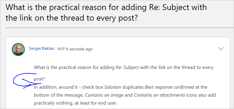
What is the practical reason for adding Re: Subject with the link on the thread to every post?
- Subscribe to RSS Feed
- Mark Discussion as New
- Mark Discussion as Read
- Pin this Discussion for Current User
- Bookmark
- Subscribe
- Printer Friendly Page
- Mark as New
- Bookmark
- Subscribe
- Mute
- Subscribe to RSS Feed
- Permalink
- Report Inappropriate Content
Jun 14 2020 01:01 PM
In addition, around it - check box Solution duplicates Best response confirmed at the bottom of the message, Contains an image and Contains an attachments icons also add practically nothing, at least for end user.
- Mark as New
- Bookmark
- Subscribe
- Mute
- Subscribe to RSS Feed
- Permalink
- Report Inappropriate Content
Jun 14 2020 01:06 PM - edited Jun 14 2020 01:07 PM
And if to add better to remove extra spacing for multiline subject text and add extra space between added subject reference and body of the post. Perhaps use another font for the reference if it needed for somebody. Bit hard to read.
- Mark as New
- Bookmark
- Subscribe
- Mute
- Subscribe to RSS Feed
- Permalink
- Report Inappropriate Content
Jun 16 2020 12:17 PM
Checked today couple of relatively long threads. Reading in posts another dozen of times same subject not separated from the body... uh, you know.
- Mark as New
- Bookmark
- Subscribe
- Mute
- Subscribe to RSS Feed
- Permalink
- Report Inappropriate Content
Jun 16 2020 12:55 PM
It's bolded now, at least somewhere - much better
- Mark as New
- Bookmark
- Subscribe
- Mute
- Subscribe to RSS Feed
- Permalink
- Report Inappropriate Content
Jun 18 2020 04:36 PM
@Sergei Baklan Thanks for your diligence on reporting this and I am sorry I have not replied sooner.
We are working really hard to fix some core accessibility bugs in the platform and that means we have had to turn on some features we have previously hidden from end users while we clear each compliance step.
We will be doing some work to tidy the UI back up again early in July.
- Mark as New
- Bookmark
- Subscribe
- Mute
- Subscribe to RSS Feed
- Permalink
- Report Inappropriate Content
Jun 19 2020 01:31 PM
@Allen , thank you for the update. No problem, will wait till July. Good luck!
- Mark as New
- Bookmark
- Subscribe
- Mute
- Subscribe to RSS Feed
- Permalink
- Report Inappropriate Content
Nov 24 2020 11:43 PM
Hi @Allen
Do you have any updates for this?
- Mark as New
- Bookmark
- Subscribe
- Mute
- Subscribe to RSS Feed
- Permalink
- Report Inappropriate Content
Nov 26 2020 09:18 PM
- Mark as New
- Bookmark
- Subscribe
- Mute
- Subscribe to RSS Feed
- Permalink
- Report Inappropriate Content
Nov 26 2020 09:48 PM
Sorry guys this work got re-prioritised to focus on site performance and The VideoHub. It’s totally on me that I forgot to come up date you all.
We still want to look at this and see what we can do to improve the situation but here is where we are right now.
In the next two weeks we will move the community to Azure cloud and our primary focus is going to be supporting that and making further optimisations in code to make the community quicker for everyone.
We then plan to do further work to tidy up the UI, however the scope of that work is TBD.. why? Because Khoros are going to release a completely new skin next year which will necessitate us reworking our whole ui layer so that we can leverage the more modern technologies underlaying that layer.
So given that do we spend a whole load of dev hours tidying up post accessibility work to then spend the same and more dev horse again when we have to do the whole UI or do we cherry pick the most annoying UI issues for users and call it done until the new skin is available.
I am leaning towards the later myself and instead focus on some key things, I.e improving mobile UI and possibly re: issue that’s clearly upsetting folks before moving on to other asks.
What I will commit to do is looping back and confirming where we land on this before the Christmas holidays.
I hope my open and frank explanation of current thinking makes sense and I always love input from users if you think there is other UI issues more important than the re: subject line.
- Mark as New
- Bookmark
- Subscribe
- Mute
- Subscribe to RSS Feed
- Permalink
- Report Inappropriate Content
Nov 27 2020 09:49 AM
@Allen , thank you for this honest and detailed feedback, appreciate. You have lot of challenges, good luck!
- Mark as New
- Bookmark
- Subscribe
- Mute
- Subscribe to RSS Feed
- Permalink
- Report Inappropriate Content
Nov 28 2020 07:44 AM
Thanks for the update, appreciate it!
