Updates to the Microsoft Tech Community- September 10th,2020
Published Sep 10 2020 11:10 AM 4,239 Views
Community Manager

Over the last couple of months, we have been making some changes to the Microsoft Tech Community to improve page load times and user experience. We are pleased to share with you the next update. 


In this update we have made changes to: 


  • My Dashboard 
  • Community Hubs 
  • Community Banners 
  • Primary Search 
  • Microsoft Verified Answer 


My Dashboard 


The old "My Home", though much loved by community super users, MVPs and Employees was originally designed when the community was less than a 10th of size it is today and was not fit for purpose for our community. 


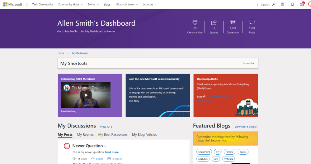
With this in mind, we have completely re-skinned both the shortcut and the My Dashboard view and added some new features we hope you will like. 


My Shortcuts 


My Shortcuts used to be access using the heart symbol in the top right, next to the notification bell. 


Allen_0-1599759084690.png


The new My Shortcuts is accessed using a list icon that is in the same location as the old heart icon: 

Allen_1-1599759084692.png


We have tried to focus on getting you to the content we know you are most interested in as quickly as possible, and so My Shortcuts is powered by Discussion Spaces, Blogs, Knowledge Bases, Ideas that you have followed. 


Recently Visited stores the last 5 placed you have visited in the Microsoft Tech Community so you can get back to where you left off from, even if it’s not a Space you have previously followed. 


My Dashboard 


The old My Dashboard was looking a little tired and so within the new My Dashboard you can: 


  • Manage the communities you have joined. 
  • Follow and un-follow spaces. 
  • See your most recent posts, replies, best responses and blog articles. 
  • Review the 3 newest, most popular, and unanswered questions from the spaces you follow. 
  • See the 3 latest blog articles from blogs you have followed. 
  • If there is a question within one of the boards, you follow that has not been answered then there is a component that will ask if you can help answer this. (*) 

* Currently this is asking if you can help answer unanswered questions in popular boards but we will be changing this behaviour shortly to use the boards you have followed 

In this update we have tried to put you and the content you care the most about front and center and so a new feature we have added to My Dashboard, is the ability to set it as your homepage. When enabled it means the community homepage will always by your dashboard.  


Allen_2-1599759084707.png


Community Hubs 


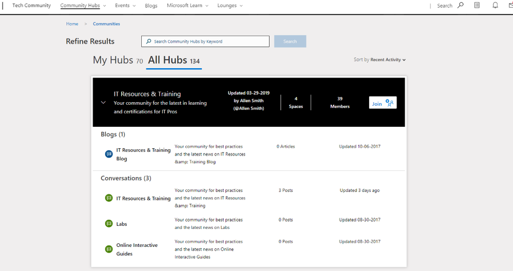
Continuing with the theme in this update of getting you to the content you are looking for as quickly as possible, we redesigned the community hubs page. You will now see all the hubs you have joined by default and have the option to view all hubs on the second tab. 


We made the search in Community Hubs more powerful, so that when you search by a keyword it not only shows you Hubs that match your keyword but also any spaces. You can Join or leave any hub right from the Community Hubs page, as well as follow or un-follow any spaces. 


You can also expand a Community Hub card and see the most recently active spaces for that hub. 


Allen_3-1599759084704.png


By default, the hubs are sorted by most recent activity but can also be sorted by: 

  • A to Z 
  • Z to A 
  • Newly Added 


Community Banners 


We took the opportunity to redesign the Microsoft Tech Community banners so that we could make better use of this hero space to not only communicate where you are in the Microsoft Tech Community, but also the activity in the community hub you are currently viewing. A key part of this design change was to also make the header more accessible and work across screen sizes. For communities that do not have a custom banner this is what the new community banner looks like. 


Allen_4-1599759084694.png


For communities that have custom banners we have tried to balance this customization with the need to make the site feel consistent.  


Allen_5-1599759084698.png


Primary Search 


In an effort to give search a little more prominence, when a user clicks our search button it now overlays over our primary navigation to give a much larger space for quick results to display.  This also helps provide a more consistent search experience across all screen sizes. 

We are currently working on an update which will also make the size of the quick results drop down take advantage of this extra space. 


Microsoft Verified Answer 


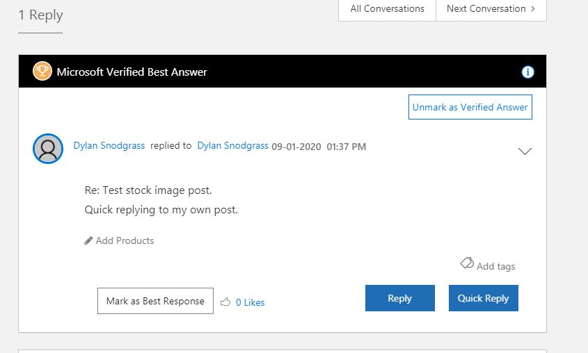
Working in a similar way to the Best Solutions system we already provide today, but managed by Microsoft Employees, the purpose of this is to give us a way to highlight answers that are provided in the community that align with Microsofts policies, guidelines or best practices. 


Allen_6-1599759084700.png


 Have questions or feedback? Feel free to post them in the comments below. 


13 Comments
Silver Contributor

@Allen 

Very nice change. I opened the website a few hours ago and was astonished by this new UI. It is better and more modern looking than what it was before. Things look more welcoming. The community dashboard, advanced search option with suggestion, improved community hubs page are things which I think will help me to contribute more on the Microsoft Tech Community.


It is also good to see that your team is also looking for performance improvents like with page loading times.


I hope that the websites will get more changes like this.

Community Manager

@TheShaunSaw 


Thank you for your feedback, we are working hard to not only build new experiences but improve the existing experiences for all users no matter what technology or device you use to access the internet.


All the best

Allen

Silver Contributor

@Allen 

I also have suggestion, improvement and bug that I have seen with the new UI.

Suggestion

I would like the profile page to see the change with how you have done it with the community banners. It would look better if your team puts new UI on the profile page than what it looks today. Maybe, we can add a cover photo on the profile page which can elaborate more on what things a user likes same as the bio.

Improvement

I would like a change in the UI which is related to the Navigation bar. The Tech Community website name is smaller than the links right to it which does not seem good. I think that the font size of the website name should be the same as the links or bigger than the links.

2020-09-11 (2).png

Bug

I don't know whether your team has noticed it or not but the links of the widgets on the dashboard webpage are not working correctly.

2020-09-11 (3).png

Community Manager

@TheShaunSaw 


Thanks for the Suggestion, the profile page is out of scope for this work at the moment but we are going to take a look at the whole on boarding experience shortly.


For the Improvement, the site name is the same size as the links next to it, they are both 16px. You can check this in your Developer tools in your browser. It maybe an optical illusion. I keep looking at it and thinking they aren't all sat on the same line but the tools tell me they are! Perhaps we could make it a size bigger though, will consider that one :)


Bug


I am sorry I am not seeing it, can you share some more details about what exactly is not working? 


Awesome Improvements @Allen and the site has more performance :cool:

Thanks for Sharing

@Allen , in general looks great, thank you. Question is about arithmetic.  I have couple dozens of hubs favourited, some of them I visit quite seldom and even don't remember their exact names, that's one of the reason I keep them in the list not to spend time on search.

However, in My Dashboard 16 of them are counted and only 12 are in the list which is not expandable.

image.png

Thus I shall to try find them through My Spaces or by Search - extra clicks. Same 16 counted and 12 mentioned if expand Community Hub

image.png

But if start browsing All Hubs here 28 are counted as favourited and only 15 are in the list below without Show more Hubs.

image.png

If browse all of them, Show more Hubs stops on second page. I didn't count how many are shown in the list, my guess less than 108. But in general that's doesn't matter since find something in such list just scrolling it is practically impossible, even with sorting. Lot of information I don't care about (when it was last updated, how many members, etc.). Practically we have only search for which you shall to know what exactly your are looking for to receive more or less proper result. For All Hubs former interface I like better.

Community Manager

@Sergei Baklan


Thanks again for sharing your insight. I spotted a mismatch between the numbers shown on the My Shortcuts & Community Hubs when I was doing UAT on the release. I have a bug open with the developers to investigate and correct it asap.

Both the Mega Menu My Hubs and the My Shortcuts are not supposed to show you all of your Hubs, they are essentially quick links to the most recently updated hubs. To see all of your hubs you need to go to Community Hubs -> Browse all Community Hubs.


Always love to hear your feedback, however we also got feedback during the design phase that many of our users do want to find the most active or newest communities and so it's about balancing what different users need from the Microsoft Tech Community.

What we should do is keep in mind your feedback and see what we can add to the MVP Lounge, it's likely many MVPs need a list like you outline.


Hope that makes sense and I will of course update when we have fixed the discrepancy between the two places on the count of hubs.

@Allen , thank you. On practice perhaps I limit my hubs by 12 to be sure they are all listed in My Shortcuts, not top 12 appeared due to some logic.


As for Browse all hubs - if Show more Hubs it repeats few hubs already shown on previous page. My guess if one page is 50 topics, total 89, it continues expanded page from number 89-50 entry, thus 11 are repeated in the middle. Numbers are approximate, I didn't count exact ones. Here is the screenshot for Z-A sorted list, sorry for big one.

image.png

Silver Contributor

@Allen 

About your last comment with about the post I had made. Yes, I checked the developer tools and and confirmed it that the Tech Community Home Page link and elements right to it are of 32px but there is some optical illusion which shows me that they are not lined up.

About the links on the dashboard page - yes, the links are working correctly on the widgets but they are not looking same as the homepage as shown in the video linked here. 

Community Manager

@TheShaunSaw 


Thanks Yes - we are aware the links do not appear in exactly the same position, we will work on fixing that shortly.

Community Manager

We have had reports from some users that they are unable to see any replies, this is being caused by a bug in this release which we will fix ASAP.


To confirm that this bug affects you please complete the following steps


  1. Go to a message that the UI says has replies
  2. if you do not see any replies when you click on the message then this bug may affect you!
  3. Click on your profile picture in the top right
  4. Click My Settings
  5. Click Preferences
  6. Click Display
  7. If your 'Format for displaying posts' is set to threaded then you are affected by this bug.
  8. If you have your 'Format for displaying posts' set to Linear or default then you should be seeing replies normally, please email us or post below if you still have problems.

The Workaround


  1. Click on your profile picture in the top right
  2. Click My Settings
  3. Click Preferences
  4. Click Display
  5. Change your 'Format for displaying posts' to either:
    1. Linear
    2. Default
  6. Save


You should now be able to see replies again.


Sorry for any inconvenience. 

Silver Contributor

@Allen 

As the Dev Team is also changing UI of the website. I just had a question that whether the Microsoft Tech Community website will comply with Microsoft Fluent Design Web system or not?

Brass Contributor

@Allen 

I haven't been on the site long enough to be familiar with all of the features, details and subsequent changes you describe in this helpful post, but as a 35-year veteran, I have a pretty good idea of the time, labor and simple hard work that went into all of this, so I'm sure most here appreciate your efforts and the results, and as for me, kudos, great job, very impressive and thanks so much. I'm sure it will have been worth everything you put into it. Cheers! - Scott

Version history
Last update:
‎Sep 10 2020 11:14 AM
Updated by: