- Home
- System Center
- System Center Blog
- Reporting on SMA Usage using Excel PowerPivot and the SMA OData web service
- Subscribe to RSS Feed
- Mark as New
- Mark as Read
- Bookmark
- Subscribe
- Printer Friendly Page
- Report Inappropriate Content
Previously, Eamon O’Reilly talked about Integrating into the Service Management Automation OData web service and discussed how to hook SMA’s OData feeds into an external system. In this post, I will continue the discussion on using the OData web service. In particular, I will discuss how to use the web service to create reports using PowerPivot in Excel. When you load data from SMA’s OData feed to PowerPivot in Excel you are able to generate reports that summarize your activity in SMA. PowerPivot is an Excel business intelligence add-on that allows users to import and manage large data sets, and quickly generate charts and tables from imported data. If you are interested in learning more about PowerPivot, you can read about it here .
Why import SMA usage data into Excel? Well, first of all, since you can access all of the data available through the OData API, you have a lot of flexibility with the reports you can generate. For instance, you may want to generate a summary report on all assets (connections, credentials, modules) or look at activities per module and report on number of activities and updates. You may also want to show how much time and money you have saved through automation by comparing the number and length of runbook jobs. PowerPivot allows you to combine multiple data sources in a single report so you can easily compare usage from other systems and add data you have created manually in Excel, such as an estimated time or cost for manually completing the runbook task.
Reporting on Usage and ROI
Want to track usage and show the return on investment for SMA? Using the SMA OData web service and PowerPivot, I generated the following reports:
USAGE
ROI


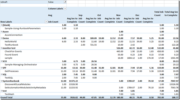
The first table shows how many jobs have run by month and the average time that it takes for these jobs to complete. This gives a quick glance into usage trends over time. The next table and chart illustrate ROI. As you can see, if I did not use SMA to automate my processes I would have wasted a lot of time manually completing these tasks!
In this post, I will show you how to recreate these reports. You will learn how to:
- Import SMA data using the OData feed
- Create and manage table relationships
- Add additional data to your PowerPivot model
- Create PowerPivot tables and charts
In order to create tables and charts using the OData feed steps 1 – 3 must be completed, although you can continue to modify 2 and 3 as you work. Why? Creating and managing table relationships allows you to draw connections between the different tables that are imported. For example, you must create a link between the Jobs and Runbooks tables in order to show the number of jobs per runbook displayed in the tables and charts above. Adding additional data to your PowerPivot model allows you to calculate job runtime from the data you have imported. Additionally, the ROI chart requires its own table describing how long a runbook process would take to complete manually.
As I walk you through creating these reports, feel free to follow along using the sample model or to create your own model as you go.
Setting up an OData Connection in Excel
The first step to creating PowerPivot reports in Excel, is importing an OData feed from SMA. To do this, go to Data > From Other Sources > From OData Data Feed.

In the Link or File text box, enter https://<YourServerName>:9090/00000000-0000-0000-0000-000000000000 and use the default log on credentials or enter the user name and password for the user with SMA access. The user must be added under the smaAdminGroup on every SMA web service host in order to access the SMA OData feed.

If your SMA installation uses an HTTPS certificate from a certificate authority, or if you have specified for this computer to trust your SMA certificate already, all the tables available from the SMA OData feed will be displayed. If not, you may need to install the SMA certificate locally before you are able to connect. If you need to do this, you will receive a Microsoft Excel Security Warning:

Select View Certificate and then in the new window, click Install Certificate > Current User. Once you have done this, select “Place all certificates in the following store” and then decide where you would like to save your certificate. I placed my certificate in “Trusted Root Certification Authorities”.

Complete the Certificate Import Wizard. You can now click “Yes” to the original Microsoft Excel security warning. When you are connected, select the tables that you would like to work with or select all tables by checking the topmost box. I imported all tables in my spreadsheet, but you may prefer to select specific tables since the import could take a while if you have a lot of data. In this example the relevant tables are: Runbooks, RunbookVersions, Jobs and JobContext. You may also be interested in importing the Statistics table as this contains additional information on job success and failures.

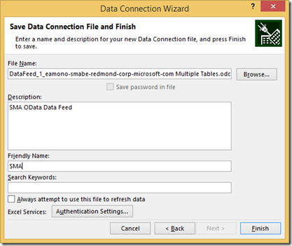
You will then be prompted to add a name and description to this connection file.
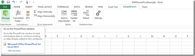
Once you complete this wizard, the data will be imported into Excel and can be viewed by table in the PowerPivot window. To open the PowerPivot window, go to the PowerPivot tab in the Excel ribbon and select Manage.
If the PowerPivot tab is not in the ribbon, you will need to turn on the add-on. Go to File > Options > Add-Ins. Then switch the Manage drop down on the bottom of the Excel Options pop-up to COM add-ins and select "Go". A new window will open up and you can select Microsoft Office PowerPivot for Excel. Note that you must have Excel 2010 or later in order to use PowerPivot.
Managing Table Relationships
Once you have the tables that you want imported you need to manage the relationships between the tables so you can create meaningful output. If you add data points to a PowerPivot table or chart at are not mapped to the other data points you are using you will see the message “Relationships between tables may be needed” in the PivotTable Fields manager:

When this appears, it means that the last item you added is missing a relationship with one of the other items used in your chart. One way to manage relationships is by clicking the “Create” button here or to go to Data > Relationships > New. However, if you have many tables and complex connections, it is much easier to use PowerPivot’s Diagram View. To access this, go to PowerPivot > Manage (you should still have this window open from viewing your imported data) and then select Diagram View.

Here you can quickly create relationships between tables and view the connections that you have already made. To map one table to another, select the column that you would like to map and drag it to the matching column on the other table. In this case, I want to show the relationship between runbooks and the jobs that have run. Since there is no matching ID to use between the Runbooks table & the Jobs table, you must make a couple of intermediary connections. First, map the JobContextID from the Jobs table to the JobContexts table.

Then map the RunbookVersionID in the JobContexts table to the RunbookVersions table.

Then you can map the RunbookID in the Runbooks table to the RunbookID in the RunbookVersions table.

Once you have completed the steps above, you will be able to create PivotTables or Charts with content on jobs and runbooks. You can also map the Runbooks table to other external imported tables in the same way or to the Statistics table if you are interested in adding any of the stats that you would see on the Dashboard in the GUI.
Supplementing Tables with Calculations and Other Data
You can add additional calculations to your PowerPivot tables using Data Analysis Expressions (DAX). This Office documentation has more information about DAX formulas. To add a new formula to an existing table, go to the PowerPivot add-on (PowerPivot > Manage) and make sure that you are in Data View.

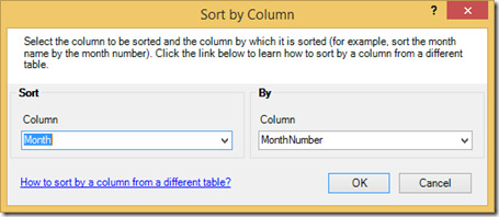
From here, you can select the Jobs table at the bottom of the page to view the data items. In the example that I’m working with, I’d like to see the number of jobs grouped by month and to see the average time that it takes a particular runbook to complete. To add the month of the run, you can use =FORMAT([StartTime],"MMM") and then right click and rename the column “Month”. To make sure the months are sorted correctly, also add =MONTH([StartTime]) as another column to get the numeric version of the month. You can then sort the months as text by the month date by selecting “Sort by Column” and sorting Month by the MonthNumber. You will now see month in chronological order rather than alphabetical order when you add the Month column to your report.

To add the time it took in seconds for the job to complete, you can add the formula: =IF(ISBLANK([EndTime]), BLANK(),ROUND(24 * 60 * 60 * ([EndTime]-[StartTime]), 1)). ISBLANK just handles the instances when the jobs have not completed (either stopped or suspended jobs) so that there is not a negative time added to the count. The rest of the formula takes the difference in start and end time and multiplies it by 24 (24 hours/day), by 60 (60 min/hour) and 60 (seconds/min). Note that in the sample, we are using average, which is bottom up based on the jobs. If you display only runbook name (as I do), the total average will not equal the average given by the runbooks as it is calculated from the underlying jobs.
It is also really easy to add data from Excel or other databases into your PowerPivot data. So if you wanted to do a comparison of the number of man hours that it takes to manually perform the equivalent to a runbook run, you would be able to input this into your model either by linking to another spreadsheet or entering information into Excel. In this example, I created a new table with the time it takes to manually do the task. I used the runbook name, number of runs, manual equivalent and the total man hours (number of runs * manual equivalent). I then imported this data to the model by selecting the table, navigating to the PowerPivot tab and clicking “Add Data to Model”. After doing this, I mapped the RunbookName column in this table to the RunbookName column in the Runbooks table.

Creating Charts & Tables
Now that you have set up the relationships between the tables you need to generate reports and have added some interesting calculations to the SMA data, you can create charts and tables. Do this from the PowerPivot add-on by clicking on PivotTable and selecting the type of desired output (i.e. table or charts).

With any of these selections you will see a PowerPivot task pane on the right hand side. You will see all of your tables on the top and a working area at the bottom. There are four different areas on the bottom of the task pane that can be used to generate output: filters, columns, rows and values. In this example, I first created a PivotTable that shows the number of jobs and the average time they took to complete in seconds by month.
In order to add data to your report, simply drag and drop the data points you want in the report into the area on the bottom. Start by dragging the Tags and RunbookName fields from the Runbooks table to the Rows section (Tags should be above RunbookName). You should now see a list of all your runbooks grouped by tag. You may also be interested in adding LastModifiedBy to the Rows section so you can group your runbooks by author.

Next, add in values to the report. To find the number of jobs per runbook, take the JobID and leave it formatted as count. Add in Seconds to Complete and format this as an average. To rename and format columns in the report, left click on the field and select Value Field Settings.

When you are creating your reports, you need to be aware that jobs include both test and production runs. In order to identify which jobs were tests versus production runs, you can use the IsDraft column from the Runbook version table.
Drag IsDraft from the RunbookVersions table to the filters section and then select “False” to ensure you are only displaying jobs from production.

To get the final table, add in the Month column from the Jobs into the Columns area.

For the ROI report, create a table and a chart. Add the RunbookName to the Axis area. Then add the time it would take to manually perform the same tasks accomplished by the runbook to the Values area. This information will be pulled the table that you entered on manual equivalents. In the example, the time to complete one manual task is multiplied by the total number of runs to highlight the total amount of manual labor that would have been spent on this process. Then add the total runtime in hours (formatted as a sum rather than an average since we are looking at totals). Since my jobs ran so quickly, I also wanted to show the total runtime in minutes. I reformatted my chart so I could also show the total runtime in minutes on the second axis.

If you have been following along, you should now have a table of SMA usage by month and a chart of Man Hours vs Automation Hours. Once you are familiar with this process it is really easy to generate reports that illustrate the value automation provides. How much time (and money) did you save through automation?
You must be a registered user to add a comment. If you've already registered, sign in. Otherwise, register and sign in.