- Home
- Content Management
- Discussions
- Re: Why do modern pages leave so much white space?
Why do modern pages leave so much white space?
- Subscribe to RSS Feed
- Mark Discussion as New
- Mark Discussion as Read
- Pin this Discussion for Current User
- Bookmark
- Subscribe
- Printer Friendly Page
- Mark as New
- Bookmark
- Subscribe
- Mute
- Subscribe to RSS Feed
- Permalink
- Report Inappropriate Content
Jun 11 2018 11:59 PM
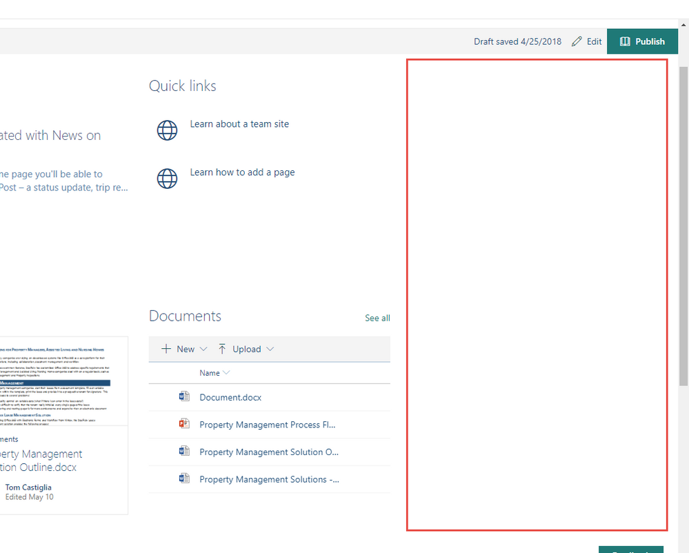
When using modern pages, there is always about 25% of the screen width that is unused on the right side. Why won't any web parts extend further to the right and use that space?
- Labels:
-
Responsive
-
SharePoint Online
- Mark as New
- Bookmark
- Subscribe
- Mute
- Subscribe to RSS Feed
- Permalink
- Report Inappropriate Content
Jun 13 2018 12:53 AM
Hi Tom!
It seems like the section contains three columns and the third one is empty. Have You tried to switch the layout option from "Three columns" to "Two Columns"?
- Mark as New
- Bookmark
- Subscribe
- Mute
- Subscribe to RSS Feed
- Permalink
- Report Inappropriate Content
Jun 29 2018 04:50 PM
Hi Magnus - Not sure why I missed your reply until now. I agree it looks like I have 3rd column that is empty, but that was not the case. I believe that example was using a 2 column layout.
- Mark as New
- Bookmark
- Subscribe
- Mute
- Subscribe to RSS Feed
- Permalink
- Report Inappropriate Content
Aug 07 2018 01:28 PM
its really bizarre. I have the same issue as well for my sites as well. I created a publishing site, but I turned on Site Pages and changed the home page to a modern page - I have the same issue, with a bunch of white space to the right hand side.
I then created an O365 Group and I had a look at the Team site there (thinking my issue could have been because I started with a publishing site - nope. The issue is here on the team site as well.
I created a Communications site (Topic) and that one didnt have any extra white space on the right hand side. Which leads me to believe its something to do with the page layout.
- Mark as New
- Bookmark
- Subscribe
- Mute
- Subscribe to RSS Feed
- Permalink
- Report Inappropriate Content
Aug 08 2018 04:55 AM
My experience is that every modern page layout in a team site (classic or modern) has this unused white space at the left.
I think it's weird, as you add a document or list webpart to a page and you get a horizontal scroll bar while there's loads of white space.
- Mark as New
- Bookmark
- Subscribe
- Mute
- Subscribe to RSS Feed
- Permalink
- Report Inappropriate Content
Nov 27 2018 08:08 PM
Whereas on the homepage template on a team site - there is no option to have a section that takes up the full width of a browser screen, and everything is left aligned - which generally looks pretty average on a laptop with a decent screen resolution!
- Mark as New
- Bookmark
- Subscribe
- Mute
- Subscribe to RSS Feed
- Permalink
- Report Inappropriate Content
Oct 01 2019 07:15 AM
I am having the very same issue and am frustrated@Tom Castiglia
It is not due to having an empty column. Why is the right side have all this wasted space?
- Mark as New
- Bookmark
- Subscribe
- Mute
- Subscribe to RSS Feed
- Permalink
- Report Inappropriate Content
Oct 01 2019 07:16 AM
- Mark as New
- Bookmark
- Subscribe
- Mute
- Subscribe to RSS Feed
- Permalink
- Report Inappropriate Content
Dec 17 2019 05:10 AM
Full screen: https://i.imgur.com/IrKRQ6v.png
Windowed: https://i.imgur.com/14ZJSsr.png
That said, there is a school of thought that says that narrow columns are easier to read - your eye doesn't scan as much. So I'm okay with the white band. I think this is why newspapers have narrow columns
- Mark as New
- Bookmark
- Subscribe
- Mute
- Subscribe to RSS Feed
- Permalink
- Report Inappropriate Content
May 05 2021 10:57 AM
Did you ever figure anything out with this issue? I am similarly frustrated. It doesn't make any sense that the banners can span the entire width of the page but the webparts leave this giant white space. It looks really unprofessional and like a mistake.
- Mark as New
- Bookmark
- Subscribe
- Mute
- Subscribe to RSS Feed
- Permalink
- Report Inappropriate Content
Jun 08 2022 07:05 AM
Help someone. This white space is bugging me. I have 3 columns but they wont extend to cover the white space on both sides. The pictures are squished in the middle. Are there any resizing options?
- Mark as New
- Bookmark
- Subscribe
- Mute
- Subscribe to RSS Feed
- Permalink
- Report Inappropriate Content
Jun 08 2022 08:29 AM - edited Jun 08 2022 08:30 AM
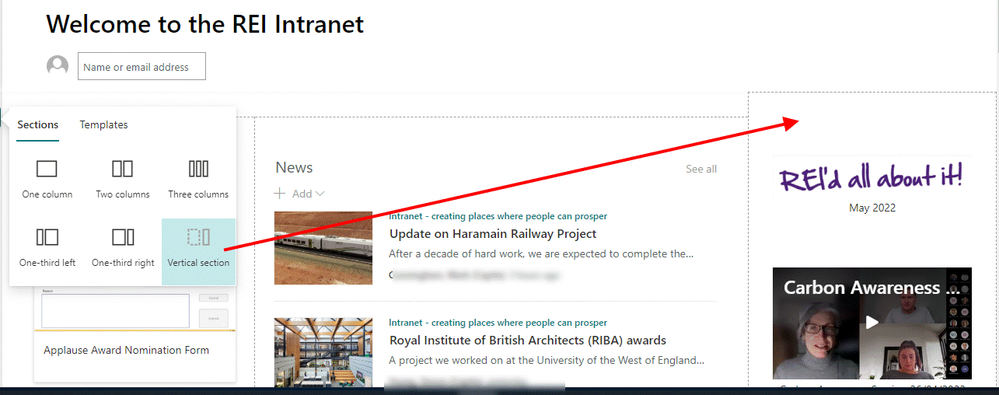
@1417785 you can't extend the columns or web parts into the white spave but you CAN add a vertical section which will take up the space and will allow you to add web parts all down the right hand side of the page.
Also, make sure you don't have Quick Launch navigation selected in the Site Settings as that uses up the left hand sapce.
Rob
Los Gallardos
Intranet, SharePoint and Power Platform Manager (and classic 1967 Morris Traveller driver)
- Mark as New
- Bookmark
- Subscribe
- Mute
- Subscribe to RSS Feed
- Permalink
- Report Inappropriate Content
- Mark as New
- Bookmark
- Subscribe
- Mute
- Subscribe to RSS Feed
- Permalink
- Report Inappropriate Content
Feb 28 2023 10:26 AM
@RobElliott There's still an entire column worth of white space, even when installing a right-side vertical pane
- Mark as New
- Bookmark
- Subscribe
- Mute
- Subscribe to RSS Feed
- Permalink
- Report Inappropriate Content
Jun 06 2023 05:44 PM
- Mark as New
- Bookmark
- Subscribe
- Mute
- Subscribe to RSS Feed
- Permalink
- Report Inappropriate Content
Jun 07 2023 01:05 PM
@draconxanathos - Came here for the same issue. Quite annoying. I dont remember this being like this in the past.
- Mark as New
- Bookmark
- Subscribe
- Mute
- Subscribe to RSS Feed
- Permalink
- Report Inappropriate Content
Jun 07 2023 02:26 PM
- Mark as New
- Bookmark
- Subscribe
- Mute
- Subscribe to RSS Feed
- Permalink
- Report Inappropriate Content
Jun 07 2023 06:13 PM
- Mark as New
- Bookmark
- Subscribe
- Mute
- Subscribe to RSS Feed
- Permalink
- Report Inappropriate Content
Jul 20 2023 04:00 AM
- Mark as New
- Bookmark
- Subscribe
- Mute
- Subscribe to RSS Feed
- Permalink
- Report Inappropriate Content
Jul 31 2023 05:32 AM


