- Home
- Content Management
- Discussions
- Re: SharePoint Modern Vertical Column on Small Screens
SharePoint Modern Vertical Column on Small Screens
- Subscribe to RSS Feed
- Mark Discussion as New
- Mark Discussion as Read
- Pin this Discussion for Current User
- Bookmark
- Subscribe
- Printer Friendly Page
- Mark as New
- Bookmark
- Subscribe
- Mute
- Subscribe to RSS Feed
- Permalink
- Report Inappropriate Content
Oct 17 2019 09:43 AM
Hi there!
As part of a SharePoint Online Modern intranet, we have a home site and are using the new vertical column as part of the layout. The issue is that for the majority of users the vertical column is pushed to the bottom of the page, due to the responsive resizing. The majority of the users have their default display scaling set to 150%. This on smaller screens results in this behavior where the vertical column is moved.
Through some investigating I've found that the breakpoint for this behavior is at a window width of around 1365px. I understand the need for this but I was wondering if there are:
1) Any workarounds to avoid this behavior for our users
2) Best practices for helping users deal with the issue.
3) Any plans to adjust the responsive design for the vertical column.
- Labels:
-
Developer
-
Responsive
-
SharePoint Online
-
Sites
- Mark as New
- Bookmark
- Subscribe
- Mute
- Subscribe to RSS Feed
- Permalink
- Report Inappropriate Content
Oct 17 2019 10:18 AM
@StephenBradley I'm interested in solutions as well. On common monitors here at work - resolution 1280 x 1024, browsers at 100% push the vertical column to the bottom. This just started happening a month ago - before, as I started using verticals, it displayed fine.
Now I have to use 90% zoom to get the correct display, and if this continues when we go live with our new intranet that's how I'm going to have to train on it.
And this is over all the Edges and Chrome as well. Something changed in the SharePoint page formatting or Win10 display formatting - there's either extra padding or margins or something. Fonts and sizes haven't changed.
It's really annoying.
- Mark as New
- Bookmark
- Subscribe
- Mute
- Subscribe to RSS Feed
- Permalink
- Report Inappropriate Content
Mar 02 2020 01:40 PM
@Robin Nilsson Same exact settings and problem here. Would love to use vertical column but I cannot tell all employees to switch to 90% zoom for their browsers. :( Would love this to be fixed!
- Mark as New
- Bookmark
- Subscribe
- Mute
- Subscribe to RSS Feed
- Permalink
- Report Inappropriate Content
Mar 01 2021 05:33 AM
- Mark as New
- Bookmark
- Subscribe
- Mute
- Subscribe to RSS Feed
- Permalink
- Report Inappropriate Content
Mar 10 2021 08:33 AM
Same, 1356px is too large for a sidebar to collapse. The expected behavior would be for both columns to shrink in size first before stacking.
- Mark as New
- Bookmark
- Subscribe
- Mute
- Subscribe to RSS Feed
- Permalink
- Report Inappropriate Content
Jun 30 2021 04:50 AM
I was dealing with the same situation. The sharepoint modern sites are a bit strict on what you can do. I managed to not need the 90 % zoom by injecting javascript. I'll share the steps how I've found a solution:
- I already had a custom sharepoint webpart installed, that let's me inject custom javascript onto the page -> SharePoint Online – install Modern Script Editor Web Part for SharePoint Online Modern Site – Ashish...
- Tried a lot of ways, messing with the elements styles. First tried with jquery, but couldn't get it to work with sharepoint. Finally I noticed something. When zooming in, so that the section column goes way, the style
disappears from the div
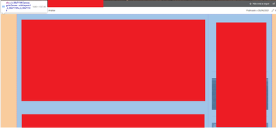
Here's a print of the DIV, on my case (the webparts are covered):
- In the end I got it to work copying the style of this DIV, and the two below (in my case it's a normal section and a colunm section) when the screen is okay, and setting it up when the screen is small. In the javascript I put:
if (window.screen.width < 1365){
	document.querySelector("#spPageCanvasContent > div > div > div > div").style.cssText = "-webkit-font-smoothing: antialiased;display: flex;margin: 0 auto;max-width: 1648px;user-select: text;color: rgb(0, 0, 0);font-weight: 400;font-size: 14px;-webkit-font-smoothing: antialiased;"

document.querySelector("#spPageCanvasContent > div > div > div > div > div.g_b_50a7110f").style.cssText = " -webkit-font-smoothing: antialiased; font-size: 14px; font-weight: 400; color: rgb(0, 0, 0); user-select: text; width: 75%;"

document.querySelector("#spPageCanvasContent > div > div > div > div > div.h_b_50a7110f").style.cssText = " -webkit-font-smoothing: antialiased; font-size: 14px; font-weight: 400; color: rgb(0, 0, 0); user-select: text; width: 25%;"

}
I think all those styles are not necessary, only the ones related to size.

