- Home
- Content Management
- Discussions
- Images in Microsoft Lists with Status via Power Automate for visual progress
Images in Microsoft Lists with Status via Power Automate for visual progress
- Subscribe to RSS Feed
- Mark Discussion as New
- Mark Discussion as Read
- Pin this Discussion for Current User
- Bookmark
- Subscribe
- Printer Friendly Page
- Mark as New
- Bookmark
- Subscribe
- Mute
- Subscribe to RSS Feed
- Permalink
- Report Inappropriate Content
Aug 18 2022 07:14 PM
I saw this for a status on a website and thought it might be helpful to have this and would need to talk with the marketing department for graph changes.
Have people had success with this or used or have recommendations for it. I have the status with back and forth and it is not as straight forward as some things such as onboarding might not be as straight forward. We have maybe eight or so different status which is not tough yet wonder how it would be with a graphic for such various options.
- Mark as New
- Bookmark
- Subscribe
- Mute
- Subscribe to RSS Feed
- Permalink
- Report Inappropriate Content
Aug 19 2022 02:55 AM - edited Aug 19 2022 03:06 AM
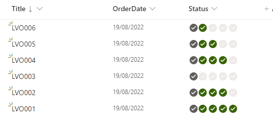
@Matthew Carter you can do something similar by using JSON column formatting. My one is based on the JSON code by Chris Kent at https://github.com/pnp/List-Formatting/tree/master/column-samples/multi-choice-icons
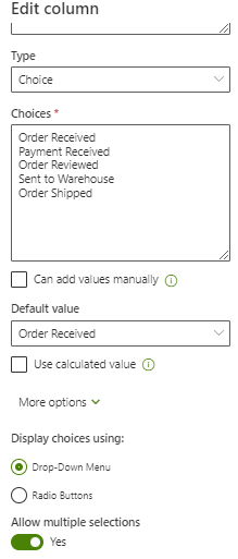
Create a Choice column and set it to allow multiple selections:
Then format the column and in advanced mode with the following JSON:
{
  "$schema": "https://developer.microsoft.com/json-schemas/sp/v2/column-formatting.schema.json",
  "elmType": "div",
  "style": {
    "font-size": "16px"
  },
  "children": [
    {
      "elmType": "span",
      "attributes": {
        "title": "Order Received",
        "iconName": "CompletedSolid",
        "class": "='ms-fontColor-' + if(indexOf(join(@currentField,''),'Order Received) != -1, 'themeDark', 'neutralLight')"
      },
      "style": {
        "padding": "0 2px"
      }
    },
    {
      "elmType": "span",
      "attributes": {
        "title": "Payment Received",
        "iconName": "CompletedSolid",
        "class": "='ms-fontColor-' + if(indexOf(join(@currentField,''),'Payment Received') != -1, 'themeDark', 'neutralLight')"
      },
      "style": {
        "padding": "0 2px 0 0"
      }
    },
    {
      "elmType": "span",
      "attributes": {
        "title": "Order Reviewed",
        "iconName": "CompletedSolid",
        "class": "='ms-fontColor-' + if(indexOf(join(@currentField,''),'Order Reviewed') != -1, 'themeDark', 'neutralLight')"
      },
      "style": {
        "padding": "0 2px"
      }
    },
    {
      "elmType": "span",
      "attributes": {
        "title": "Sent to Warehouse",
        "iconName": "CompletedSolid",
        "class": "='ms-fontColor-' + if(indexOf(join(@currentField,''),'Sent to Warehouse') != -1, 'themeDark', 'neutralLight')"
      },
      "style": {
        "padding": "0 2px"
      }
    },
    {
      "elmType": "span",
      "attributes": {
        "title": "Order Shipped",
        "iconName": "CompletedSolid",
        "class": "='ms-fontColor-' + if(indexOf(join(@currentField,''),'Order Shipped') != -1, 'themeDark', 'neutralLight')"
      },
      "style": {
        "padding": "0 2px"
      }
    }
  ]
}
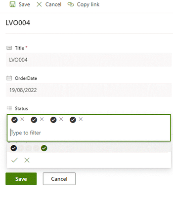
So you edit the item and select the next applicable status, and of course you can "go back" if a status has been added by mistake or for some other reason.
In the list you can hover over the check mark and the hover text tells you what the status is. The icon be changed and the ones I use are from https://www.flicon.io/
and you could have a different icon for each status to make it clearer what each icon represents.
Hope that helps.
Rob
Los Gallardos
Intranet, SharePoint and Power Platform Manager (and classic 1967 Morris Traveller driver)


