- Home
- Content Management
- SharePoint Developer
- Re: Make it easier to check in and check out
Make it easier to check in and check out
- Subscribe to RSS Feed
- Mark Discussion as New
- Mark Discussion as Read
- Pin this Discussion for Current User
- Bookmark
- Subscribe
- Printer Friendly Page
- Mark as New
- Bookmark
- Subscribe
- Mute
- Subscribe to RSS Feed
- Permalink
- Report Inappropriate Content
Dec 08 2016 04:56 PM
I spoke with an internal client today and her group relies on checking files in and out. The option to check out and check in files is buried deeper in UI. Now you have to click ellipsis, ellipsis, advanced, check out. In SharePoint 2010 they just click the drop down menu and select check out. How can I surface the option to check out a file off the first or second ellipsis.
- Mark as New
- Bookmark
- Subscribe
- Mute
- Subscribe to RSS Feed
- Permalink
- Report Inappropriate Content
Dec 08 2016 05:11 PM
I agree, having just had to go looking for the check-in option. It's not obvious which means that documents are more likely than before to remain checked out. We use a script now across the on-prem farm to identify what is checked out, how to do that easily in SPO?
- Mark as New
- Bookmark
- Subscribe
- Mute
- Subscribe to RSS Feed
- Permalink
- Report Inappropriate Content
Dec 09 2016 09:16 AM
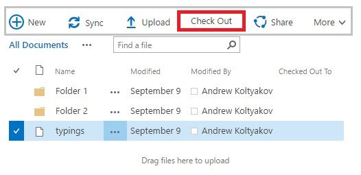
In Modern UI document libraries Check In/Out menus options are a bit closer (actually one click closer - 3 clicks path through ellipsis either top menu).
I personally prefer a ribbon actions for these operations in classic views (also 2-3 clicks away: select a document, Files tab in a ribbon and the desired option) or right-click on a document in a view, advanced and the action. In SPO in classic views, there is also a quick buttons menu (above views toggle links and list search control).
- Mark as New
- Bookmark
- Subscribe
- Mute
- Subscribe to RSS Feed
- Permalink
- Report Inappropriate Content
Dec 09 2016 09:38 AM
There is a possibility to get all checked out documents with the use of `CheckoutUser` field filtering or search.
E.g. it can be achieved with such actions described in the article. The store also can be helpful.
- Mark as New
- Bookmark
- Subscribe
- Mute
- Subscribe to RSS Feed
- Permalink
- Report Inappropriate Content
Dec 09 2016 10:05 AM
Thanks for your responses @Andrew Koltyakov. I was really wondering if someone had added a link to check-out\check-out up higher in the UI. For example, add a link on the first click on the ellipsis.
- Mark as New
- Bookmark
- Subscribe
- Mute
- Subscribe to RSS Feed
- Permalink
- Report Inappropriate Content
Dec 09 2016 11:25 AM
SolutionI would recommend sticking with clicking Files tab in the ribbon then selecting a document, so Check In/Out/Discard in a click away.
Anyway, it's going to a New UI (OneDrive view) experience, which can be changed dramatically in near future.
It's definitely possible to modify callout behavior by adding custom action or inject redundant quick buttons in DocumentLibraryQCB area with custom script if it worth it.
- Mark as New
- Bookmark
- Subscribe
- Mute
- Subscribe to RSS Feed
- Permalink
- Report Inappropriate Content
Dec 09 2016 02:52 PM
Thanks for your thoughtful response @Andrew Koltyakov. I was surprised when my internal client said she didn't want to go to SharePoint online because the checkin\checkout experience was worse than SharePoint 2010.
- Mark as New
- Bookmark
- Subscribe
- Mute
- Subscribe to RSS Feed
- Permalink
- Report Inappropriate Content
Apr 25 2017 11:17 AM
Unsure why MS is so aggressive in the "lighter UI layer" than the actual SharePoint 'engine'. The UI layer in my view would be simplest to maintain and probably the biggest crowd winner, otherwise SharePoint is already notorious enough and 'Something Went Wrong' is strenghening that even further.
I was wondering if anyone could help me out with my UI issue with check-in/check-outs here SharePoint UI Challenges (Check-in/Check-Out)
Thanks so much.
Vivek
Accepted Solutions
- Mark as New
- Bookmark
- Subscribe
- Mute
- Subscribe to RSS Feed
- Permalink
- Report Inappropriate Content
Dec 09 2016 11:25 AM
SolutionI would recommend sticking with clicking Files tab in the ribbon then selecting a document, so Check In/Out/Discard in a click away.
Anyway, it's going to a New UI (OneDrive view) experience, which can be changed dramatically in near future.
It's definitely possible to modify callout behavior by adding custom action or inject redundant quick buttons in DocumentLibraryQCB area with custom script if it worth it.


