- Home
- Project
- General Discussion
- Re: What's the best way to graphically view resource utilisation in Project?
What's the best way to graphically view resource utilisation in Project?
- Subscribe to RSS Feed
- Mark Discussion as New
- Mark Discussion as Read
- Pin this Discussion for Current User
- Bookmark
- Subscribe
- Printer Friendly Page
- Mark as New
- Bookmark
- Subscribe
- Mute
- Subscribe to RSS Feed
- Permalink
- Report Inappropriate Content
Sep 11 2022 12:21 AM
Long time P6 user, looking for something similar to this in MSP...
A list of all my resources, against their utilisation in graphical (not tablature) form
I've tried Resource Graph, but that seems like you have to scroll around to see the resources - i cant select more than one resource to see cumulative
Any suggestions appreciated
David
- Labels:
-
Assignments
-
Resource
- Mark as New
- Bookmark
- Subscribe
- Mute
- Subscribe to RSS Feed
- Permalink
- Report Inappropriate Content
Sep 11 2022 07:14 AM
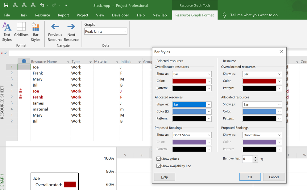
SolutionYes you can see multiple resources on the Resource Graph. First you have to set up the Resource Graph Bar Styles to be active for "selected resources" as shown here.
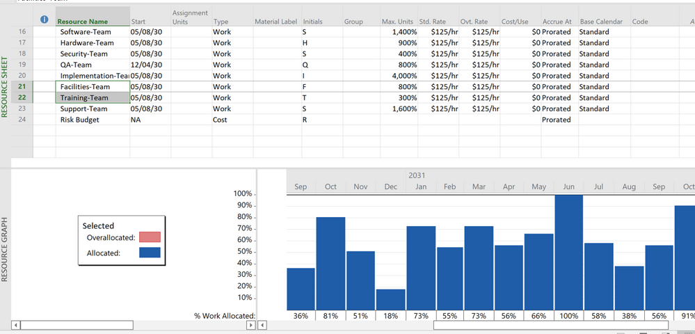
Then on either the Resource Sheet or Resource Usage, select a single or group of resources. In my sample file, it looks like this when two team resources are selected.
But, just for reference, Project doesn't have a lot of flexibility for graphing resources. You can try the Resource Graph or one of the Reports but you may find it is best to export Project data to Excel and graph it there.
John
- Mark as New
- Bookmark
- Subscribe
- Mute
- Subscribe to RSS Feed
- Permalink
- Report Inappropriate Content
Sep 11 2022 08:00 AM
And thanks for the note on exporting to Excel - suspect they would anticipate use of Power BI for more flexible reporting, or indeed Excel
- Mark as New
- Bookmark
- Subscribe
- Mute
- Subscribe to RSS Feed
- Permalink
- Report Inappropriate Content
Sep 11 2022 11:00 AM
You're welcome and thanks for the feedback.
I'm a VBA guy so I use that for communicating between Project and Excel.
John
- Mark as New
- Bookmark
- Subscribe
- Mute
- Subscribe to RSS Feed
- Permalink
- Report Inappropriate Content
Sep 13 2022 10:29 AM
When i select more than one, the graph is only shown for the initially selected resource
- Mark as New
- Bookmark
- Subscribe
- Mute
- Subscribe to RSS Feed
- Permalink
- Report Inappropriate Content
Sep 13 2022 12:41 PM
Look carefully at the Bar Styles window shown in my previous response. On the right side you set up bar styles for a single resource. On the left side you set up bar styles for multiple resources (i.e. selected or filtered). If you only have bar styles for a single resource it will show the first resource in a multiple selection. To only see multiple resources, turn off bar styles for a single resource.
John
Accepted Solutions
- Mark as New
- Bookmark
- Subscribe
- Mute
- Subscribe to RSS Feed
- Permalink
- Report Inappropriate Content
Sep 11 2022 07:14 AM
SolutionYes you can see multiple resources on the Resource Graph. First you have to set up the Resource Graph Bar Styles to be active for "selected resources" as shown here.
Then on either the Resource Sheet or Resource Usage, select a single or group of resources. In my sample file, it looks like this when two team resources are selected.
But, just for reference, Project doesn't have a lot of flexibility for graphing resources. You can try the Resource Graph or one of the Reports but you may find it is best to export Project data to Excel and graph it there.
John


