- Home
- Microsoft 365
- Microsoft 365
- Re: Please could we have the ribbon down the side of the screen? It wastes so much space on the top.
Please could we have the ribbon down the side of the screen? It wastes so much space on the top.
- Subscribe to RSS Feed
- Mark Discussion as New
- Mark Discussion as Read
- Pin this Discussion for Current User
- Bookmark
- Subscribe
- Printer Friendly Page
Jun 09 2019
06:14 AM
- last edited on
Feb 06 2023
03:42 AM
by
TechCommunityAP
- Mark as New
- Bookmark
- Subscribe
- Mute
- Subscribe to RSS Feed
- Permalink
- Report Inappropriate Content
Jun 09 2019
06:14 AM
- last edited on
Feb 06 2023
03:42 AM
by
TechCommunityAP
This has annoyed me ever since Office replace the icon bar with a ribbon that was so much deeper - at the same time that widescreen (and hence short top to bottom screen) devices were becoming popular.
In the days of 4:3 screens, my 17 inch screens had more than enough space to cope with a ribbon at the top, but my widescreen 17 inch had a couple of inches LESS space to show it. I found I was having to collapse the ribbon, and open it back when I needed to do something. Such a backwards step, yet no one seemed to be bothered.
I have been posting about this issue in Edge Dev because there is an option via Chrome store. I prefer to have my tabs down the left side, because of the screen space there that is otherwise wasted. Tabs along the top of a widescreen device just take up space or show so little of themselves that it is hard to work out from a letter or two what they are. Tabs down the left allow far more to be shown, and give the possibility of nesting.
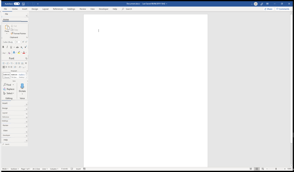
There are lots of times that apps and programs could use the space more efficiently if they would put their menus down the left. Just imagine being able to better see a word document or excel spreadsheet, or any other file if the Ribbon was on the left. No more having to collapse the ribbion just to see your document better.
What about it?
Thisis just a very quick mockup to give a flavour of what I suggest.
- Labels:
-
Microsoft 365 Apps
-
Office 365
- Mark as New
- Bookmark
- Subscribe
- Mute
- Subscribe to RSS Feed
- Permalink
- Report Inappropriate Content
Jun 09 2019 11:07 AM
UserVoice is the correct place to leave feedback: https://office365.uservoice.com/forums/264636-general
- Mark as New
- Bookmark
- Subscribe
- Mute
- Subscribe to RSS Feed
- Permalink
- Report Inappropriate Content
