- Home
- Microsoft 365
- Microsoft 365
- Re: New App Launcher cannot have a white Accent color because controls disappear
New App Launcher cannot have a white Accent color because controls disappear
- Subscribe to RSS Feed
- Mark Discussion as New
- Mark Discussion as Read
- Pin this Discussion for Current User
- Bookmark
- Subscribe
- Printer Friendly Page
- Mark as New
- Bookmark
- Subscribe
- Mute
- Subscribe to RSS Feed
- Permalink
- Report Inappropriate Content
Feb 28 2018 02:05 AM - edited Feb 28 2018 03:38 AM
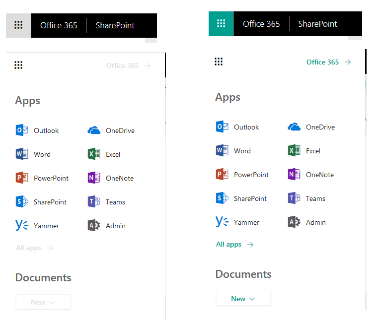
I was asked to set Accent color of app launcher to light gray but discovered the new app launcher have controls that inherit the color and become barely visible.
As displayed in image below I had to get the visual identity responsible to come up with another option.
Guess what happened when the accent color was set to white ....
- Labels:
-
Office 365
-
Theme
- Mark as New
- Bookmark
- Subscribe
- Mute
- Subscribe to RSS Feed
- Permalink
- Report Inappropriate Content
Feb 28 2018 02:34 AM
@Brian Levenson can you get the right people to look into getting this poor choice of fonts/colors fixed? The gray/white color combo should never be used, it is very hard for many people to read.
- Mark as New
- Bookmark
- Subscribe
- Mute
- Subscribe to RSS Feed
- Permalink
- Report Inappropriate Content
Feb 28 2018 04:57 AM
@Tom Batcheler might be able to help here.
I'd also like to express my concerns on this, as it seems that accessibility features are being overlooked lately. I've always praised Microsoft on that front, hope they continue delivering...
- Mark as New
- Bookmark
- Subscribe
- Mute
- Subscribe to RSS Feed
- Permalink
- Report Inappropriate Content
Feb 28 2018 05:22 AM
@Tom Resing this seems to be in conflict with your tweet announcing an award that MS received for accessiblity https://twitter.com/resing/status/968660861899255808. Can you help get this UI issue looked at?
- Mark as New
- Bookmark
- Subscribe
- Mute
- Subscribe to RSS Feed
- Permalink
- Report Inappropriate Content
Feb 28 2018 08:11 AM
Thanks for flagging the issue, @Dean Gross. Accessibility is very important. I'll let you know what I find out.
@Dean Gross wrote:
@Tom Resing this seems to be in conflict with your tweet announcing an award that MS received for accessiblity https://twitter.com/resing/status/968660861899255808. Can you help get this UI issue looked at?
- Mark as New
- Bookmark
- Subscribe
- Mute
- Subscribe to RSS Feed
- Permalink
- Report Inappropriate Content
Feb 28 2018 04:26 PM
SolutionFirst, thank you for calling this out. We are 100% committed to accessibility.
We are considering removing the behavior where the Office 365 app launcher inherits custom accent colors. We want to provide flexibility to customize Office 365 to reflect an organizational brand, but also safe guard against the creation of accessibility issues for users.
In the short-term, the work around is to select another custom accent color (like you have done) that reflects organizational brand color in the header, but also allows the links in the Office 365 app launcher to be visible to all users.
- Mark as New
- Bookmark
- Subscribe
- Mute
- Subscribe to RSS Feed
- Permalink
- Report Inappropriate Content
Sep 19 2018 01:30 PM
Come see what's new with Office.com and experiences built into Office 365 in the web at Ignite!
Our sessions will build on what we shared last year with the redesign of the Office 365 app launcher and include lots of live demo!
Demo Palooza: Office.com and New O365 web experiences
https://techcommunity.microsoft.com/t5/Microsoft-Ignite-Content-2018/Demo-palooza-Office-com-and-new...
Going beyond the waffle: From search to chat and more, what's new in Office 365 web experiences to power the digital transformation
Accepted Solutions
- Mark as New
- Bookmark
- Subscribe
- Mute
- Subscribe to RSS Feed
- Permalink
- Report Inappropriate Content
Feb 28 2018 04:26 PM
SolutionFirst, thank you for calling this out. We are 100% committed to accessibility.
We are considering removing the behavior where the Office 365 app launcher inherits custom accent colors. We want to provide flexibility to customize Office 365 to reflect an organizational brand, but also safe guard against the creation of accessibility issues for users.
In the short-term, the work around is to select another custom accent color (like you have done) that reflects organizational brand color in the header, but also allows the links in the Office 365 app launcher to be visible to all users.
