Turn on suggestions
Auto-suggest helps you quickly narrow down your search results by suggesting possible matches as you type.
- Home
- Microsoft To Do
- Microsoft To Do
- Inconsistent padding on the Microsoft To Do iOS app
Inconsistent padding on the Microsoft To Do iOS app
Discussion Options
- Subscribe to RSS Feed
- Mark Discussion as New
- Mark Discussion as Read
- Pin this Discussion for Current User
- Bookmark
- Subscribe
- Printer Friendly Page
- Mark as New
- Bookmark
- Subscribe
- Mute
- Subscribe to RSS Feed
- Permalink
- Report Inappropriate Content
Oct 05 2021 07:46 AM - edited Oct 05 2021 07:48 AM
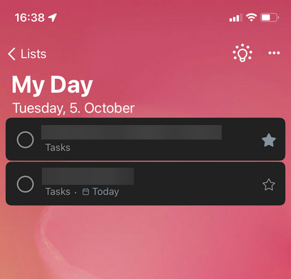
On the iOS version of Microsoft To-Do, the padding between the headline block and the task list is almost nonexistent. The padding should be increased to be consistent with the Windows and Mac version of Microsoft To Do. As a graphic designer it makes me want to scrape my eyes out of my skull.
You should also consider increasing the spacing between items a bit across all platforms, it's a very thin space on smaller displays, and it just doesn't seem very clean.
This is how it looks on iOS.
This is how it looks on Windows.
0 Replies

