Turn on suggestions
Auto-suggest helps you quickly narrow down your search results by suggesting possible matches as you type.
- Home
- Security, Compliance, and Identity
- Microsoft Defender for Cloud Apps
- Re: Unusual Profile/Sign Out UI
Unusual Profile/Sign Out UI
Discussion Options
- Subscribe to RSS Feed
- Mark Discussion as New
- Mark Discussion as Read
- Pin this Discussion for Current User
- Bookmark
- Subscribe
- Printer Friendly Page
- Mark as New
- Bookmark
- Subscribe
- Mute
- Subscribe to RSS Feed
- Permalink
- Report Inappropriate Content
Nov 27 2019 05:58 AM
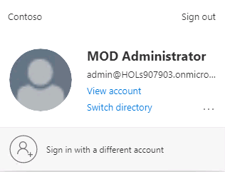
The Profile icon/functionality is different in MCAS than other MS products (Azure/O365), see below.
It would be better if MCAS used the same Profile menu without the additional Gear icon. There would be fewer clicks required and logging out would be more intuitive/consistent
MCAS
Office 365
Azure
Labels:
- Labels:
-
Cloud App Security
1 Reply
- Mark as New
- Bookmark
- Subscribe
- Mute
- Subscribe to RSS Feed
- Permalink
- Report Inappropriate Content
Dec 17 2019 12:06 PM
Your feedback has been captured and I'll work with my team to see if changes will be made.


