- Home
- Security, Compliance, and Identity
- Microsoft Defender for Cloud Apps
- Re: Unusual checkboxes in UI
Unusual checkboxes in UI
- Subscribe to RSS Feed
- Mark Discussion as New
- Mark Discussion as Read
- Pin this Discussion for Current User
- Bookmark
- Subscribe
- Printer Friendly Page
- Mark as New
- Bookmark
- Subscribe
- Mute
- Subscribe to RSS Feed
- Permalink
- Report Inappropriate Content
Nov 27 2019 05:13 AM - edited Nov 27 2019 05:16 AM
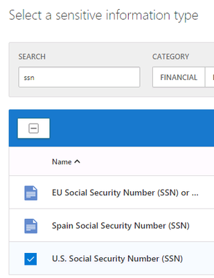
MCAS has implemented some UI conventions that are not consistent with other Microsoft products, for example the selection boxes shown below for EU and Spain are not the typical empty square check boxes which is slightly confusing. After selecting the US SSN, the typical check mark is displayed but prior to selection it is not obvious that the blue paper image is the selector.
It would be better if these were the same as all of the other MS web apps.
- Labels:
-
Cloud App Security
- Mark as New
- Bookmark
- Subscribe
- Mute
- Subscribe to RSS Feed
- Permalink
- Report Inappropriate Content
Dec 17 2019 12:05 PM
Thank you for your feedback!
I'll work with my team to investigate this.
