- Home
- Microsoft 365
- Excel
- Re: What's the best way to visualize this data?
What's the best way to visualize this data?
- Subscribe to RSS Feed
- Mark Discussion as New
- Mark Discussion as Read
- Pin this Discussion for Current User
- Bookmark
- Subscribe
- Printer Friendly Page
- Mark as New
- Bookmark
- Subscribe
- Mute
- Subscribe to RSS Feed
- Permalink
- Report Inappropriate Content
Jan 10 2021 01:17 PM
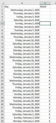
I have tracked my mood and habits over the past year:
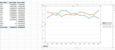
Mood has been visualized as follows (1-5, 5 being best, tracked daily, averaged out over month):
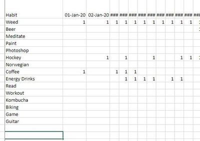
Habits have been tracked as follows, just not sure how I would visualize this in a chart?
Would there be any way to cross reference the mood vs habits in a chart as well?
Thanks for any help!
- Labels:
-
Charting
- Mark as New
- Bookmark
- Subscribe
- Mute
- Subscribe to RSS Feed
- Permalink
- Report Inappropriate Content
Jan 10 2021 02:38 PM
The Excel Pivot Table is made for cross-tabulating things like that. You'd find it a lot easier, however, if you collected the two sets of data in a single table.
I'd personally recommend expanding the number of columns in that first table to show which behavior (some clearly are "habits" but others are less so; "behaviors" strikes me as the more inclusive term for them all...anyway, create a separate column for each, and maybe even consider categorizing those behaviors/habits as "positive" or "negative" or "neutral" --- or "constructive" vs "destructive" -- or is that what you're trying to establish?
Anyway, since you clearly already have a spreadsheet, if you'd like more pointers on creating the Pivot Table, you'd help us help you by posting the spreadsheet itself rather than just images of it.


