- Subscribe to RSS Feed
- Mark Discussion as New
- Mark Discussion as Read
- Pin this Discussion for Current User
- Bookmark
- Subscribe
- Printer Friendly Page
- Mark as New
- Bookmark
- Subscribe
- Mute
- Subscribe to RSS Feed
- Permalink
- Report Inappropriate Content
Jan 13 2022 05:54 AM
How do you insert a target line into charts?
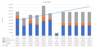
I have created the chart but want it to show the target line for monthly sales achieved.
The chart has the monthly totals as per below but I want a horizontal target line for better visual effect of targets met.
| July | August | September | October | November | December | January | February | March | April | May | June | |
| CEC Service | $273,370 | $157,535 | $195,843 | $173,988 | $235,758 | $253,360 | $28,138 | $162,000 | $162,000 | $162,000 | $162,000 | $162,000 |
| Support & Training | $50,997 | $7,770 | $49,996 | $18,498 | $64,105 | $29,732 | $0 | $38,000 | $38,000 | $38,000 | $38,000 | $38,000 |
| LR Service | $62,539 | $118,030 | $89,281 | $138,702 | $182,071 | $77,315 | $17,220 | $182,100 | $182,100 | $182,100 | $182,100 | $182,100 |
| Total Month | $386,906 | $283,335 | $335,120 | $331,188 | $481,934 | $360,407 | $45,358 | $382,100 | $382,100 | $382,100 | $382,100 | $382,100 |
- Labels:
-
Charting
- Mark as New
- Bookmark
- Subscribe
- Mute
- Subscribe to RSS Feed
- Permalink
- Report Inappropriate Content
Jan 13 2022 06:54 AM
@PLiscia008 In that attached I copied your data, created a fictitious Target and created a COMBO graph. You can select your graph and go to Chart Design -> Change Chart Type or start over. Just for fun I added all the parts so you can see how it all 'stacks up'. So the parts and 'Target' are all on the primary axis and the Total Month is on the secondary axis which I hid and set the fill and border to 'none' so it isn't on the main graph just on the data table.
- Mark as New
- Bookmark
- Subscribe
- Mute
- Subscribe to RSS Feed
- Permalink
- Report Inappropriate Content
Jan 13 2022 07:05 AM

