- Subscribe to RSS Feed
- Mark Discussion as New
- Mark Discussion as Read
- Pin this Discussion for Current User
- Bookmark
- Subscribe
- Printer Friendly Page
- Mark as New
- Bookmark
- Subscribe
- Mute
- Subscribe to RSS Feed
- Permalink
- Report Inappropriate Content
Apr 18 2022 10:56 AM
Hello! I am using the EXCEL bivariate scatterplot function to create Lorenz curves and Gini coefficients using 16 data points. Both the X and Y axes are supposed to have a range from 0 to 1.0 as defined in the corresponding Excel data columns. While my Y axis data appears in the scatter plot with the correct 0 to 1.0 range, the X-axis data is consistently appearing with a range of 1 to 16, so mimicking the number of data entries rather than the correct numerical range the X-axis data values. This is obviously distorting my scatterplot results and creating an incorrect Lorenz curve. I tried adjusting the Axis Range for the X-axis, but that resulted in a grouping of all my data point at the 1.0 mark. Any ideas on how to correct this and get my X-axis on a 0 to 1.0 scale in tandem with the Y-axis? Many thanks for any help you can provide. JZ
- Labels:
-
Excel
- Mark as New
- Bookmark
- Subscribe
- Mute
- Subscribe to RSS Feed
- Permalink
- Report Inappropriate Content
Apr 18 2022 11:31 AM
Could you attach a sample workbook, or if that is not possible, make it available through OneDrive, Google Drive, Dropbox or similar?
- Mark as New
- Bookmark
- Subscribe
- Mute
- Subscribe to RSS Feed
- Permalink
- Report Inappropriate Content
Apr 18 2022 01:01 PM
Thank you!
https://www.dropbox.com/scl/fi/usjssjx6mmdkc7lfnzfwi/SAMPLE-GINI-FILE.xlsx?dl=0&rlkey=taavqaxkqgk02a...
- Mark as New
- Bookmark
- Subscribe
- Mute
- Subscribe to RSS Feed
- Permalink
- Report Inappropriate Content
Apr 18 2022 01:17 PM
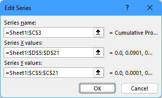
SolutionYou can edit the series and specify the x-values there:
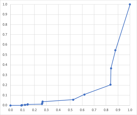
Result:
See the attached version.
- Mark as New
- Bookmark
- Subscribe
- Mute
- Subscribe to RSS Feed
- Permalink
- Report Inappropriate Content
Apr 18 2022 01:32 PM
Accepted Solutions
- Mark as New
- Bookmark
- Subscribe
- Mute
- Subscribe to RSS Feed
- Permalink
- Report Inappropriate Content
Apr 18 2022 01:17 PM
SolutionYou can edit the series and specify the x-values there:
Result:
See the attached version.

