- Subscribe to RSS Feed
- Mark Discussion as New
- Mark Discussion as Read
- Pin this Discussion for Current User
- Bookmark
- Subscribe
- Printer Friendly Page
- Mark as New
- Bookmark
- Subscribe
- Mute
- Subscribe to RSS Feed
- Permalink
- Report Inappropriate Content
Nov 15 2022 01:47 PM
I cannot create a "scatter plot with straight lines".
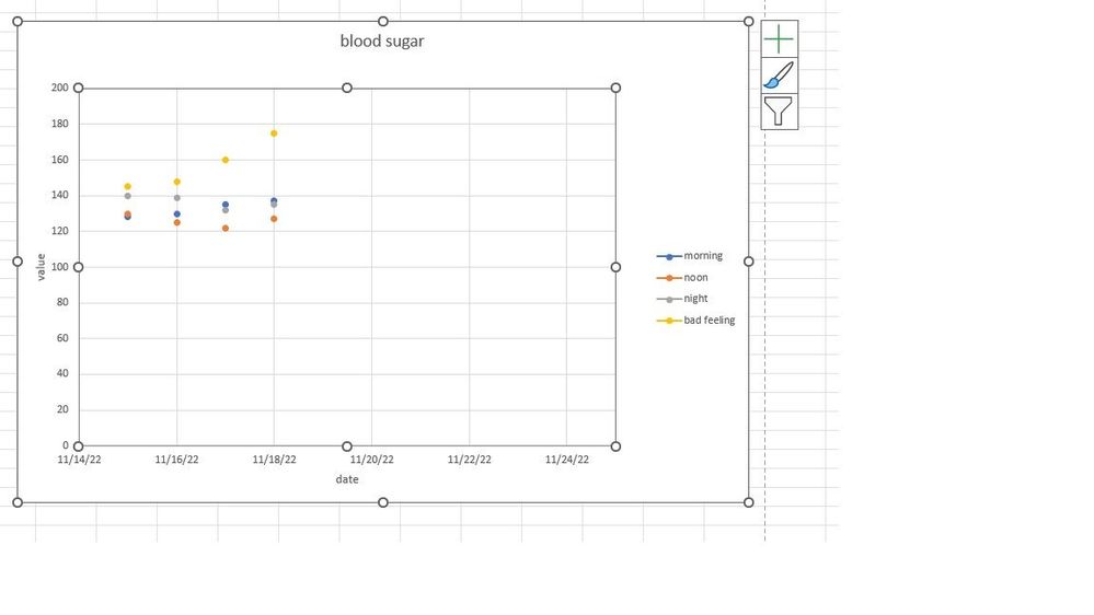
Here is a screen shot of a plot:
This is a scatter plot, but I have selected "scatter with straight lines and markers".
Changing chart type to "scatter" and back to "scatter with straight lines..." does nothing.
I am using WIN 11 Home; Microsoft 365; Microsoft Excel for Microsoft 365 MSO 64 bit.
Plot selections do not seem to work right.
Any ideas?
thanks for the help
- Labels:
-
Excel
- Mark as New
- Bookmark
- Subscribe
- Mute
- Subscribe to RSS Feed
- Permalink
- Report Inappropriate Content
Nov 15 2022 01:58 PM
Could you attach a small sample workbook demonstrating the problem (without sensitive data), or if that is not possible, make it available through OneDrive, Google Drive, Dropbox or similar?
- Mark as New
- Bookmark
- Subscribe
- Mute
- Subscribe to RSS Feed
- Permalink
- Report Inappropriate Content
Nov 15 2022 02:44 PM
- Mark as New
- Bookmark
- Subscribe
- Mute
- Subscribe to RSS Feed
- Permalink
- Report Inappropriate Content
Nov 15 2022 02:53 PM
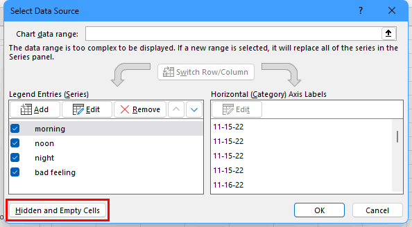
Thanks! There are empty cells between the data points of each series. By default, these are displayed as gaps in the chart. To change this:
- Click anywhere in the chart.
- On the Chart Design tab of the ribbon, click Select Data.
- Click the 'Hidden and Empty Cells' button.
- Select 'Connect data points with line'.
- Click OK, then click OK again.
- Mark as New
- Bookmark
- Subscribe
- Mute
- Subscribe to RSS Feed
- Permalink
- Report Inappropriate Content
Nov 16 2022 07:36 AM
thanks again
- Mark as New
- Bookmark
- Subscribe
- Mute
- Subscribe to RSS Feed
- Permalink
- Report Inappropriate Content
Nov 16 2022 07:43 AM
SolutionThe data points for a chart series are usually in adjacent cells. If there is an empty cell in between, it often means that there are missing data. But here, there are many empty cells between the data points because of the layout of the source range. So that's different.
Accepted Solutions
- Mark as New
- Bookmark
- Subscribe
- Mute
- Subscribe to RSS Feed
- Permalink
- Report Inappropriate Content
Nov 16 2022 07:43 AM
SolutionThe data points for a chart series are usually in adjacent cells. If there is an empty cell in between, it often means that there are missing data. But here, there are many empty cells between the data points because of the layout of the source range. So that's different.


