- Home
- Microsoft 365
- Excel
- Scatter chart plots wrongly if blank cells exist in input range
Scatter chart plots wrongly if blank cells exist in input range
- Subscribe to RSS Feed
- Mark Discussion as New
- Mark Discussion as Read
- Pin this Discussion for Current User
- Bookmark
- Subscribe
- Printer Friendly Page
- Mark as New
- Bookmark
- Subscribe
- Mute
- Subscribe to RSS Feed
- Permalink
- Report Inappropriate Content
Apr 25 2020 12:30 AM - edited Apr 25 2020 12:31 AM
I am trying to make a general template to plot a Q-Q plot for upto 100 data points (if a reader is unaware of what a Q-Q plot is, in present context it doesn't matter, just take it as a simple X-Y Scatter Chart)
Problem being faced is that if there is even one x-y pair empty in the input cells range of that scatter chart, then the chart doen't plot correctly. Instead of plotting selected y against selected x alues, it just plots the selected y valyes against serial number of the ys i.e. x-range just becomes 1,2,3,...always irrespective of what values are there in the designated column of x-values.
So my problem is, since scatter chart is unable to take a blank cell as input, so i am not able to make a generic template to make a Q-Q Plot.
The said file is attached - there are 2 sheets in it - the sheet 100 points with all 100 x-y pairs filled plots the correct chart - no problems, and in a duplicated copy of same sheet titled 99 points the last x-y pair cells were made blank, and doing just this destroys the whole x-y scatter!
I seek a solution or workaround to this problem!
- Mark as New
- Bookmark
- Subscribe
- Mute
- Subscribe to RSS Feed
- Permalink
- Report Inappropriate Content
Apr 25 2020 01:37 AM
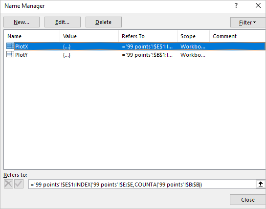
SolutionYou may apply dynamic ranges using named formulas as
using them as data for chart series
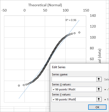
Don't forget sheet name applying series values, like ='99 points'!PlotX
- Mark as New
- Bookmark
- Subscribe
- Mute
- Subscribe to RSS Feed
- Permalink
- Report Inappropriate Content
Apr 25 2020 04:40 AM - edited Apr 25 2020 04:41 AM
@Sergei Baklan thanks! i get the idea and it seems a good solution.
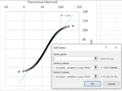
Strangely though, in my version of Excel (2016), the named formula is automatically referring to the workbook name. Even when i open your (downloaded) solution workbook as it is, it shows workbook name instead of sheet name. Must be something to do with the excel version i guess.
But thanks, i get the line of the solution!
Accepted Solutions
- Mark as New
- Bookmark
- Subscribe
- Mute
- Subscribe to RSS Feed
- Permalink
- Report Inappropriate Content
Apr 25 2020 01:37 AM
SolutionYou may apply dynamic ranges using named formulas as
using them as data for chart series
Don't forget sheet name applying series values, like ='99 points'!PlotX


