- Home
- Microsoft 365
- Excel
- Quickly creating a x-y scatter chart with straight lines and markers
Quickly creating a x-y scatter chart with straight lines and markers
- Subscribe to RSS Feed
- Mark Discussion as New
- Mark Discussion as Read
- Pin this Discussion for Current User
- Bookmark
- Subscribe
- Printer Friendly Page
- Mark as New
- Bookmark
- Subscribe
- Mute
- Subscribe to RSS Feed
- Permalink
- Report Inappropriate Content
Sep 27 2021 01:21 AM
I have a large number of data series with annual data returned. I would like to quickly create an X-Y scatter chart with lines and markers with one line for each series, with values returned on the y-axis and year of data entry on the x-axis. I currently have a table of data with "year" along the top, "series label" down the side and data within the table. I could manually create a blank chart and add the series one by one but this would take a long time. I have tried marking all the data and creating a chart but the software does not seem to recognise what I am trying to do. Is there a way to create this chart quickly?
- Mark as New
- Bookmark
- Subscribe
- Mute
- Subscribe to RSS Feed
- Permalink
- Report Inappropriate Content
Sep 27 2021 02:12 AM
SolutionSelect the range.
Insert a scatter chart with lines and markers.
If it looks wrong, click anywhere in the chart.
On the Chart Design tab of the ribbon, click Switch Row/Column.
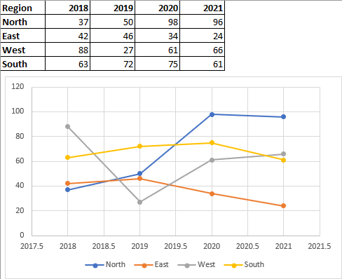
Here is an example. First, the scatter chart as created by Excel:
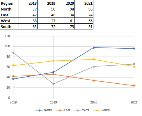
Next, the result of clicking Switch Row/Column:
It needs a bit more work - we don't want 2017.5 etc., so we format the X-axis:
- Mark as New
- Bookmark
- Subscribe
- Mute
- Subscribe to RSS Feed
- Permalink
- Report Inappropriate Content
Oct 01 2021 04:36 AM
Accepted Solutions
- Mark as New
- Bookmark
- Subscribe
- Mute
- Subscribe to RSS Feed
- Permalink
- Report Inappropriate Content
Sep 27 2021 02:12 AM
SolutionSelect the range.
Insert a scatter chart with lines and markers.
If it looks wrong, click anywhere in the chart.
On the Chart Design tab of the ribbon, click Switch Row/Column.
Here is an example. First, the scatter chart as created by Excel:
Next, the result of clicking Switch Row/Column:
It needs a bit more work - we don't want 2017.5 etc., so we format the X-axis:


