- Home
- Microsoft 365
- Excel
- Pivot Table - Displaying data from the same filter two different ways on the same Pivot Chart
Pivot Table - Displaying data from the same filter two different ways on the same Pivot Chart
- Subscribe to RSS Feed
- Mark Discussion as New
- Mark Discussion as Read
- Pin this Discussion for Current User
- Bookmark
- Subscribe
- Printer Friendly Page
- Mark as New
- Bookmark
- Subscribe
- Mute
- Subscribe to RSS Feed
- Permalink
- Report Inappropriate Content
Nov 11 2022 03:38 PM
I am just learning Pivot Tables and Pivot Charts, so please forgive me if this is easy or straightforward, but I cannot figure this one out. Here's what I'm trying to do. I am creating a set of reports for our clients that show a variety of performance data over the last year. On many of these, I would like for the chart to show both how the client on average performed individually AND how all clients on average performed in these same categories. This way when the client looks at the chart, they can see their own performance AND how it measures up to their peers. I've been able to do this without any problem at all in Excel when I just create a chart from a table or dataset manually, but pivot tables and pivot charts seems like a much better and less time consuming way of creating these. For the sake of context - I have to create an annual report for each one of our clients enrolled in a particular program we administer and there is about 50 of them - and each report contains about 15-20 charts. So, while I could create each chart individually in Excel (the way I've done it for years), the idea of using a pivot table and chart to make this more efficient is very appealing. But only if I can figure out how to do this one thing.
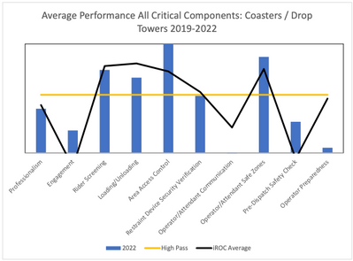
Here's an example of what I'm trying to do (yes, my clients are amusement parks):
The blue bars show how this particular client performed in each of the categories on the horizontal axis with regard to the operation of coasters & drop towers. The black line is the average performance of about 50 facilities (all the facilities I currently work with on this program). I can get the Pivot Chart to show one or the other of these, but not both.
If it matters, I'm using a Mac and the latest version of Excel. Any help would be appreciated.
- Labels:
-
Excel
-
Excel on Mac
